EDITORS’ PICK
The Marvels of Daily Life
STREET LIFE
Street Life Editors’ Pick
Following Philip-Lorca diCorcia’s selection of winning images for our STREET LIFE theme, this compilation of 20 images, selected by the Life Framer editors represents some of the other talented photographers whose work struck us and left a mark. Each a stunning image worthy of exposure and attention…
These are intended to be a conversation starter… so feel free to join the discussion on our social networks.
BANNER IMAGE COURTESY OF DAVID HORTON
www.hortonpictures.com / @davidhorton1010
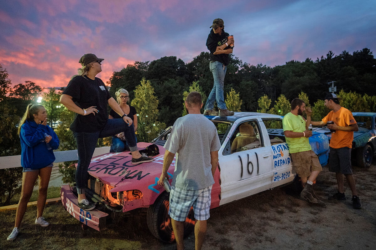
Editor’s comment: Documenting life in the city through its communities is always interesting. I like the flow of bodies through the frame from left to right, and of course the sunset colors and the way they compliment the subjects’ attitudes. The beaten-up, hand-painted car makes for a fascinating focal point that leaves the viewer wanting to understand more of the context.
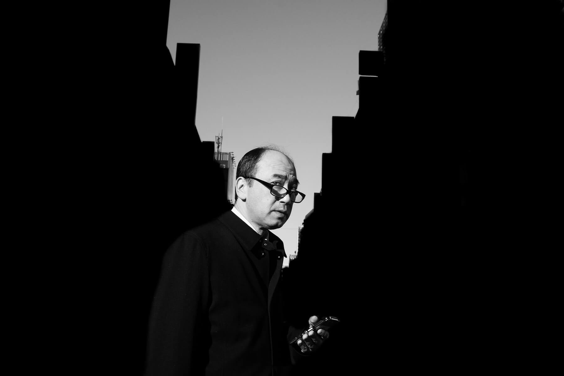
IMAGE COURTESY OF LEE CHAPMAN
www.leechapman.photos / @tokyotimes_lee
“The variety of life found on Tokyo’s equally varied streets.”
Editor’s comment: This photo speaks about modern life and technology. The symmetry in composition and the game of light and shadows create a strong focal point, and the use of black and white is a wise choice because the lack of color emphasizes the character and his conflict. It’s brilliantly executed.
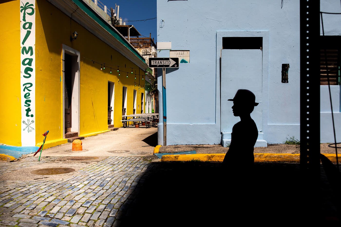
IMAGE COURTESY OF LENG UNG
@leng.ung.312
Editor’s comment: An interesting, well-balanced and challenging composition that denotes technical skill and storytelling knowledge. I appreciate the use of different types of contrast – between colors, shapes, patterns – to create an immersive frame.
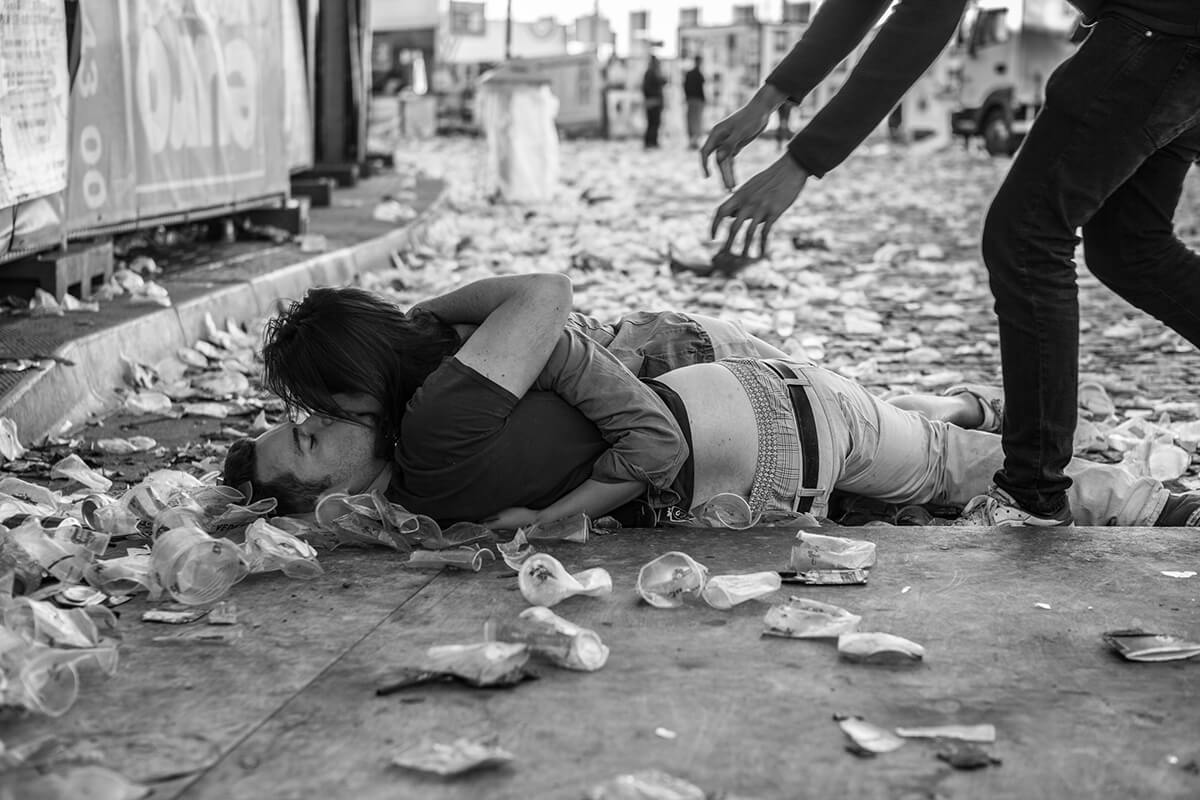
IMAGE COURTESY OF NATACHA PERSYN
www.fotografie-natachapersyn.be / @malouot
“From the series The Gentse Feesten”
Editor’s comment: A fantastic image that says so much – a story in motion that captures the passion, chaos, and debauched, messy drama of youth. Black and white is an excellent choice, as is the tight depth of field in order to focus on this couple in fervent embrace.
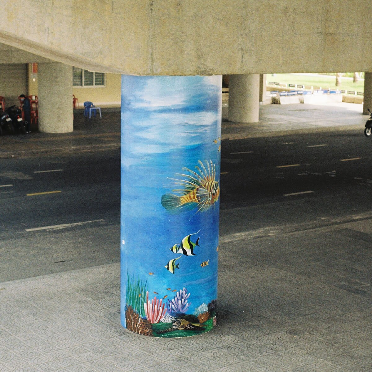
IMAGE COURTESY OF JADE FLORENCE
@www.jadeflorence.com / @jadeflorencephoto
Editor’s comment: A simple but powerful frame, highlighting a splash of creativity and personality in a drab city, and perhaps symbolic of the irony in how we yearn for a nature that we progressively and knowingly destroy as our cities grow.
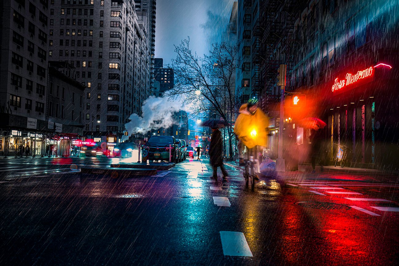
IMAGE COURTESY OF ADAM HONG
@www.adamhong.com / @adamhong_nyc
Editor’s comment: Dreamy, rainy, and appealing, like any urban night scene should be. Adam works very well with light and shadows, and it’s clear he has taken the time to observe. While the centrally aligned, silhouetted and umbrella-carrying pedestrian in the background anchors the frame, Adam could have perhaps waited for the cyclist to enter the empty foreground, or framed the scene more tightly to crop this foreground. Overall though, it’s an excellent evocative scene.
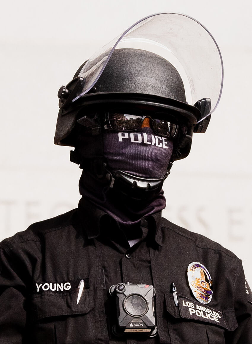
IMAGE COURTESY OF MARK HOLLEY
@_mark_holley
“This series was taken in Los Angeles at the Black Lives Matter protests during the lockdown. As a non-black ally, attendance in solidarity at these demonstrations has been essential to increasing my understanding of how white supremacy permeates the culture in the United States and how I benefit from my privilege. The resulting images have given me a way to amplify BIPOC voices/issues by creating conversations about racial equity with people in my inner circle of friends and family and beyond as the images were shared via social media and ended up reaching people in rural areas who may not understand the reality of what they see on television and how it relates to people they may know.”
Editor’s comment: This street portrait of a police officer has a formal quality in its clean composition and sharpness. Given the battles for social and racial justice taking place across America (and beyond), and the growing recognition of the deep-rooted, systemic issues in law enforcement, it has a particular resonance – a faceless, intimidating presence that watches over the city.
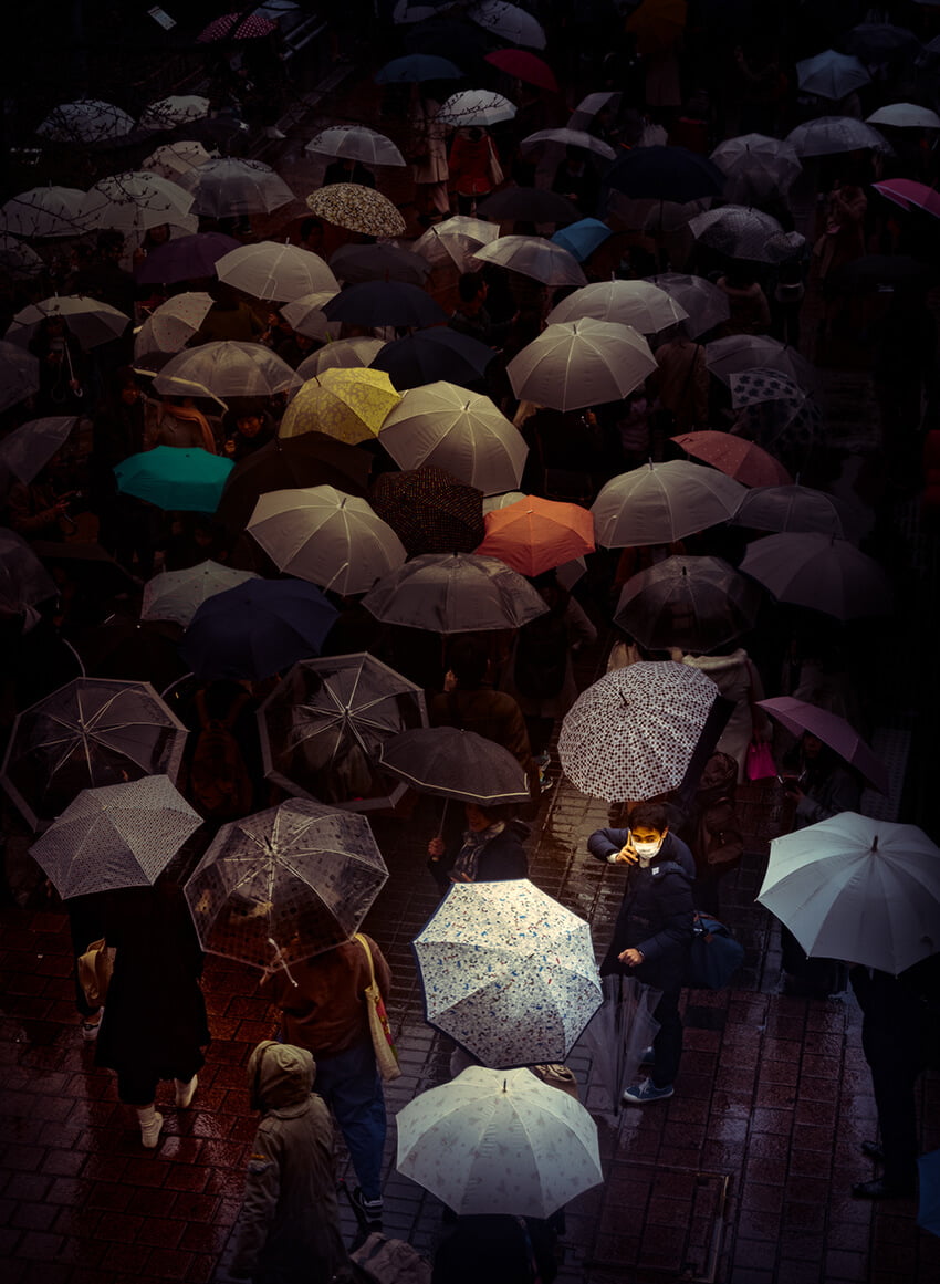
IMAGE COURTESY OF TOM LEIGHTON
www.tleighton.com / @tomleightonart
“In this series of Tokyo based works, the city is shown in what appears to be perpetual twilight. Tokyo is lit by both natural and enhanced lighting to explore a relationship between anonymity and individuality. The narrative is implied but never specific: in these floating dreamlike perspectives of the city are frozen moments of individual contemplation.”
Editor’s comment: Using a soft color palette and patterns, this picture individualizes a character and creates a narrative. It has a strong focal point and a smooth atmosphere. The photo exhibits artistic skills and an inclination towards storytelling – one that has an increased resonance in our current times.
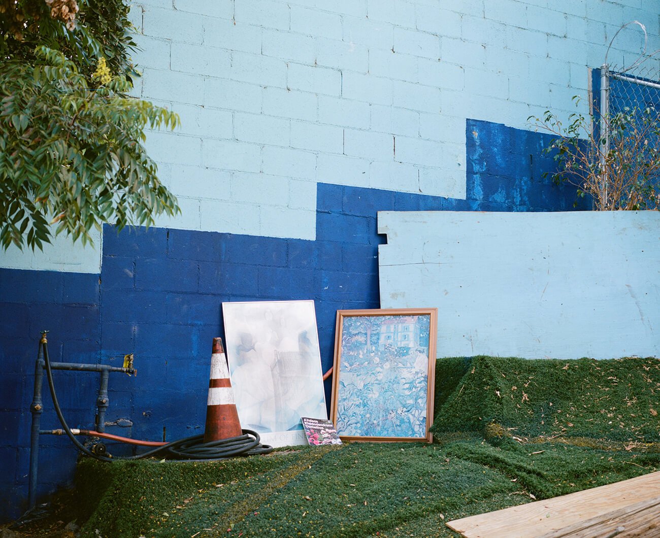
IMAGE COURTESY OF MAX KNIGHT
www.maxknightphoto.com / @maxknightmare
Editor’s comment: Max documents a fabulous spontaneous street still life – a display of seemingly random elements which combine into something strangely profound.
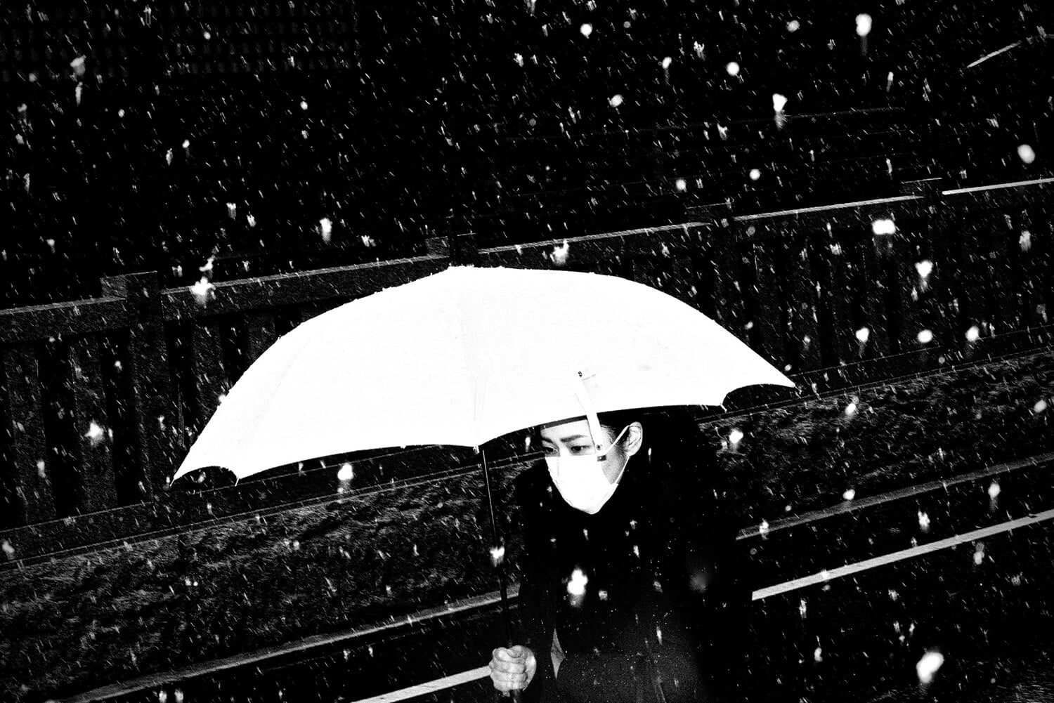
IMAGE COURTESY OF JOEL PULLIAM
www.joelpulliam.com / @j_pulliam_photo
“While Tokyo is often portrayed as a city of crowds, peaceful moments of street life are plentiful.”
Editor’s comment: High-key photography isn’t easy, but this image uses that technique to capture emotion and mood in a stripped-back, distraction free way – finding a quiet moment in a chaotic city, as Joel expresses in his statement. I appreciate the composition and technical skill. It’s a simple photo with several dimensions.
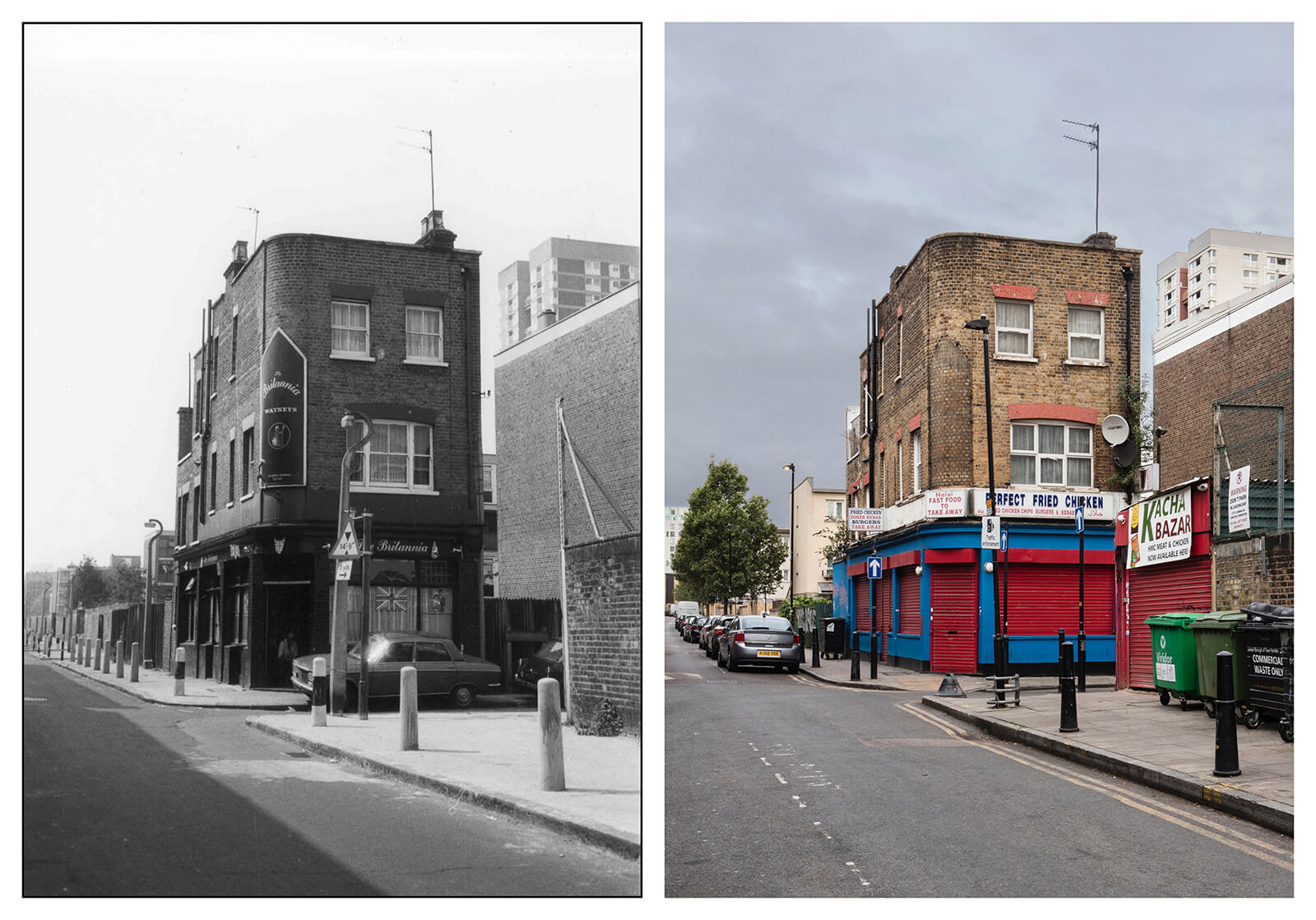
IMAGE COURTESY OF ANDRAS ANDOR JAMBOR
www.andrasandorjambor.photography / @andrasandorjambor.photography
“Britannia, 44 Morris Street from the series Is this the Future of the Pubs? This project is a documentation of disappearing traditional English pub architecture and culture in the East End of London. It stems from my ongoing interest in architectural and landscape photography and the love of pub culture, food and national traditions. According to CAMRA (Campaign for Real Ale) book ‘Britain’s Best Real Heritage Pubs’ (2013), the total number of pubs in the UK was 75,000 at the end of ’70s, and then decreased to 52,000 in 2013. Nevertheless, only around 250 of them still had an original un-retouched taproom interior. These traditional ‘watering holes’ are closing down at an average rate of 25 per week.
My series consists of both archival photographs and contemporary photographs presented as horizontal diptychs. The archival images were sourced from The Bishopsgate Institute Photography Collections, Tower Hamlets Local History Library and Archives as well as Collage, a London Picture Archive documenting pub architecture in the last 50 years.
I have researched these locations and returned to them with the intent of photographically documenting this change. Whether the pub is open or closed, altered or converted, it is a cultural institution and part of the country’s heritage. I found that every pub has a different exterior design matching with local traditions. After over a decade of working in English pubs, I have seen many refurbishments take place that leaves the traditional architecture nearly unrecognisable. This project aims to raise awareness of the challenging times facing the pub industry and reflects on the disappearing tradition, and often overlooked value, of the history and heritage of the pub and its architecture.”
Editor’s comment: Old and new are never easy to depict in photos and require determination and deep engagement, both of which Andras employs to document the disappearance of traditional English pub architecture and culture in the East End of London – a part of the city that has aggressively gentrified over the last 20 years. He uses color in the ‘today’ shot to add a clear temporal dimension, and finding the exact same angle is impressive.
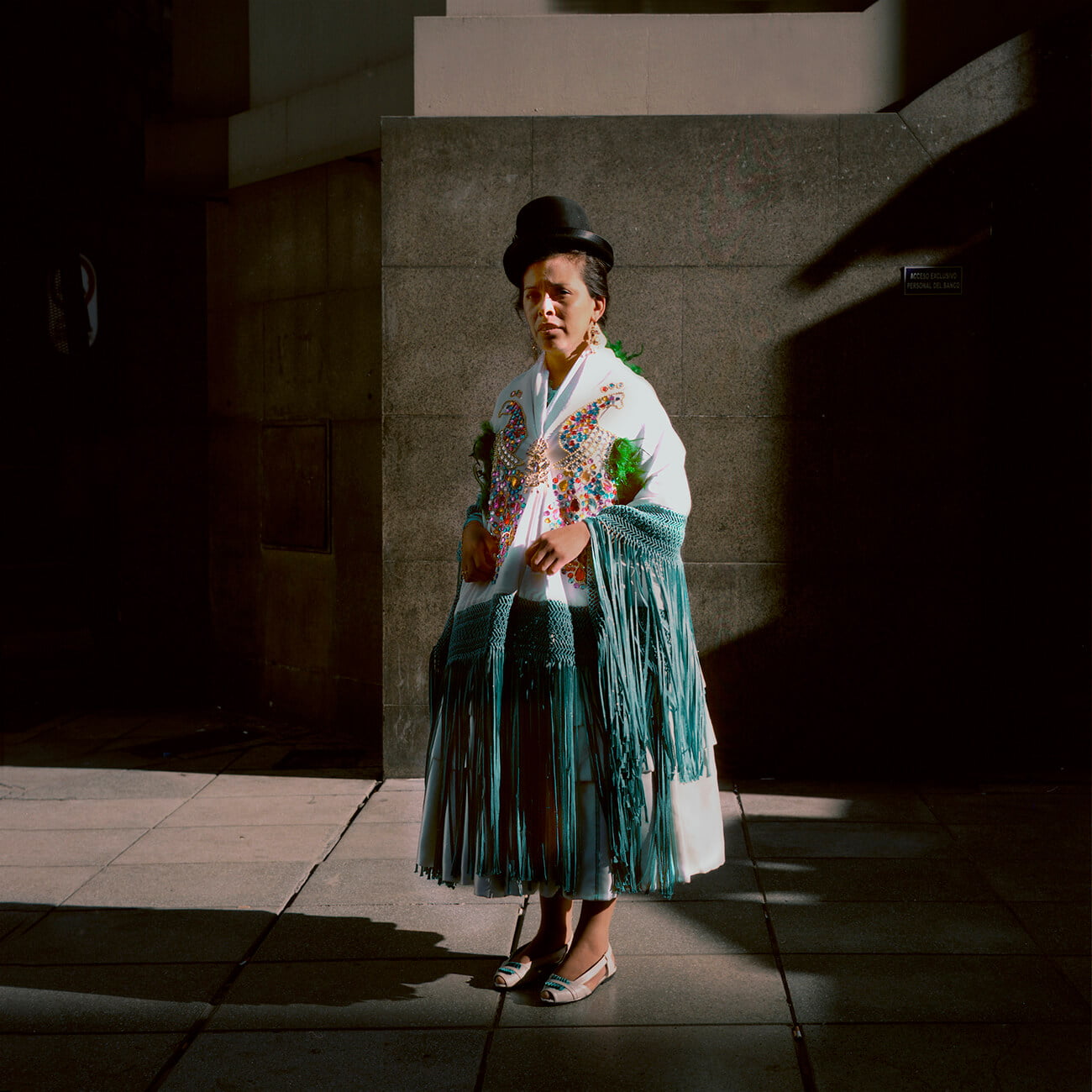
IMAGE COURTESY OF FERNANDO DI SISTO
@fernandodisisto
“Downtown Buenos Aires.”
Editor’s comment: The streets of Buenos Aires are a mix of tradition and modernity, and that dichotomy is captured wonderfully here by Fernando. I like the contrast between the concrete and woman’s silhouette, the gray background and colorful character. The city looks positively drab in comparison to her, reminding us of the importance in maintaining a history that can so easily be crowded out through modernization. The whites of her dress are overexposed but it works here – giving her a glowing aura that emphasizes that importance even more.
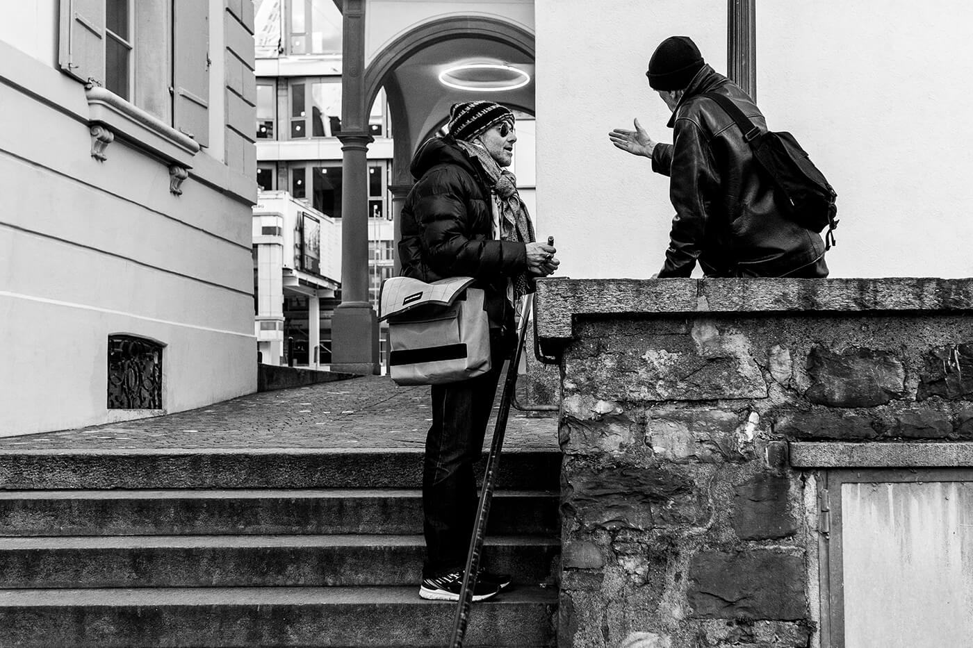
IMAGE COURTESY OF MARK WYSS
@blackandwyss
“Streets of Switzerland – Halo.”
Editor’s comment: An artful visual perspective can transform a dull image into a great composition. This is everyday life in the city, and Mark captures the essence of an ordinary day and succeeds in making it interesting with the playful visual juxtaposition of the ‘halo’.
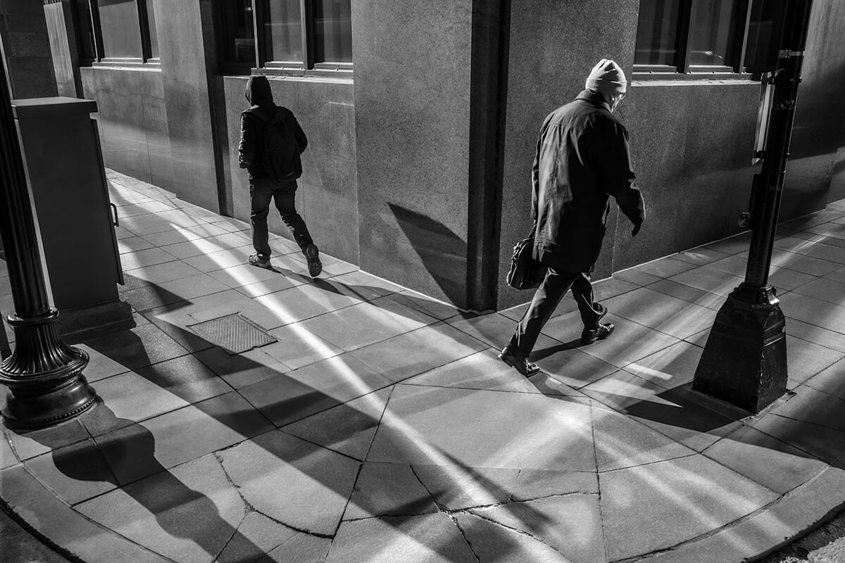
IMAGE COURTESY OF JEFF LARASON
www.jefflarason.com / @jeff_larason
“From my series Boston Sonder, documenting the streets of Boston.”
Editor’s comment: This is a powerful image, so illustrative of the comings and goings and ‘isolation in close proximity’ of city life. A monochrome palette suits the scene perfectly as the game of highlights and shadows captures the eye and leads us through the frame. It’s geometrical and well-balanced, and the shards of light create an interesting effect, almost like we’re looking through a kaleidoscope, elevating ‘normal’ life into something beyond.
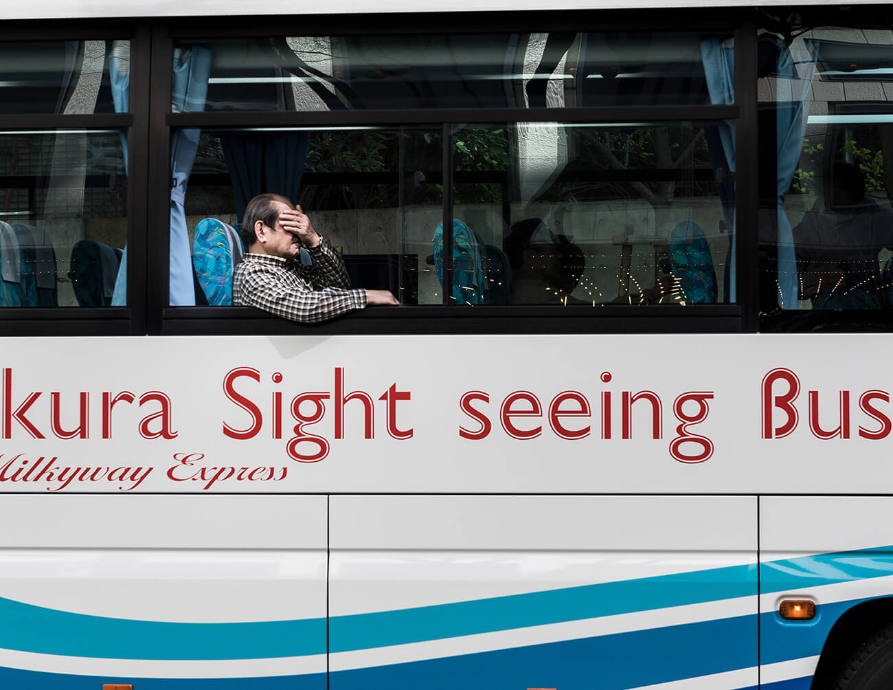
IMAGE COURTESY OF MIKE REED
www.mikereedphotography.com / @mikereedphoto
Editor’s comment: Taking a good snapshot is harder than it looks, especially a simple one like this. I appreciate the humorous visual narrative that Mike conjours through sharp timing and a clean composition. It’s a wry and amusing comment on tourism, with a strong punchline.
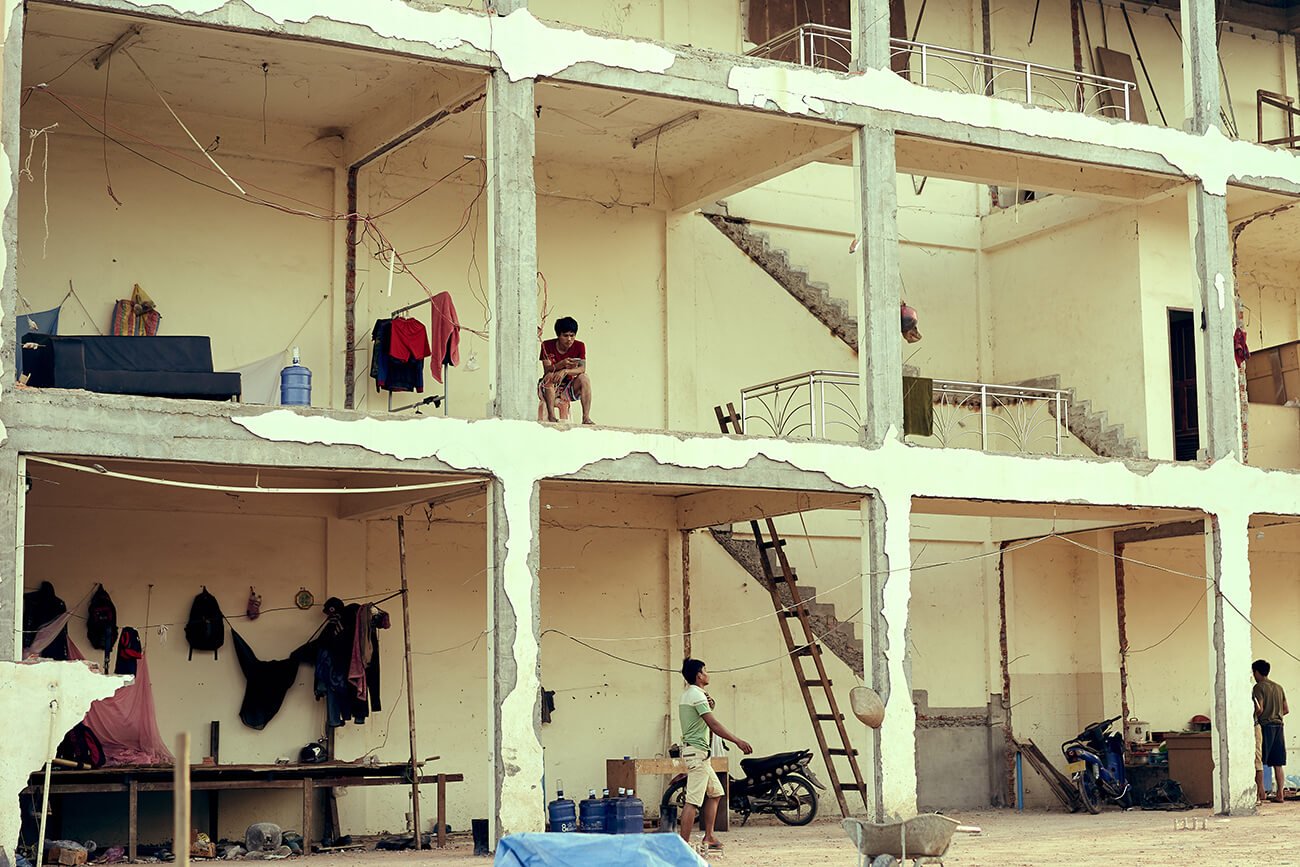
IMAGE COURTESY OF HAI VAN
www.amazingworx.com / @vanhai
Editor’s comment: The main purpose of photography is to bring us closer to the world, and when people call a half-demolished building their home, their voices must be heard. I appreciate the considered composition and the myriad details to absorb across the whole frame.
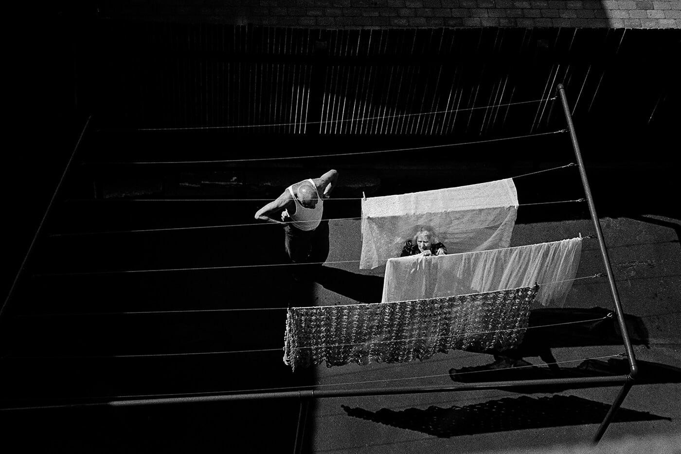
IMAGE COURTESY OF BETINA VANG
www.betinavang.com / @betinavangphoto
Editor’s comment: An interesting perspective on urban life, this photo creates an island of old habits. It’s a well-chosen subject matter that denotes an eye for photography, engagement, and emotion. The photo has a wide dynamic range, which is not easy to achieve.
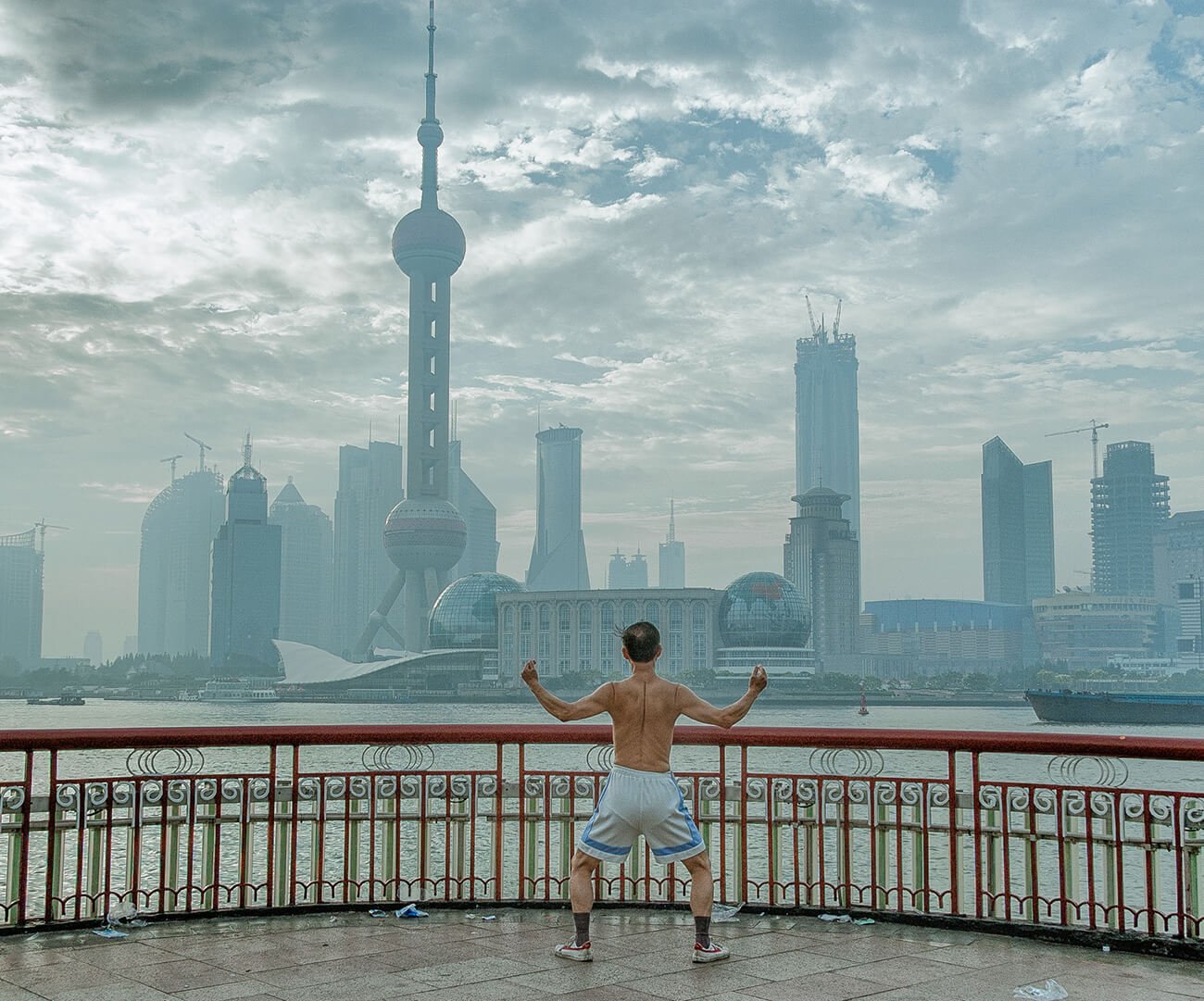
IMAGE COURTESY OF ATTILA BALOGH
www.attila.photo / @guczo
Editor’s comment: The soft tones of the background and the wide perspective over the city give this image its visual pull, and the fence has an interesting pattern that separates the two visual planes. It’s a battle between man and the city.
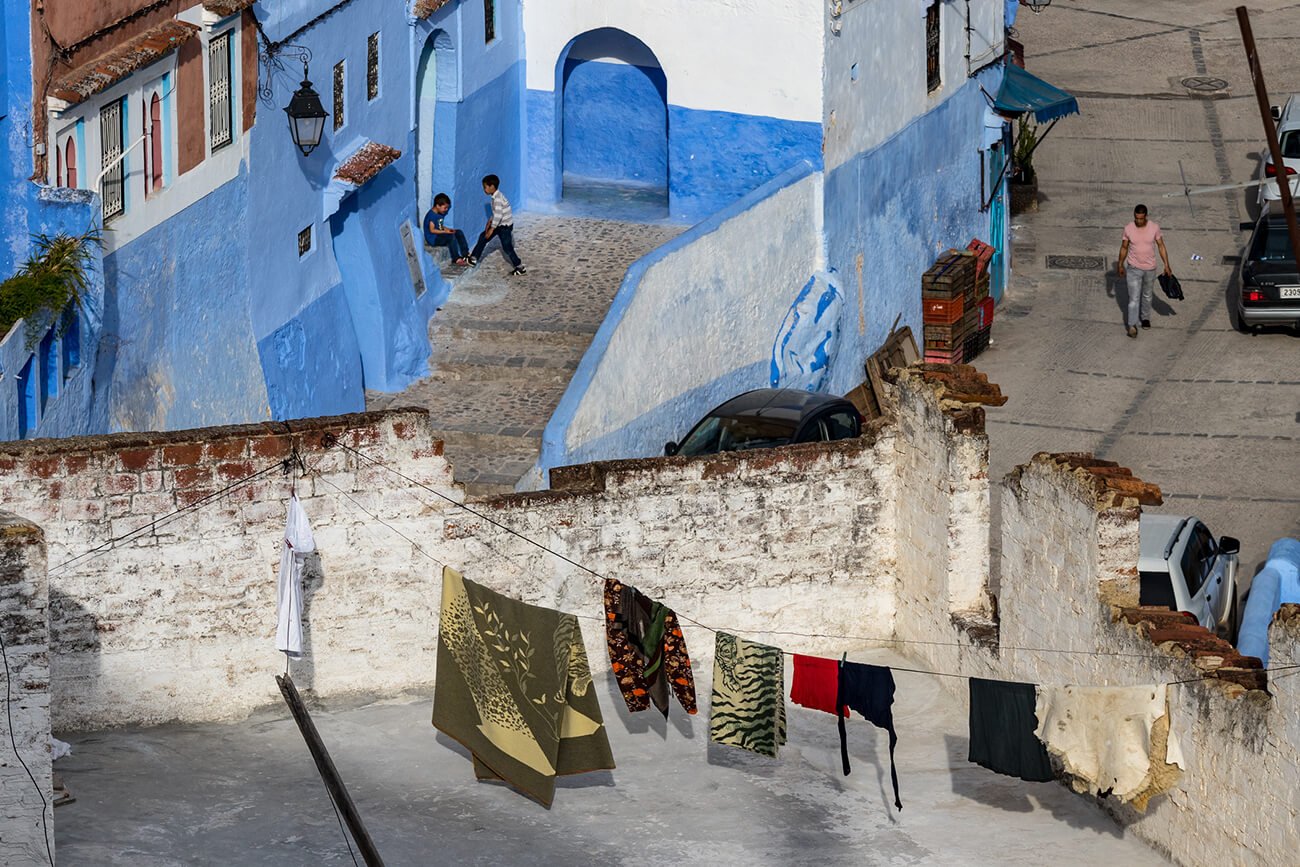
IMAGE COURTESY OF DORON TALMI
www.pbase/dorontalmi / @talmidoron
Editor’s comment: A wonderfully unusual perspective, the depth compressed to create a flattened, mind-bending scene. There’s so much happening in the frame, with each element slowly revealing itself, each quarter of the frame offering something of interest. It’s a unique perspective of the city with a strong color palette too.
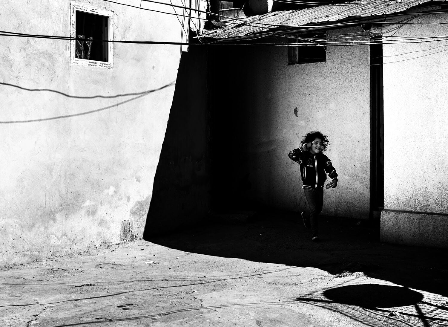
IMAGE COURTESY OF ELENA RACEALA
www.1x.com/member/elephotos / @joinwithphotos
Editor’s comment: These high-contrast street images are not uncommon, but this is a wonderful example of the style – the shadows severing the frame into distinct components. The smile of the little girl as she darts through this Bucharest street injects joy and playfulness into what is clearly a harsh environment. It conveys a powerful message about childhood and the universality of play, even here in the hardest of surroundings.
