“STREET LIFE”
ANNOUNCING THE WINNERS
“The true mystery of the world is the visible, not the invisible” – Oscar Wilde
We are delighted to present the results of the second monthly theme of Life Framer edition IV – STREET LIFE. From the pulsing arteries of a bustling metropolis, to the quiet solitude of its empty backstreets, we asked you to take us to the streets.
The theme was judged by David Alan Harvey – a member of the prestigious Magnum Photo Agency since 1997 and a living legend of street photography, admired for his magical compositions and vivid use of color.
You can discover the winning images below and join the discussion on Facebook, Instagram and Twitter. Congratulations to all the talented photographers featured, and thank you to everyone who submitted their work.
Congratulations to the selected photographers and to everyone else: enjoy!
Join the discussion on Facebook, Instagram and Twitter and thank you to everyone who submitted their work.
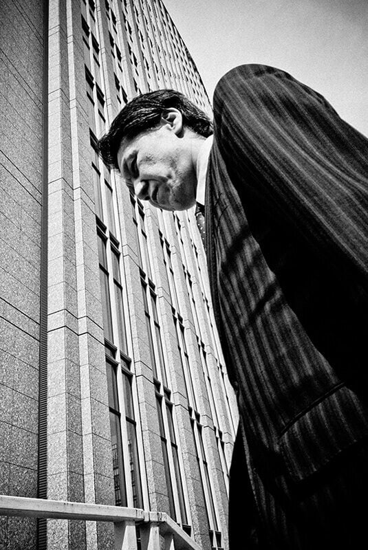
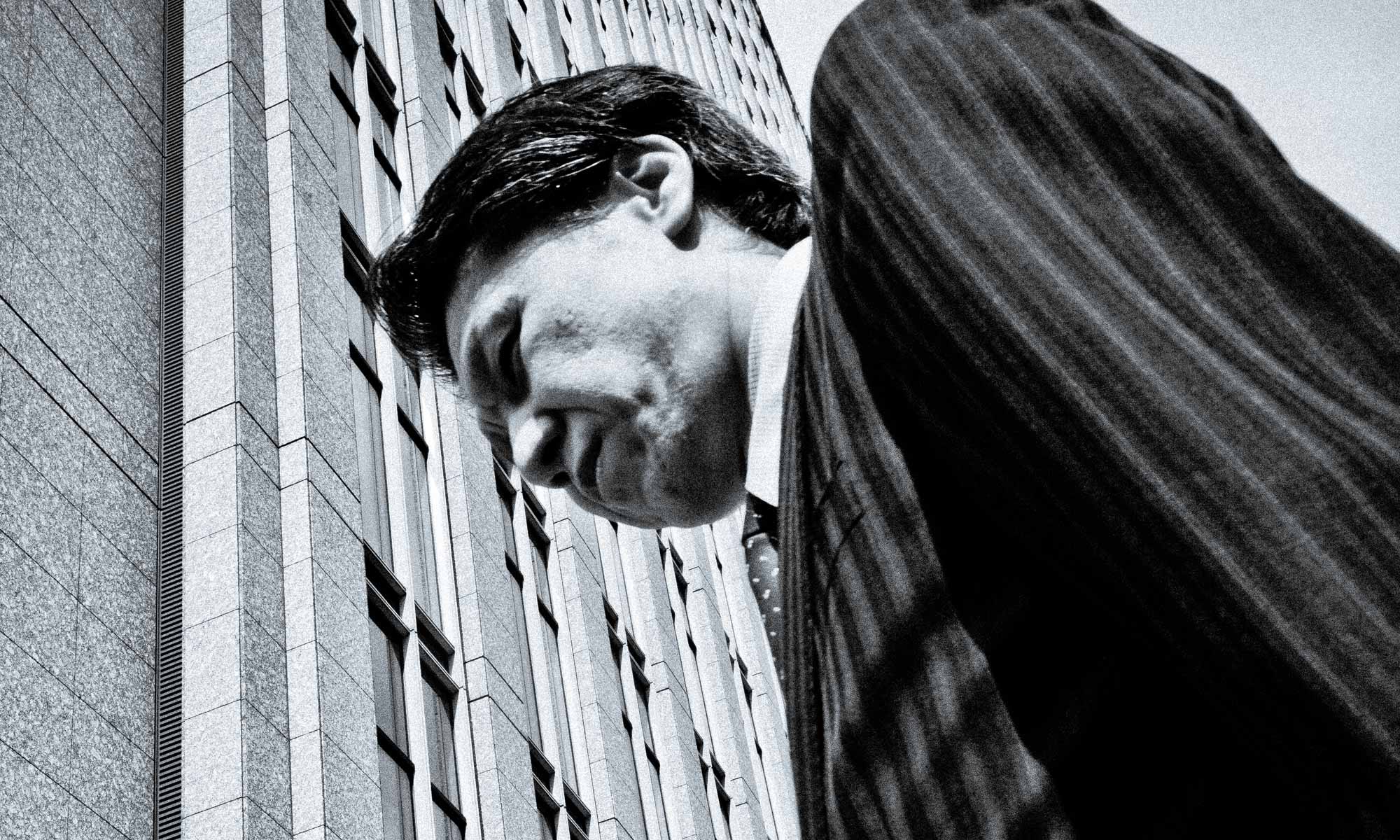
FIRST PRIZE: JON POPOWICH
“This is just an amazingly powerful picture. So many absolutely perfect elements. The hair, the lines in the jacket matching the building. His expression. The too-wide, low angle works in this case. I love it”. – David Alan Harvey
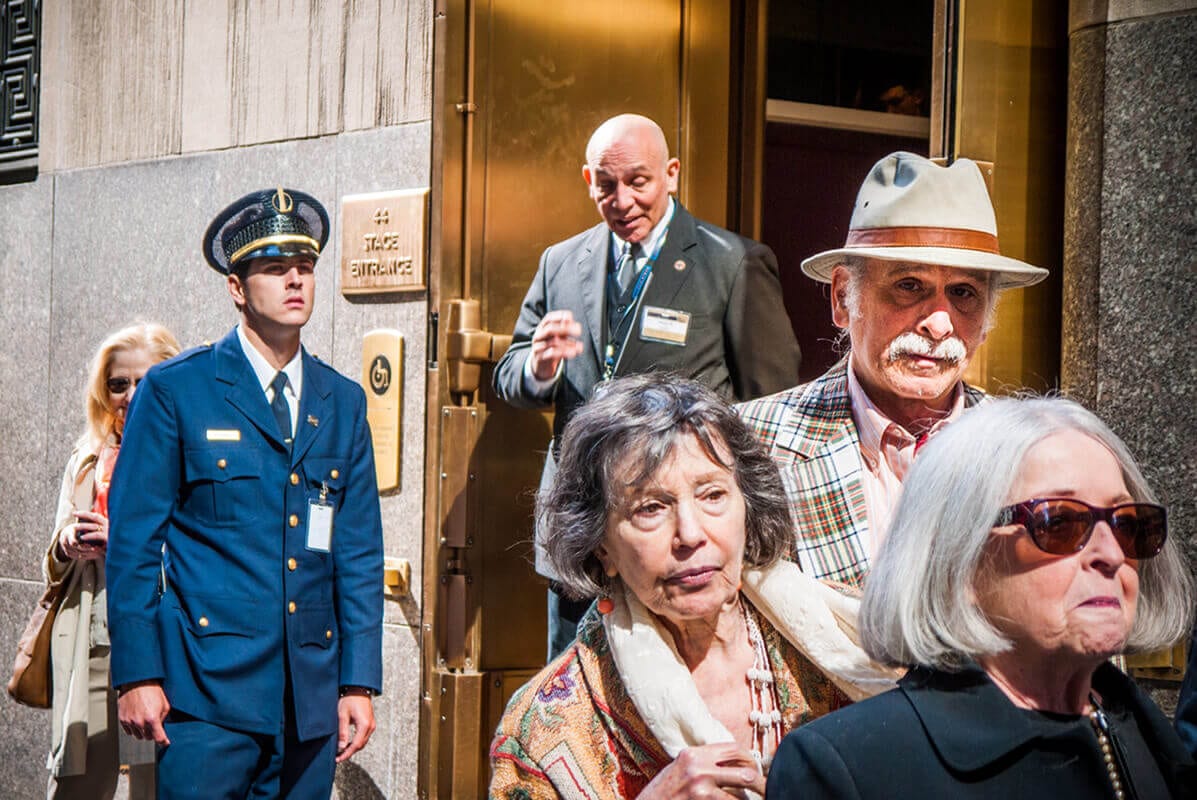
SECOND PRIZE: JOSH ETHAN JOHNSON
“This is such a terrific photograph by any standard. It is so perfect, and my first thought was that it was staged – A set up rather than a grabbed street shot. Yet if it is a real street photograph by traditional mores, it is pretty amazing. Either way it is a remarkable image”. – David Alan Harvey
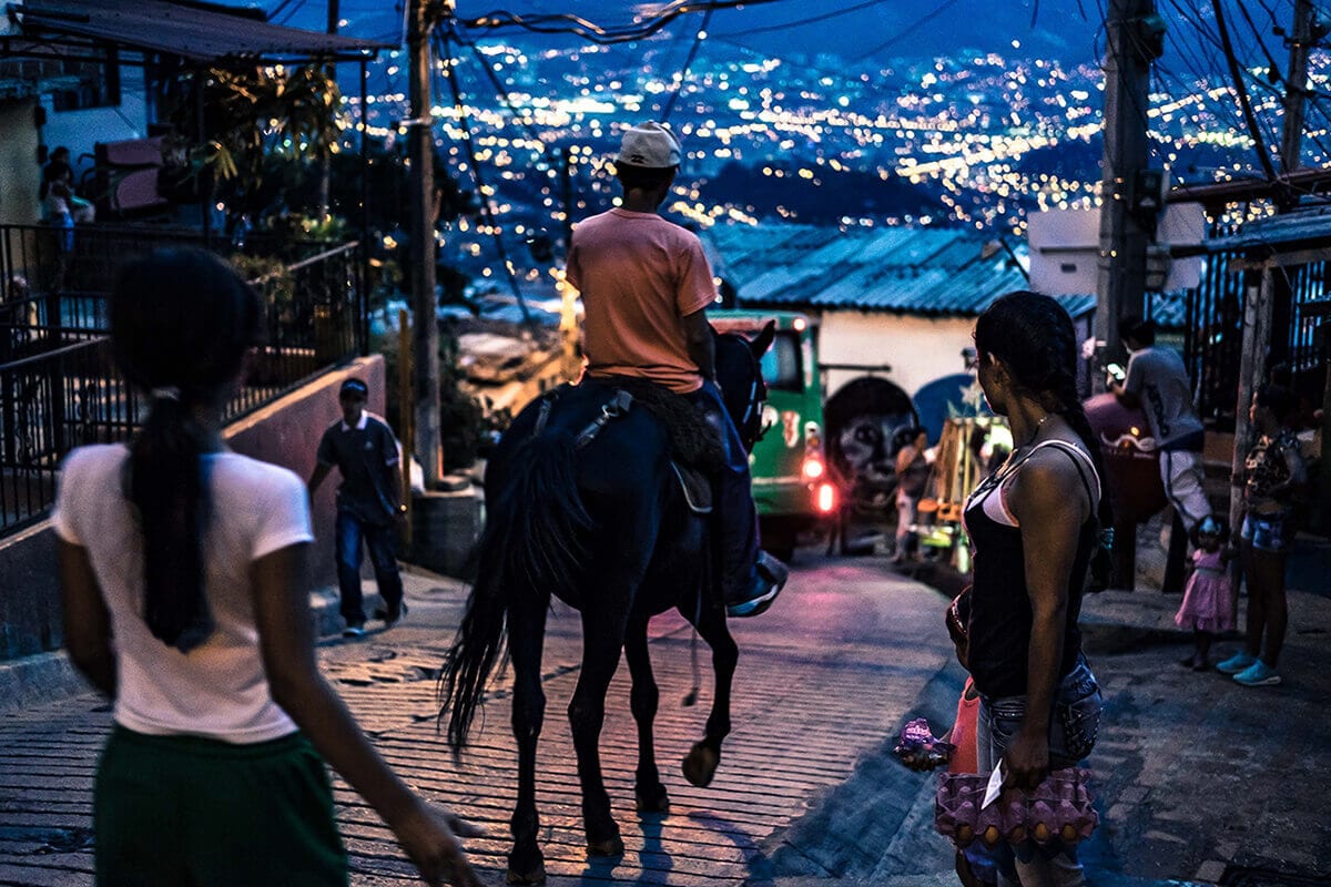
THEO GOULD
Theo’s gorgeous composition on the streets of Medellin is a real treat – awash with soft blue and cobalt tones and full of details to absorb. In every corner of the scene people look out down the street and we take on the role of yet another spectator, equally intrigued as to what might be taking place ahead. In his statement, Theo describes the concept of ‘Magic Realism’ – fiction that integrates elements of fantasy into otherwise realistic settings. It’s a beautiful phrase for describing such an image, where everyday elements align to create something elegant and dreamlike, far from the usual descriptors associated with the streets of Colombia. He does well to avoid those clichés, and the image is alive with life and atmosphere that you feel as well as see – you could almost step into it.
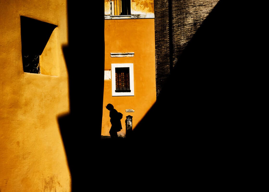
SIMONA BONANNO
Simona’s is perhaps the most ‘typical street photography’ style image of the selection, channelling the vibrant colours and silhouetted figures recognisable in the work of other artists. Nonetheless she creates a beautiful scene; the slivers of light drawing the eye down to this lone figure, and the limited colour palette resulting in a strong and effervescent aesthetic. It’s a study in light and dark, and positive and negative space – a compositional masterclass – and I think it works brilliantly.
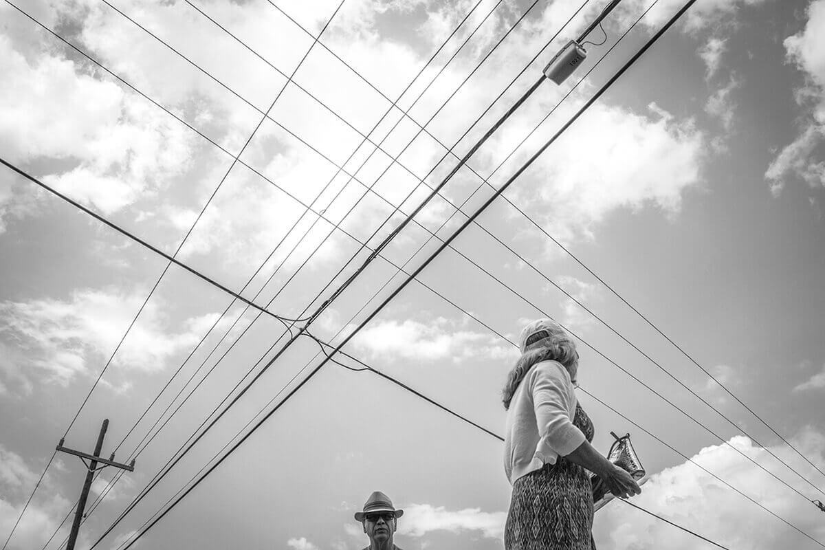
ALEJANDRO VAINSTEIN
Alejandro’s voyeuristic street image is wonderfully staged; the low, upwards framing totally unexpected, and the compositional elements perfectly balanced. In his statement he describes his viewfinder as the weapon and the power lines as the crosshairs, and it’s a canny metaphor for the series from which this image is drawn, with the subjects acting as his walking ‘prey’. In this particular image I love how the man looks out above us, and the lady glances down the length of the power cables – Alejandro gives us a glimpse of them going about their lives, but gives us only the smallest clues to their environment, and that creates something quite mysterious and powerful.
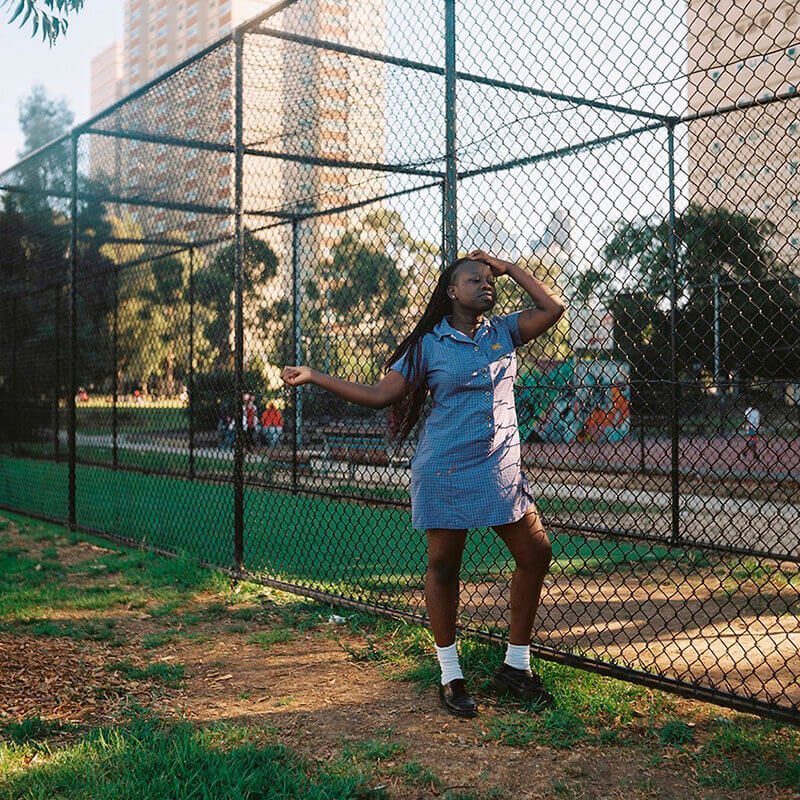
ROBYN DALY
Robyn’s street portrait is perfectly framed, capturing the self-confident energy of this young school girl in gorgeous low light. Her posture is dynamic and assured, at once posed and natural, and in that sense a hallmark of a skilled photographer finding an ease with her subject. The angled framing against the sports court fencing works well, creating depth in the scene and linking the subject to her surroundings. It’s a lovely, tender portrait.
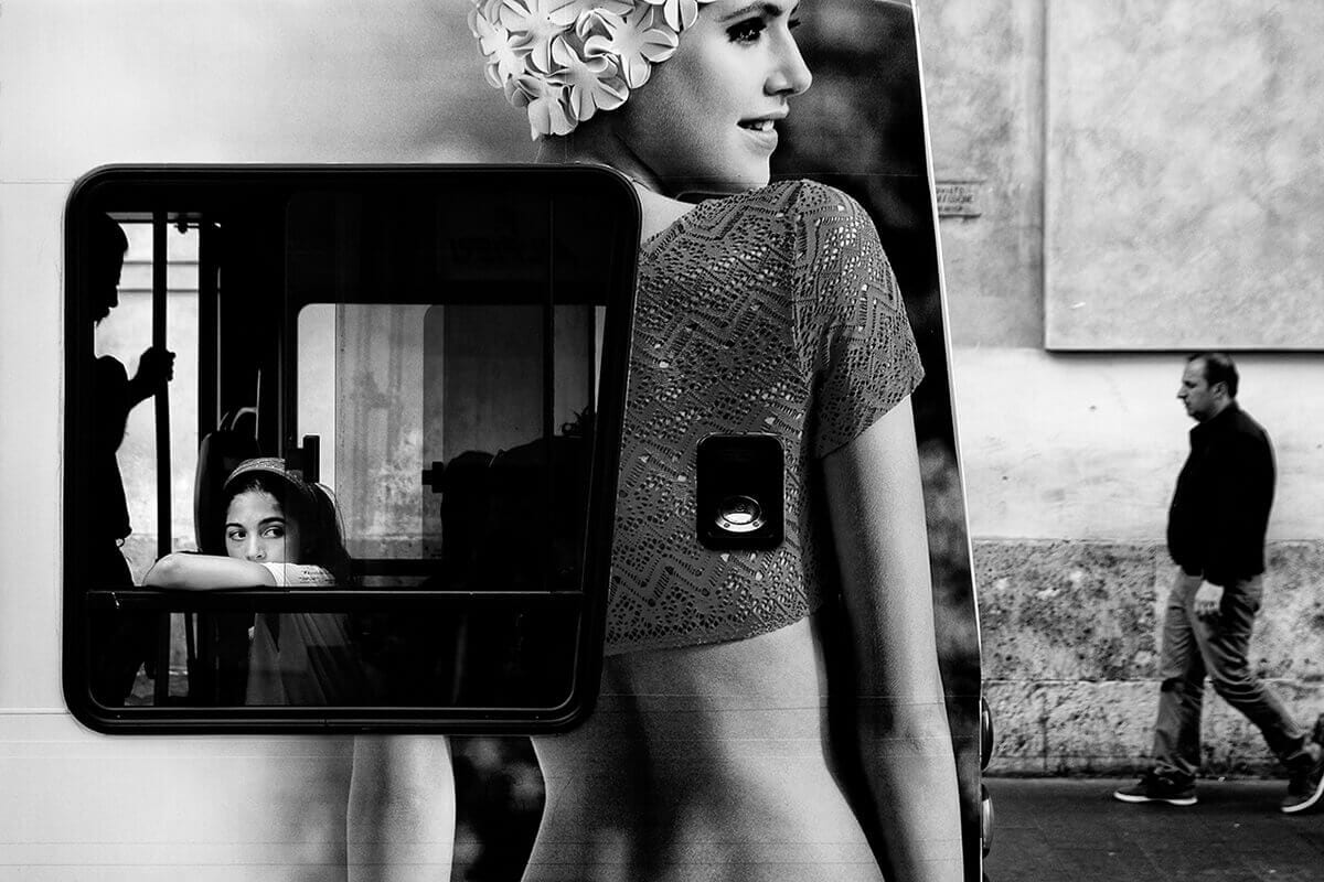
STEFANO MIRABELLA
Stefano’s image is a delightful visual trick. He plays with perspective and geometry, with the real and the constructed, with new and old, with light and shadow, and it’s a joy to unravel it; to decipher the elements from which it’s formed. There’s a lovely parallel between the young girl in the window and the lady in the advertisement – and a satisfying mirror between the silhouetted man left of frame, and the walking man to the right. It’s one of those moments where elements align seemingly effortlessly, concealing the skill in capturing it. One tiny criticism is how the foot of the man on the right is cropped from the frame. A quarter-second later in capturing the shot, and he would have been in full frame, but it’s a pedantic critique on what is a fantastic shot.
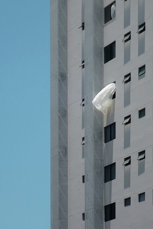
RICARDO SEOLA
It’s nice to see non-linear interpretations of the theme such as this one. Ricardo looks upwards from the street – towards the ‘streets in the sky’ – to find life; in this case a white curtain billowing in the wind, the only break in a geometric, repetitious landscape. It’s a subtle clue to the lives that exist behind this inert metal façade, which paired with the visual satisfaction in the well-framed architectural geometry makes for a strong and provocative image.
MARCUS ENGLER
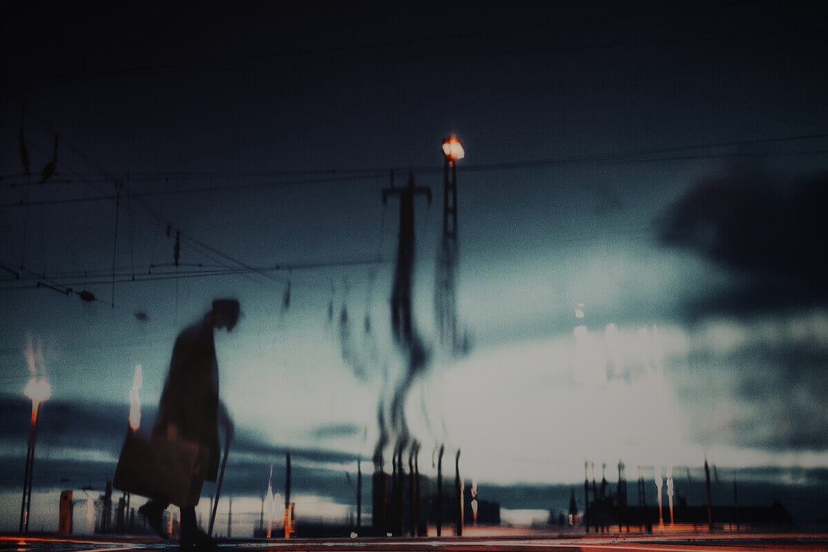
Marcus’ image works on both an aesthetic, or thematic level and a cerebral one. In terms of the former, it drips with cinematic atmosphere, like a frame from a classic film noir. This hunched, trench-coated man walks alone through an empty, dusk-lit industrial setting, his destination, and the contents of his suitcase unknown. The mind can wander fluently, building scenarios for who he might be, and where he might be going. It’s incredibly evocative. And then in terms of the intellectual level, I have little idea how the image was constructed – it’s a visual puzzle. Perhaps a reflection in water, but with a soft focus that clouds the ripples, or perhaps a product of post-processing. It’s a beautifully realised and mystifying image in both senses, and for that reason it stays with me.
MERETHE WESSEL-BERG
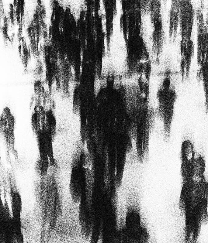
I find Merethe’s image to be quite painterly – the film grain imitating the discreet brush stabs of pointillism, the complex urban scene distilled down to its key elements; pace and scale. I also read it as a contemporary take on street life, playing on ideas of surveillance and anonymity in public spaces. It’s a heavily stylised and processed image, but here it works elegantly – the visual treatment strengthening, rather than diluting the central message of the shot. I do wonder how Merethe would retain interest were this expanded into a series (I think she would have to contrast this image type with different viewpoints), but as a single frame it’s quite magical.
LUCA MEOLA
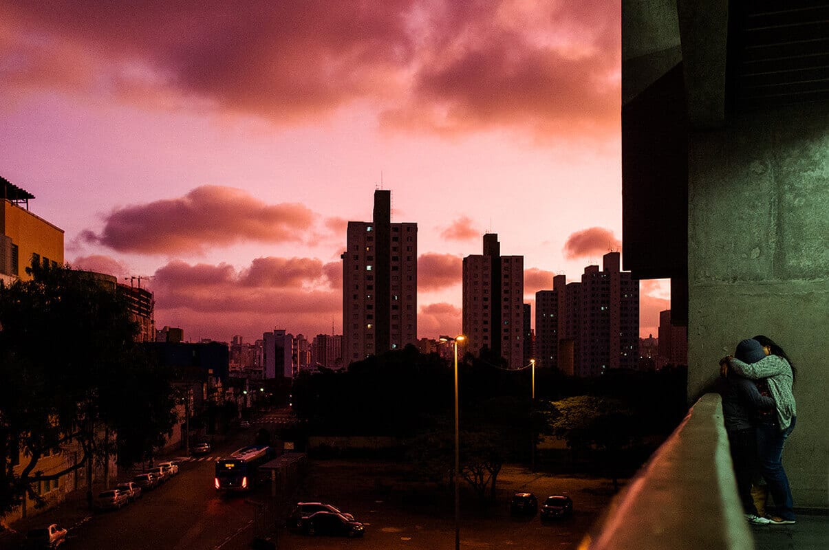
I love the voyeurism of this scene – a peak into the lives of these anonymous teenagers, just one isolated story in a dense, humming city. It’s a skilfully framed moment of tenderness (our protagonists occupying just a tiny portion of the scene, paralleling the relative insignificance of their story), in a harsh and austere environment – a fleeting moment where the world around them doesn’t exist. In his statement, Luca describes metropolitan kisses as “a key to opening the door to Sao Paulo, depicting its various shades and contradictions”. He goes on to describe the vast size of the city and the relative safety of the subway, and how these elements may give context to such a scene. It’s a layer of information that helps interpret what is already at face value a powerful and alluring image.
MATT MACPAKE
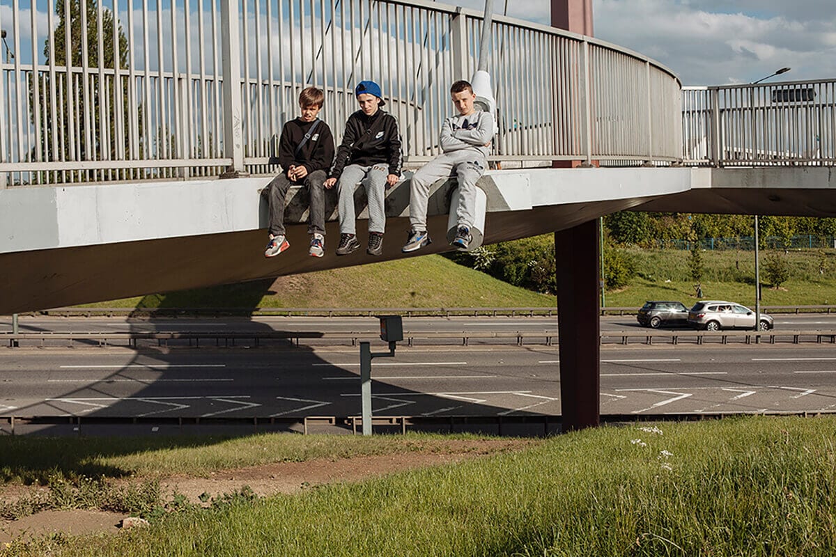
Matt’s portrait of three young boys against a busy urban backdrop, from his series ‘To & From the North Circular’, paints a powerful cultural picture of growing up in a suburban landscape. The boys sit precariously on the edge of this steel bridge – a small act of rebellion, of finding recreation in a dull world not designed for them – and I’m drawn to their expressions, to a maturity that belies their age. Perhaps those faces are a consequence of growing up in such a harsh, concrete setting. It’s a wonderful frame from a fascinating series that explores the essential blight of this road network on the communities it passes through.
BIVAS BHATTACHARJEE
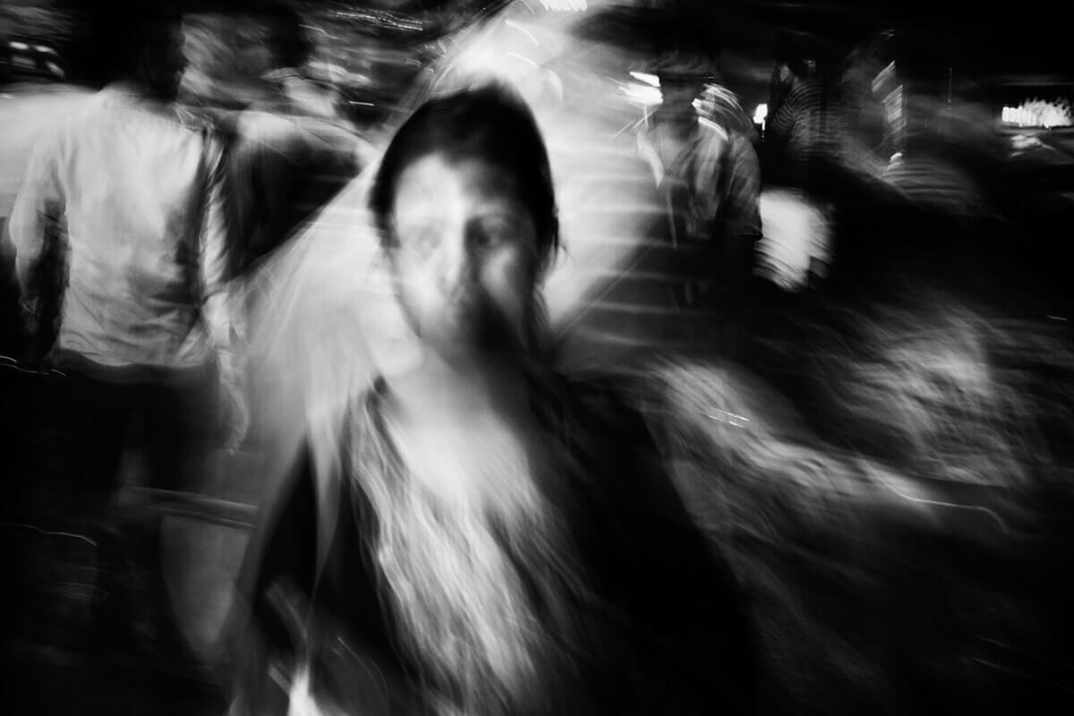
With Bivas’ blurred image of a girl in the streets of Kolkata, India, he elegantly captures an idea so intrinsic to street life – of being simultaneously alone and surrounded, isolated in a sea of people. It’s a feeling that most of us can relate to, and here his low shutter speed and choice of black and white results in a sinister, heightened sense of that emotion. His expertise is in carefully balancing the level of shutter blur; enough to channel the hectic, bustling atmosphere of the scene, but while still retaining the girl’s downward, uncertain glance. Without that, he would lose the emotion, the human connection with her. It’s a powerful, brilliantly crafted image.
OLGA DE LA IGLESIA
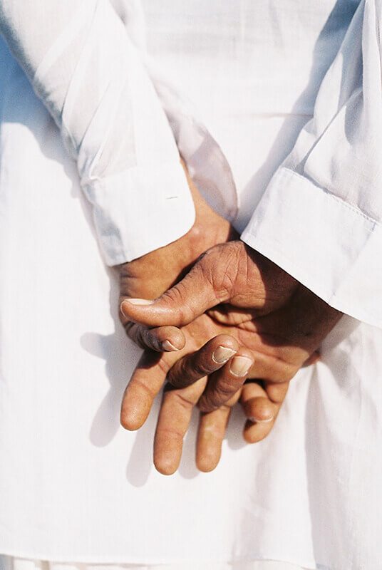
Olga’s image stood out for its unexpectedness – a simple, tender and understated moment that is a refreshing contrast to the many busy, pulsing and dynamic street scenes we reviewed. With the pure white, sunlit clothing, and the tight composition that disguises the contextual setting, we are in fact completely extracted from the street; descriptors such as heavenly and blissful more appropriate than urban or street. Photography can suggest and deceive as well as faithfully describe, and Olga does the former brilliantly. It’s a memorable image for just that reason.
OLEG TOLSTOY
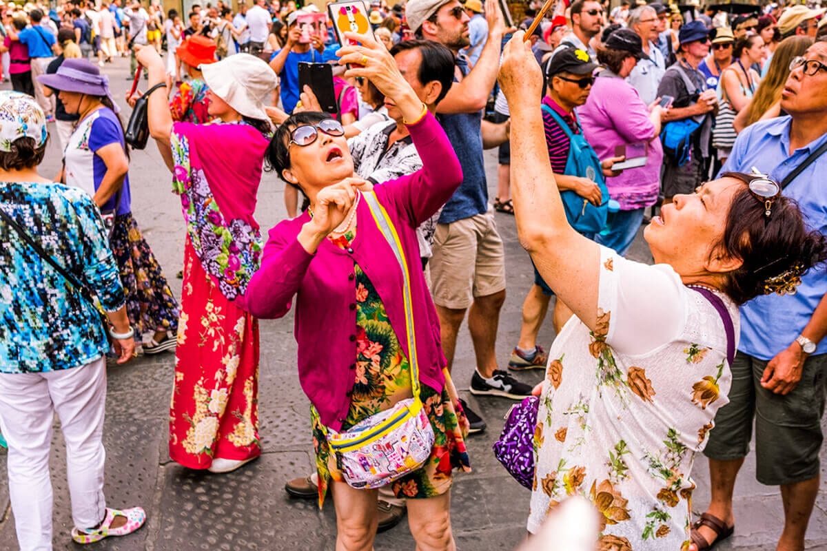
Oleg’s wry, tongue-in-cheek image channels the likes of Martin Parr’s series ‘Small World’ – a humorous look at the world of tourism and its weird idiosyncrasies. Here Oleg captures a touristic site (in Florence as he describes in his statement) filled with happy-snappers. There’s a visual spark from the bright coloured clothing against the dark stone floor, and he makes a clever compositional choice – to tightly frame the crowd, isolating us as viewers from the landmark that they’re witnessing. The image highlights a strange modern phenomenon that Oleg eloquently describes – of people having “travelled across the world to be here but in the act of obsessively making thousands of bits of postcard-perfect content to show to friends back home, they’re lost in their viewfinders and not really aware of their surroundings at all”. By tightly cropping the scene he denies us those surroundings too, thereby emphasising his message. It’s a clever image – both comical and poignant.
ALASTAIR MCLACHLAN
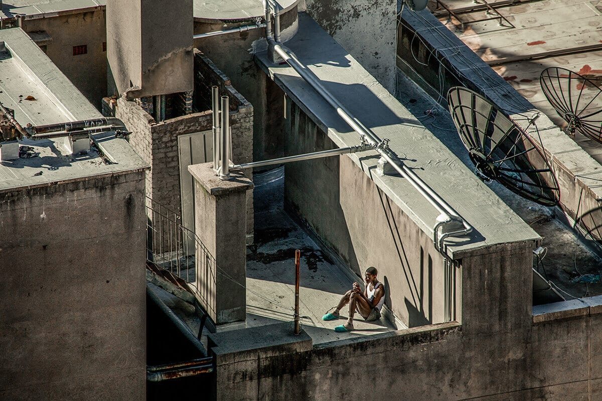
Like photographers such as Peter Massini and Tomas Van Houtryve, Alastair recognises a power in capturing cities from above – how this rarely seen vantage point can offer a fascinating perspective on how we live our lives. Unlike those two photographers though, his images aren’t top-down aerial shots but taken from the rooftops themselves, and as such we feel a part of the urban fabric, rather than a distant spectator. It results in fascinating viewpoints of Johannesburg such as this one. Here he elegantly frames this resting man in the high sun against the complex urban geometry. He cuts a figure of calm within the monochromatic maze of pipes, passageways and aerial dishes – having temporarily escaped from the urban bustle. It’s a powerful meditation on finding peace and beauty in unexpected places.
JULIEN HAZEMANN
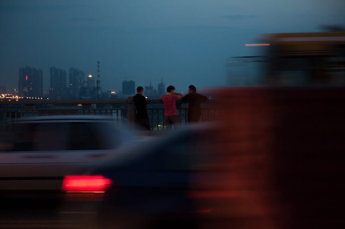
Car light trails might be an obvious trope for describing the speed and relentlessness of urban environments, but here Julien employs the effect well, framing these boys centrally in the distance between the passing cars. For me this image channels the idea of ‘sonder’ – the realisation that everyone else in the world has a life as vivid and complex as your own. These young boys survey their enormous, perhaps overwhelmingly so, city from a distance and there’s a sense of calm in spite of the racing vehicles behind them. It’s a simple, delicate moment that lingers, despite not being the most powerful or immediate image in the selection.
BRANDON BLUE
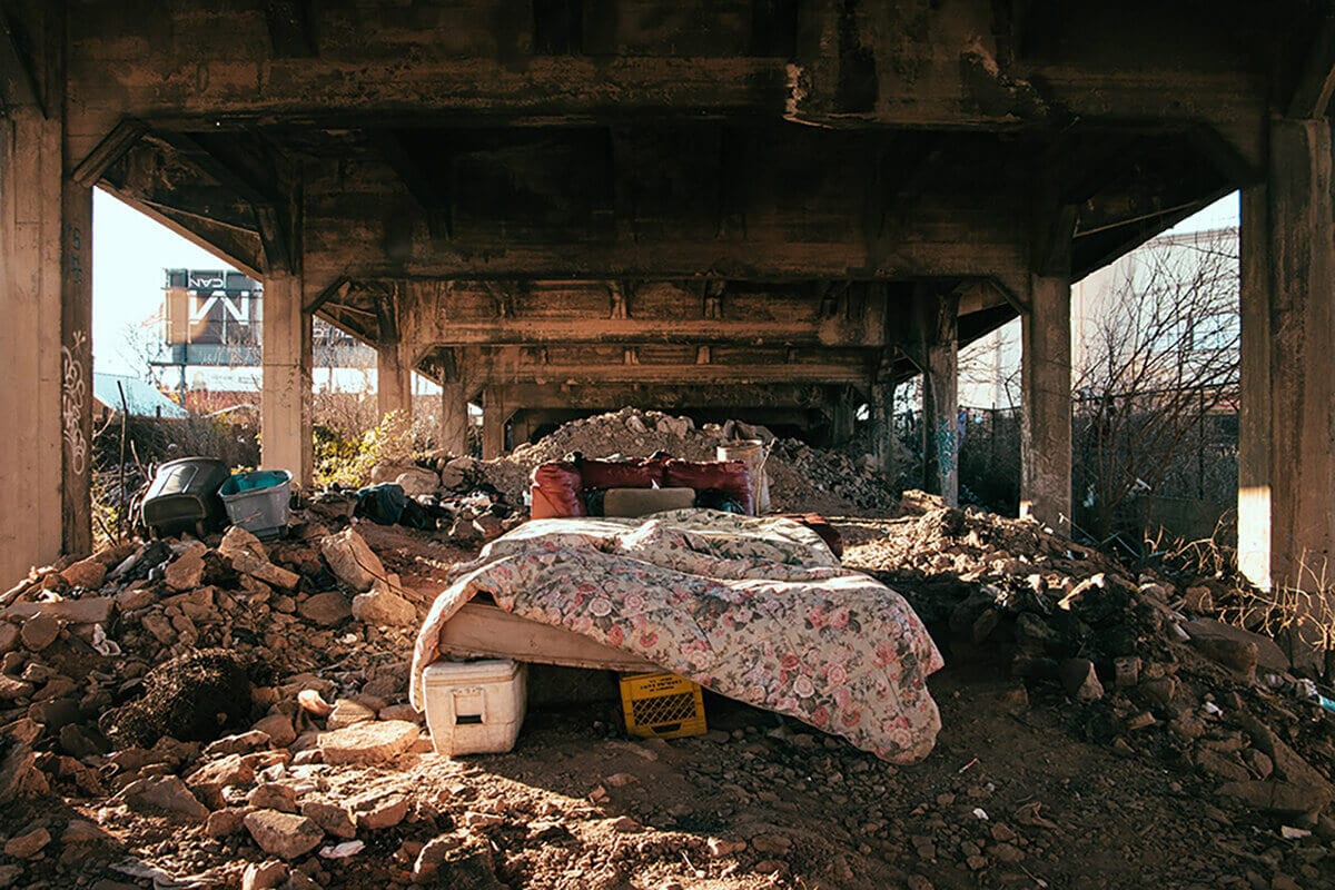
Photographing downbeats, drug addicts, gangs and misfits in urban environments is a well-trodden path, with photographers such as Boogie, Bruce Davidson, Philip-Lorca diCorcia and Cheryl Dunn creating powerful and memorable series. There’s an argument to be made that there’s little space for more of the same without a refreshing perspective, and that they can be exploitative if not for a strong social message. Brandon however gives us a strikingly powerful and evocative image without photographing anyone, and in this sense it’s creative and unexpected. We see a hand-constructed double bed, centrally framed by the perspective lines of the overpass and lit by the low sun against the shrubs and rubble. There’s a care and ingenuity visible in its construction, and an ironic parallel with the grand four-poster beds associated with wealth and decadence. It presents a powerful reminder of shared humanity – of relating to and empathising with social groups it’s so easy to ignore. It’s a very well realised image.
SAULO CISNEROS
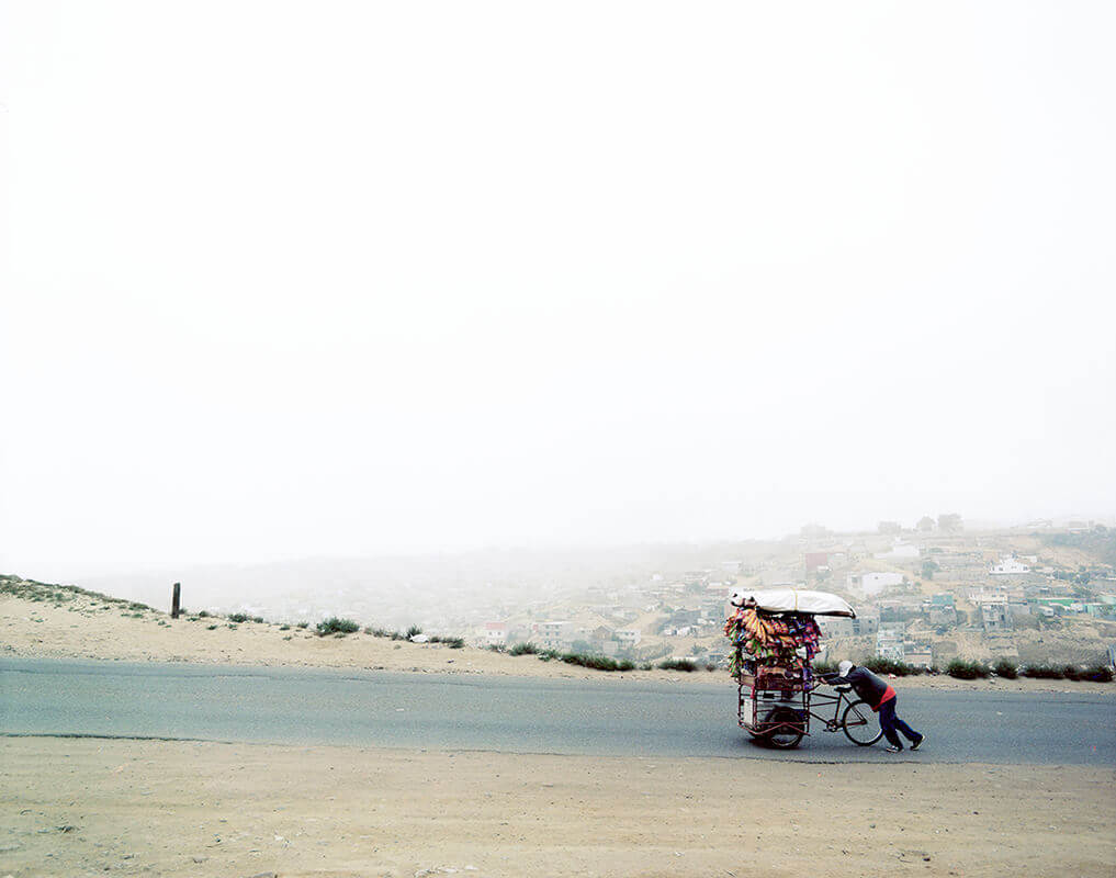
Saulo’s image, taken in Tijuana, Mexico close to the United States border shows us a different side to street life – a Mexican struggling with his bicycle stall along a dusty road, and with that perhaps a comment on the vast wealth divide between Mexico and its closest neighbour. It’s a very well-realised image – the washed out road and background isolating him in his uphill plight, framed in the right-hand side to emphasise the task ahead – harbouring relevant messages alongside an aesthetic appeal.
GLENN HOMANN
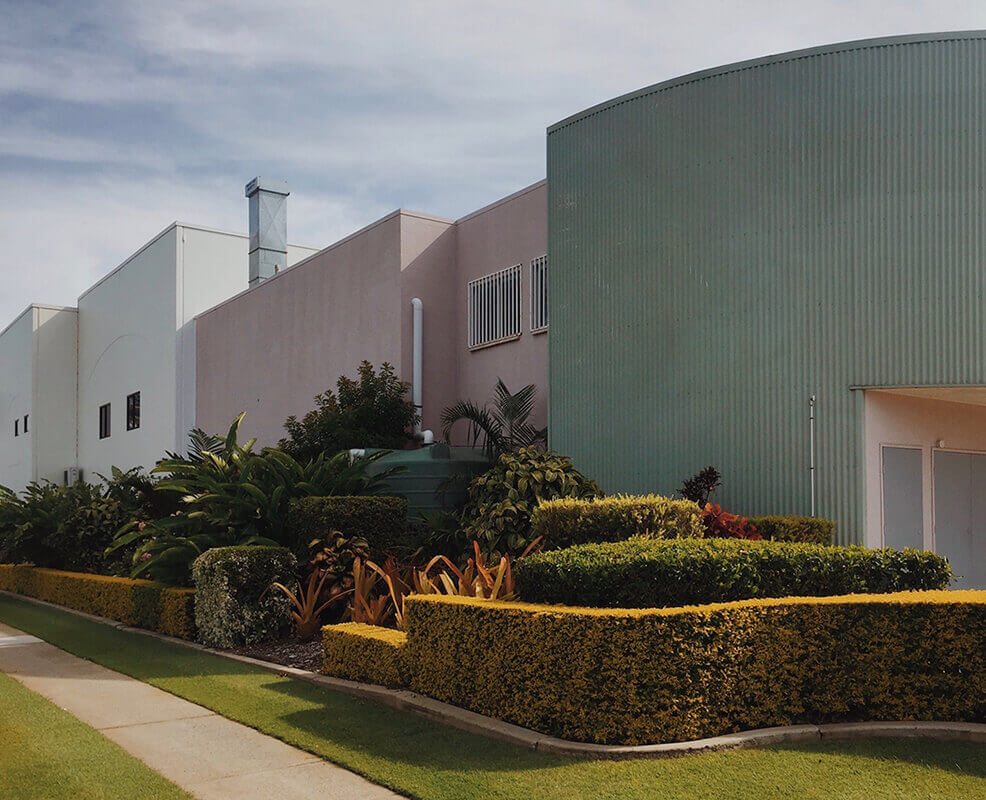
There’s a rich aesthetic appeal to Glenn’s image of a well-preened urban garden – a satisfying coalescence of clean curves and angles that he elegantly frames with careful regard. It’s perhaps a comment on our desire to tame and sculpt nature, and the complex interplay between man and his habitat.
