INSIGHT
Being a Photo Editor
BY AMY KELLNER
Amy Kellner on the varied reality of being a photo editor at The New York Times Magazine.
Amy Kellner, Senior Photo Editor at The New York Times Magazine, on how she broke into photo editing, what makes for really powerful visual journalism and why, no matter your talent, you’re letting yourself down if you don’t have an easy to navigate website…
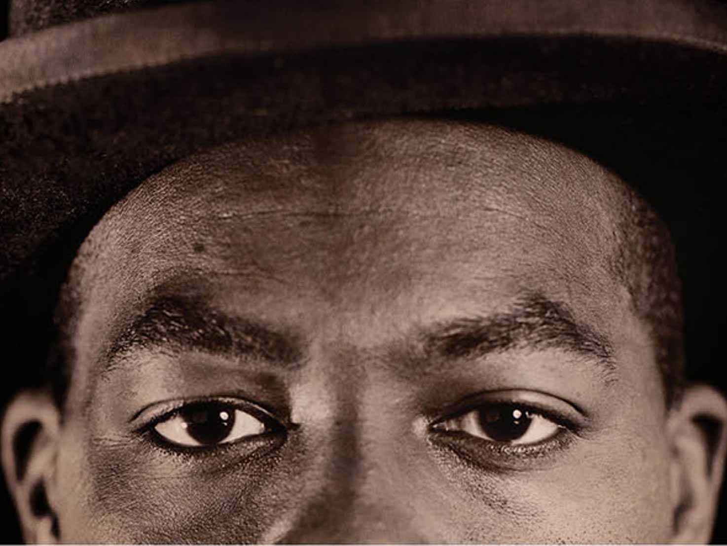
Banner image © Lyle Ashton Harris
When people ask me, what do you do? I point to a picture in a magazine and say, look at this photo, how did this get here? Who chose the photographer and why? How did the photographer get access to the subject? Why did they choose to shoot in colour or in black and white? Who set up the shoot? What did the art director want? What did the editor want? What was the tone of this story? What did we want to convey to the reader? How were the photos chosen and placed in the layout? There are so many decisions that have to be made…
The New York Times Magazine Director of Photography, Kathy Ryan, is a legend. She’s been at the Times for over 30 years and has set the bar so high. It used to be that you were either a photojournalist or a fine art photographer and it was her idea to get fine art photographers shooting editorial – it’s part of what’s called cross assigning. I learned everything I know from her.
Before the Times, I worked at VICE, when it was still mostly a magazine. There was a tiny staff, four or five of us. I was more of a writer and editor, and we did the photo editing ourselves. I didn’t even know photo editing was a job of its own. The great thing about working at VICE then was that you could do whatever you wanted. We published a lot of young photographers.
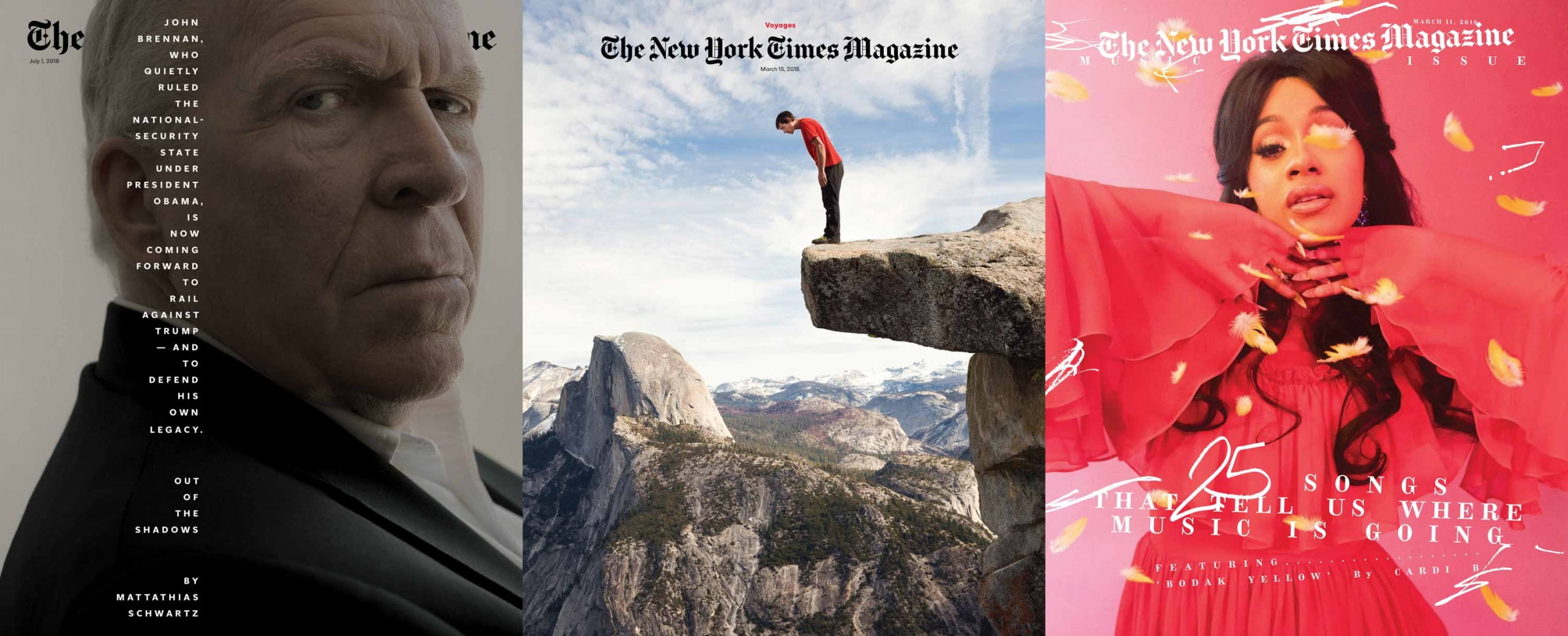
IMAGES (FROM LEFT TO RIGHT) © GABRIELLA DEMCZUK, PETER BOHLER, RYAN MCGINLEY.
Being friends with Ryan McGinley early on in his career had a big impact on me. He didn’t really have any production staff at the time. I’m organised and good at planning so he would do these epic cross country trips where he’d go photograph in multiple locations and, just as a pal, I’d help him put together a list of places to go, places to stay, an itinerary, a budget proposal…
After a while, I got really sick of writing. When I was young I had all kinds of opinions and wanted to shout them to anyone who’d listen but as I got older I felt, that’s enough words. At VICE, we would have a $1,000 budget to do a 10 page fashion shoot and I enjoyed that – making things happen, being scrappy, it was fun. Kathy will often hire photo editors who don’t have photo editing backgrounds – people who come from law, for example, or the film industry.
You can tell when a photographer has a singular style. They make images that stop you in your tracks, images that you want to study. We’ve just published a major project, America at Hunger’s Edge. Photographer Brenda Ann Kenneally travelled across America, documenting over 50 families who are facing food insecurity, some for the first time due to Covid-19. It’s an incredible example of public service journalism – creating change by informing people visually.
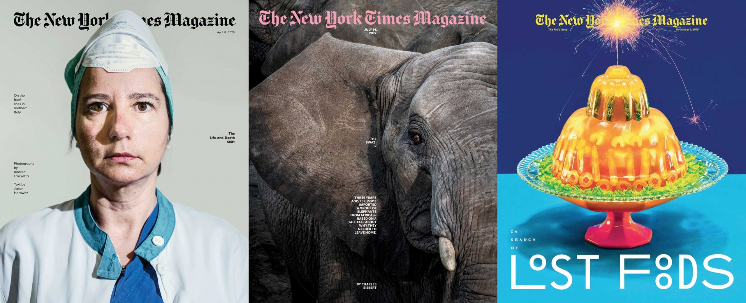
IMAGES (FROM LEFT TO RIGHT) © ANDREA FRAZZETTA, ROBIN SCHWARTZ, MAURIZIO CATTELAN/PIERPAOLO FERRARI.
It’s difficult to make beautiful photographs out of mess and squalor and chaos. Brenda is the master of that. Of the hundred or so images we’re running online, we chose 18 to run in the magazine as double page spreads. Her photographs work at that size because you can read them, they’re so full. You start noticing things in the corner that add detail to these people’s complex lives. Brenda is in her 60s and has been working on social justice issues her whole life, but you also have younger photographers like Philip Montgomery, with a very distinct eye.
It’s not just about talent, though – the most successful photographers are workaholics. They are never not working. They almost have an obsessive need to do this.
We’re constantly looking at everything from Insta to journals, to websites, to art shows. On a practical note, it’s really important to have an easy-to-view, organised website. It doesn’t have to be flashy – sometimes that’s a hindrance. Often we’re crashing stories and we need to find a photographer in a certain area immediately. I want to go to a website and quickly see portraits, documentary work, tearsheets so I can show a screengrab to my colleagues and – crucially – a phone number and email address so we can get in touch with you!
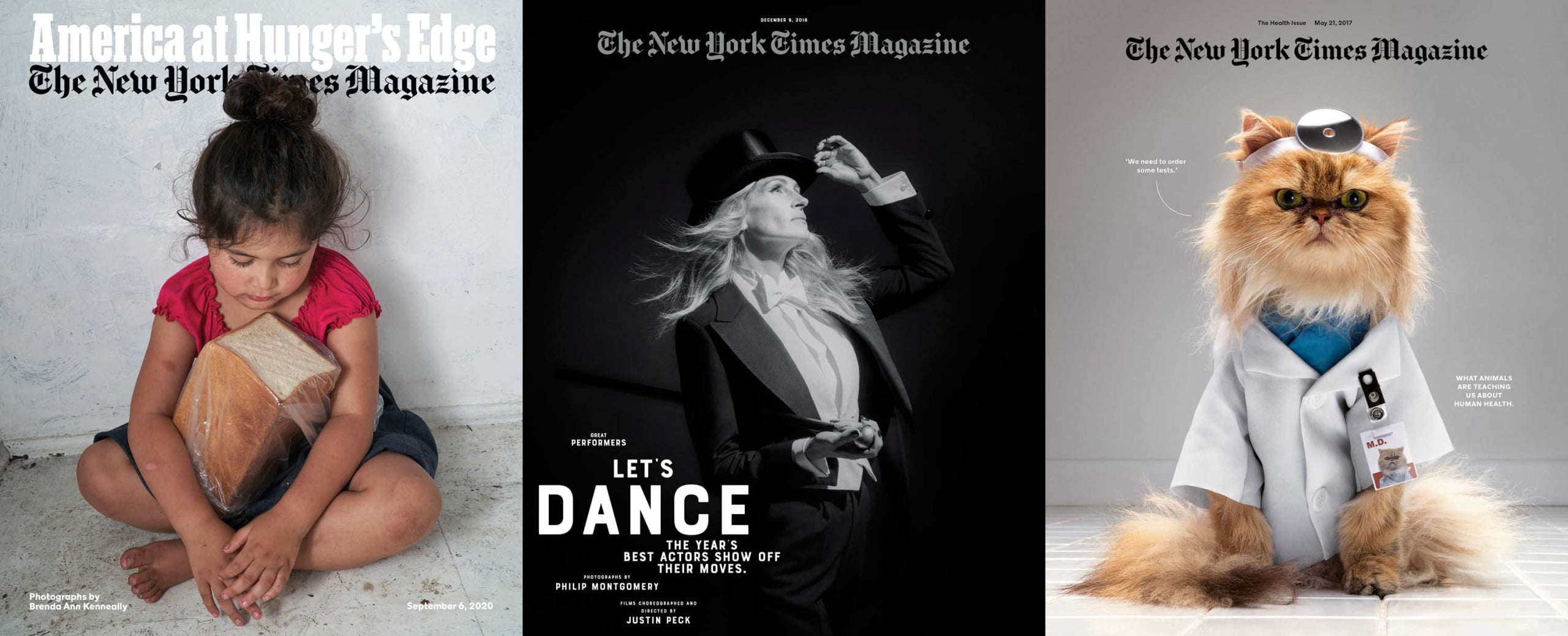
IMAGES (FROM LEFT TO RIGHT) © BRENDA ANN KENNEALLY, PHILIP MONTGOMERY, JESSICA WALSH.

Amy Kellner. Image © Art Streiber
Amy Kellner was interviewed by Rachel Segal Hamilton – a culture writer specializing in photography, who has written for publications such as VICE, The Telegraph, Time Out, Sotheby’s Institute of Art, The Barbican/Guildhall, British Journal of Photography, Hoxton Mini Press, and The Royal Photographic Society Journal. Explore more of her writing at www.rachelsegalhamilton.com
