EDITORS’ PICK
Intelligence and Imagination
OPEN CALL
Open Call Editors’ Pick
“The true sign of intelligence is not knowledge but imagination.” – Albert Einstein
Following Martin Parr’s selection of winning images for our OPEN CALL theme, this compilation of 20 images, selected by the Life Framer editors represents some of the other talented photographers whose work struck us and left a mark. Each a stunning image worthy of exposure and attention…
These are intended to be a conversation starter… so feel free to join the discussion on our social networks.
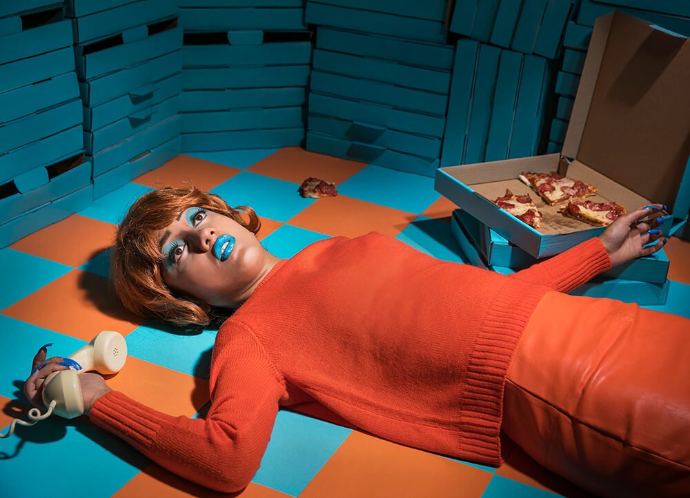
Banner image and text courtesy of Navinn Nava from the series Hedonist.
“The media has conditioned us to become mindless consumers. Advertisements are marketed to us 247. It is what we fixate on and it serves as a constant distraction. The fix is only temporary and the pleasure derived from this is the most superficial form of satisfaction. This body of work revolves around consumers’ guilty pleasures and overindulgence. By employing satire and exaggeration these works interrogate the lack of self-control in contemporary society while depicting its excess. Through humor and the absurd these works aim for the audience to question their relationship with both advertising and consumption.”
www.navinnnava.com and Instagram: @navinnnava
Editor’s comment: “If you’re looking for drama, you found it here. Brilliantly composed, Navinn drives his point on over-consumption home, not just through the stark complementary color scheme (which attracts immediately), but also through a ‘Theater of the Absurd’ style of posing and set creation. Being boxed in by the countless boxes of pizza is a beautiful final touch.”
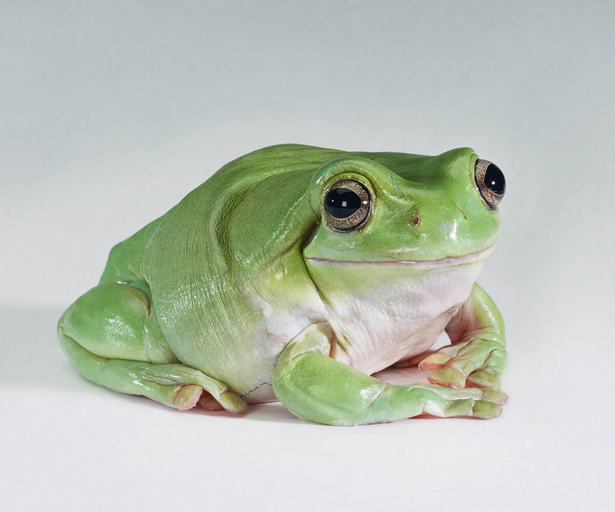
Image courtesy of Alex Grace.
www.alexgracephoto.com and Instagram: @alexgracephoto
Editor’s comment: “The expression on this frog’s face makes it look like it couldn’t possibly be real, yet texture and glistening of the skin tell otherwise. Whichever the case, it would be hard to catch a more expressive look anywhere in nature”.
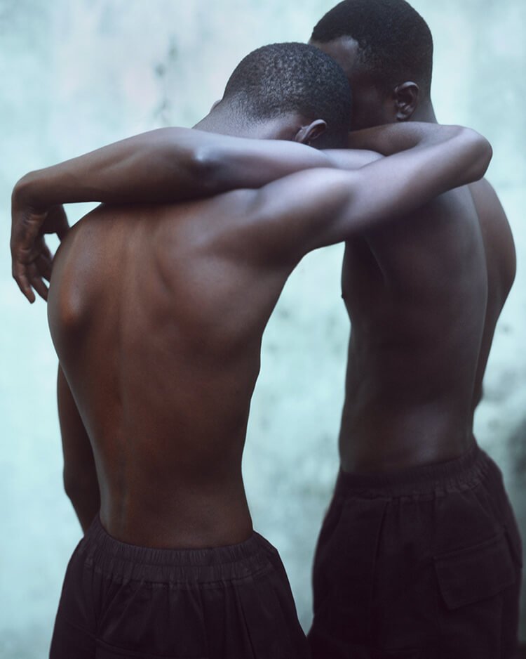
‘Embrace’ courtesy of Baud Postma.
“This image comes from a series exploring masculinity. I feel the success of the image lies in its powerful aesthetic but more importantly the ambiguity of it’s subject. Masculinity more so than ever is a complicated and highly charged issue. Whilst the motivation for their embrace is uncertain the viewer instinctively creates their own narrative to attribute meaning to the image. To me however, the composition reflects the multiple meanings of the word ’embrace’, from the act of holding someone closely to the acceptance of beliefs.”
www.baudpostma.com and Instagram: @baudpostma
Editor’s comment: “Wonderfully composed and lit, this image has both a beauty of form and a soft, yet powerful emotional component that causes one to pause. It’s a beautiful example of open-ended story telling.”

Image and text courtesy of Nina Röder.
“My grandmother checking her hair in her bathroom.”
www.ninaroeder.de and Instagram: @ninaroeder
Editor’s comment: “It’s not just the perfectly matching colors and composition in this shot that make it jump out to the eye. It’s not even the perfect capture of texture in everything from the model’s skin to the toilet seat cover. There’s something in the subject herself and the scene surrounding her that exudes some kind of truth about the human condition, especially as an elder. Well done, Nina!”
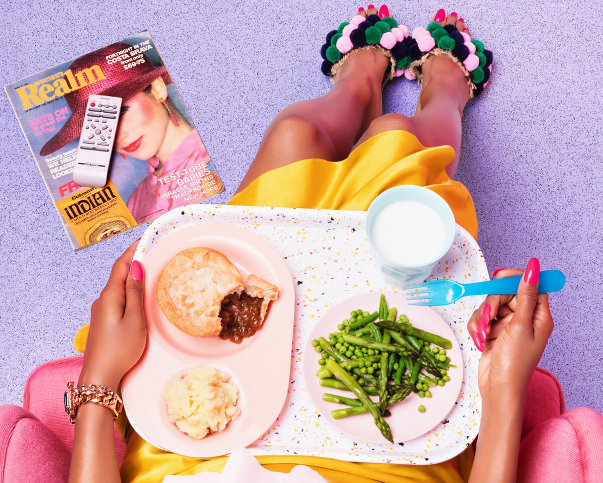
‘Bottomless Brunch’ courtesy of Ilka Noggler.
www.ilkafranz.com and Instagram: @ilkafranz
Editor’s comment: “Chocked full of both color and character, this image draws the eye like an amusement ride or like the magazine covers in the checkout lane of US supermarkets. The 60’s style of composition adds well to the overall aesthetic, and the brunch itself is a story all its own.”
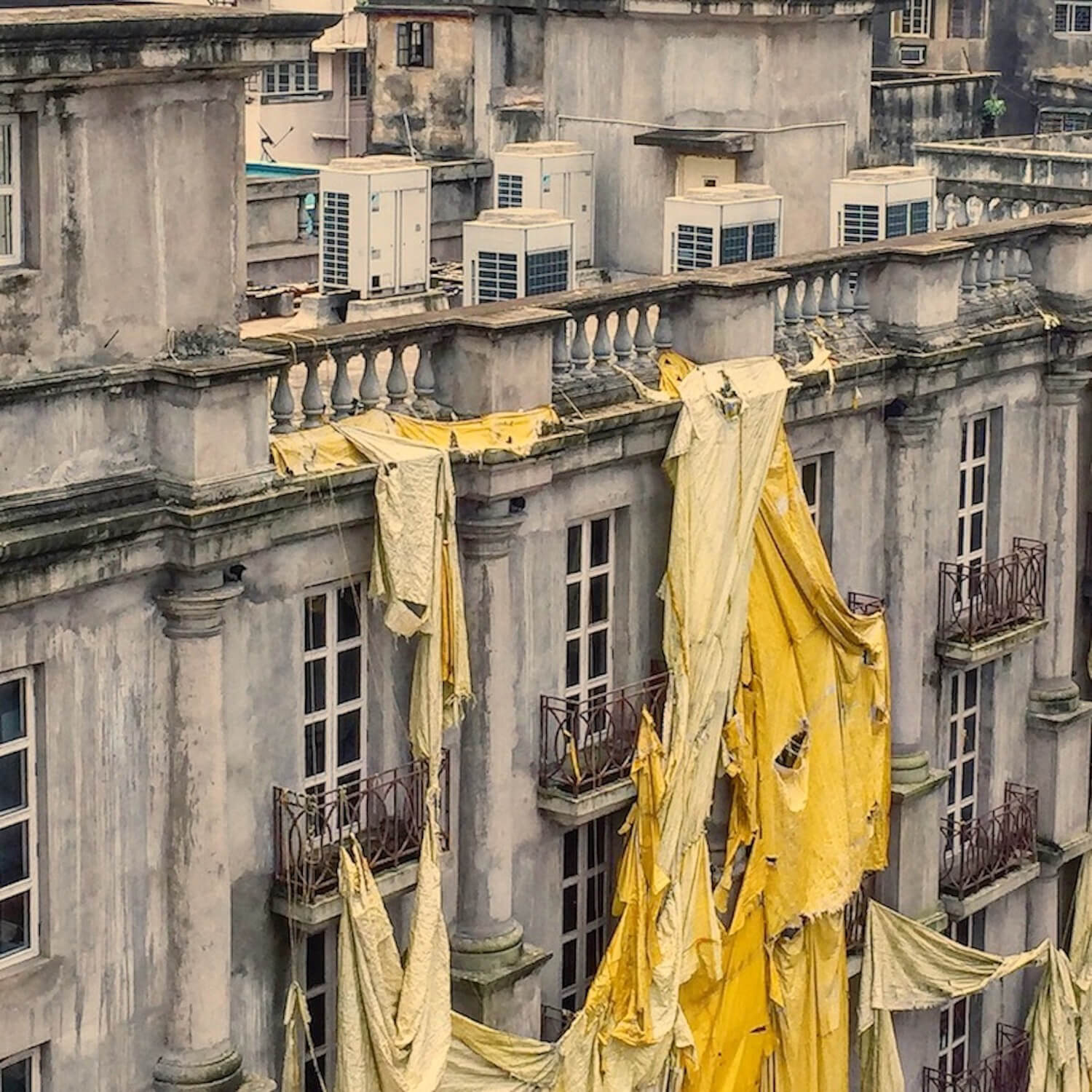
Image and text courtesy of Buku Sarkar from his series Calcutta.
“After seventeen years away I’ve done something most Indians of my generation don’t do – return back home. When people ask me where I’m from I always stumble. I say I was born in Calcutta but I grew up in New York. When you are young your awareness of the larger city is limited. I have to admit I know New York much more intimately than I feel I know Calcutta. Calcutta is like an aging beauty – decayed and crumbling. But she has a soul in a way that many other cities don’t. I can’t say my work is documenting the city – I write fiction and by nature am not always interested in what is out there or representing what I see. There is always a narrative running in my mind which doesn’t necessarily correspond to to what is real and I use the camera to express it. In that sense I feel I’m always writing fiction with the camera.”
www.bukusarkar.com and Instagram: @bukusarkar
Editor’s comment: “There is something extraordinary in this capture of what would, without the photographer’s eye, otherwise be mundane. From the color, to the rips and tears, to how it’s hanging, somehow this rather ordinary drop cloth has taken on a whole new life through the lens of Buku. A great job of finding the beauty in the ordinary.”
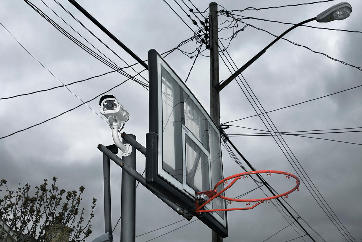
Image and text courtesy of Perri Hofmann.
“This image highlights the tension between the brands and imagery that appear in public space with the material reality of their environments. The scenes are not altered digitally – they are photographed as they were discovered.”
Editor’s comment: “Unusual or unlikely juxtapositions in photography are amazing tools for creating a sense of drama, and this image is no exception. At first glance it seems a bit ordinary, but then, after a bit more consideration one can’t help but wonder at the ramifications of this photo in relation to the modern world.”
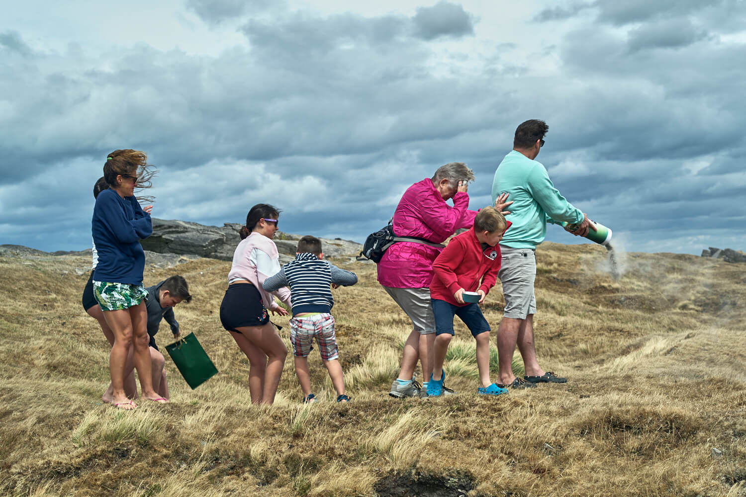
Image and text courtesy of Greg Turner from his series Portrait of Dementia.
www.tearsinrain.co.uk and Instagram: @geetee1972
“This project explores and documents my fathers decline into dementia and subsequent death This was a very challenging project both in terms of my own personal experience and the challenges it presented within the family raising questions around disclosure and consent.”
Editor’s comment: “This unusual candid photo of a family spreading the ashes in the wind contains a remarkable diversity of character and response. The eye can’t help but roam from the whole to each element and then back to the whole to make sense of the apparent chaos the wind creates. A truly unique and unusual capture.”
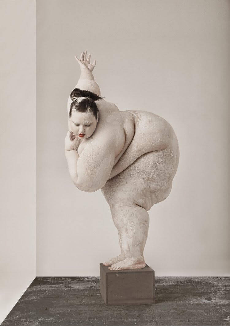
“In the US, what little nudity is permitted is usually shown in a sexual context. This contributes to a perception that we’re supposed to evaluate every naked body we see as a potential sex partner or rival. Seeing nudes in a museum is one of the only exceptions to this. I don’t think that most of us react to a naked portrait in a museum by thinking “wow I’d never have sex with that. Why is it on display?” or by writing a letter of complaint to the museum director about Rubens’ glorification of obesity. Therefore I have framed my models as sculptures and works of art in a museum in the hope that the viewer will suspend any judgments about whether they find the models sexually attractive or not, or whether their bodies are socially acceptable. Hopefully this will give the viewer an opportunity to observe the work as they might a classic painting and discover some aesthetic interest or even pleasure in the unique shapes and textures of the models’ bodies.”
Image and text courtesy of Julia SH from her series Studio Practice.
www.juliash.com and Instagram: @juliashoots
Editor’s comment: “Posing her model as if they’re a work of art in a museum has quite the unusual effect. Instead of judging the body, as we’d be wont to do in most other settings, the composition invites to explore the aesthetic qualities of the subject—the curves and dimples, the lines and fissures. Julia’s intention here was to cause the viewer to suspend their judgments about the social acceptability of her model’s body, and instead dwell on the lines and form. Successfully done!”
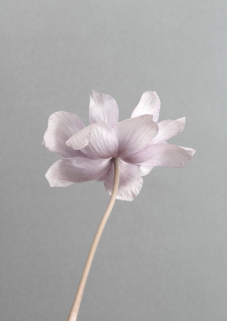
Image and text courtesy of Nathalie Dekker from her series Wallflower.
“I have a fascination for translating words into images in the purest, simplest way. I jot down words that fascinate me. ‘Wallflower’ is an example. It has huge appeal to me and my imagination runs with it. The wallflower is known for being shy, quiet, reserved, pure and vulnerable, yet simultaneously strong and sparkling. In this project I look for more words that create wallflower.”
www.nathaliedekker.nl and Instagram: @nathalie.dekker
Editor’s comment: “Don’t let the simplicity of this photo fool you—it can be insanely difficult to capture the detail in white or near-white subjects. Zooming in on this little beauty shows a depth of texture that’s truly not so easy to achieve. The simplicity of the composition is almost Zen-like, evoking a sense of peace and tranquility, along with the wallflower’s unique expression.”
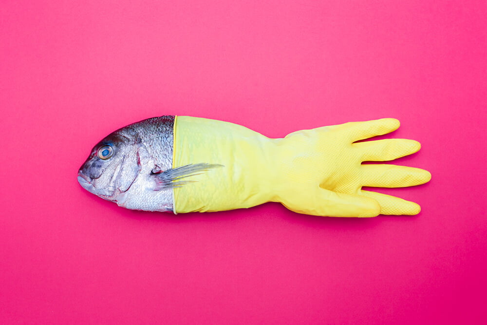
Image and text courtesy of Wolf Silveri from his series We’ll Sea / Polymeer.
“In a few years the plastic waste that floats in the oceans will exceed the fish stock in terms of weight. This dystopian photo series is based on the idea that the oceans find a way to integrate human-produced waste into their habitat.”
www.silveri.eu and Instagram: @wolf.silveri
Editor’s comment: “In a time when the issue of plastic waste and its impact on our oceans is making its way into mainstream media, Wolf’s pairing of a fish and glove is timely, witty and direct. He boils a complex idea into a clean and satisfyingly visual concept, and executes it with colors that grab the attention.”
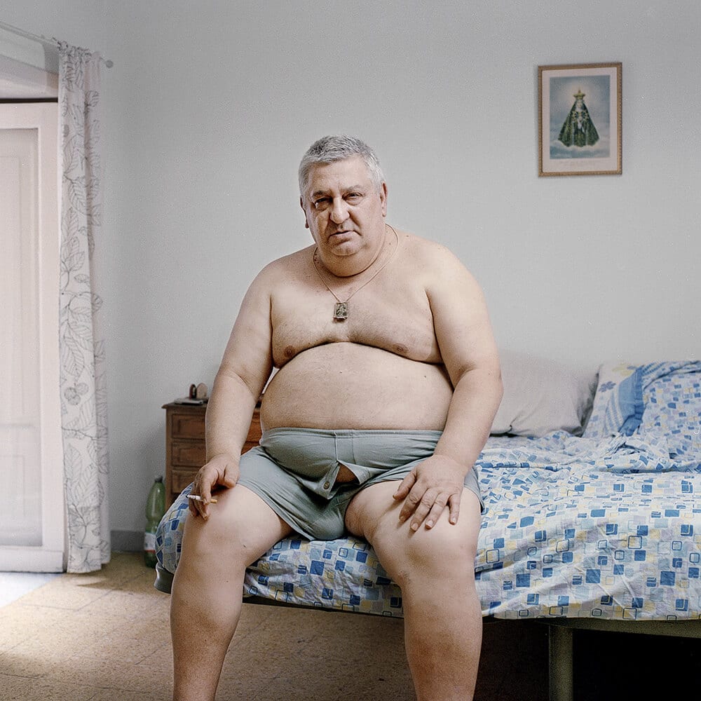
Image and text courtesy of Luca Iovino from his series Tribute to a Broken Promise.
“This work is modulated around a large reflection on the expectancy of waiting. The theme in question is evoked by the aesthetic sense of these images that reveals a distance within them. Throughout the scenes pervades a motionless stasis, the loss of a fixed time that recalls a theatrical stage, ambiguous and emotionless. This feeling causes a disorientation of metaphysical imprint like a vertigo – an abandonment in an absolute sense like the tormented one who is victim of useless anguish because it is not truthful but entrusted to a doubt.”
Editor’s comment: “This ‘slice of life’ photo is one of those compositions that has an immediate visual draw, but then offers elements that slowly reveal themselves and linger. The style of composition is simple, yet artfully done, with the colors, foreground and background elements combining effortlessly. Add to that the uniqueness of the human subject and you have an image that keeps the viewer lingering.”
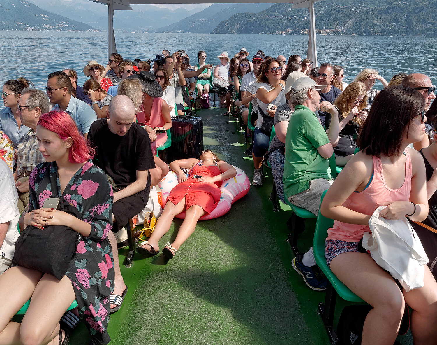
Image courtesy of Fabio Vittorelli.
www.fabiovittorelli.com and Instagram: @fabiovitto
Editor’s comment: “While the colors and tourists might be the first thing our eyes are drawn to here, the eye inevitably will settle on the person in the middle. It’s hard to imagine the story behind someone so unabashedly passed out in the middle of a tour boat with wildly beautiful scenery all around them. There’s enough material here for a short story!”
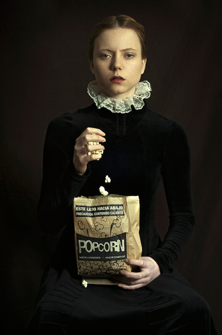
Pop-Corn courtesy of Romina Ressia from her series How Would Have Been.
www.rominaressiaph.com and Instagram: @rominaressia
Editor’s comment: “Again, another strange and unusual juxtaposition of elements that causes the viewer to pause and go deeper. The look on the model’s face as well as her posture and clothing, scream strictness and conservatism, yet the falling popcorn and even the one that’s fallen on her dress give a sense of freedom and license. Fascinating.”
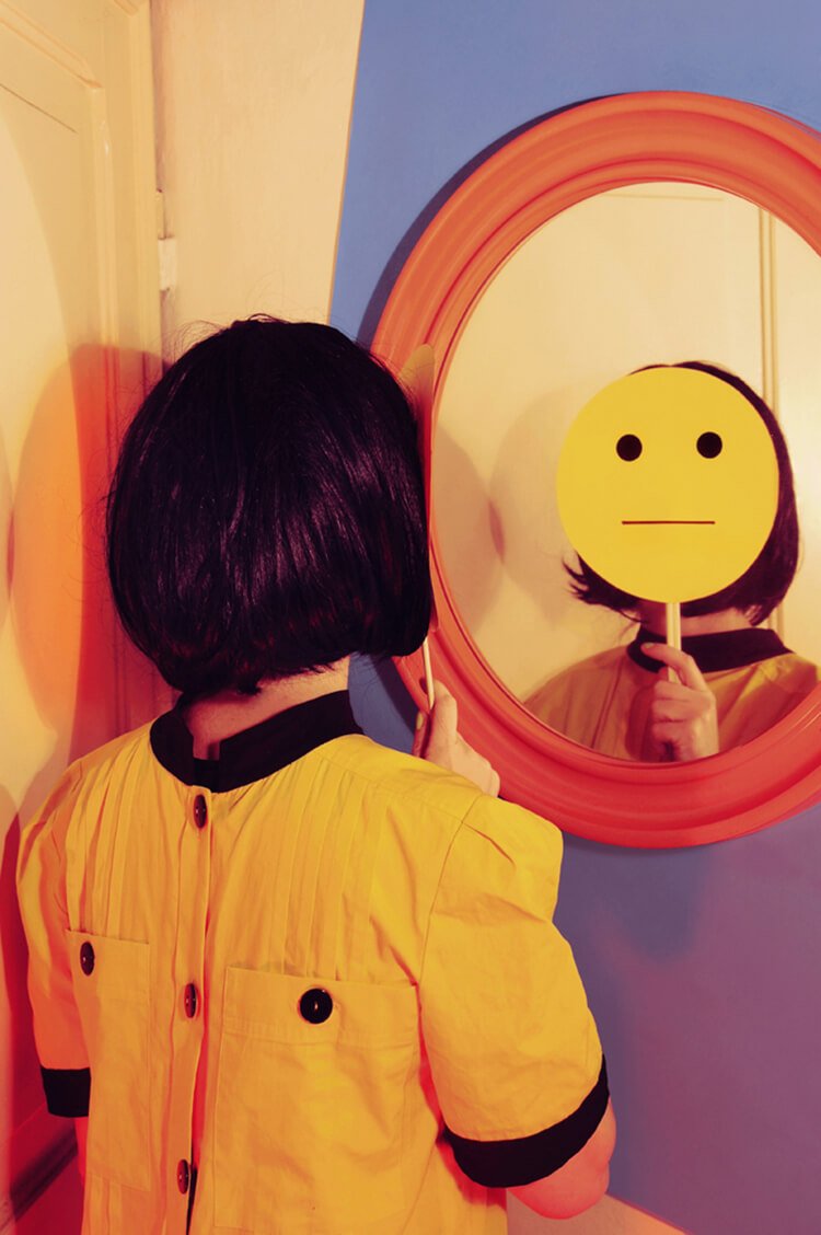
Image courtesy of Giulia Mazza.
www.giuliamazza.com and Instagram: @pazzyjuly
Editor’s comment: “In this photo, Guila’s simplicity of composition almost hides the complexity of thought and idea available in it. Masterful idea of patterning the cut out after the back of the dress—so many options for interpretation!”
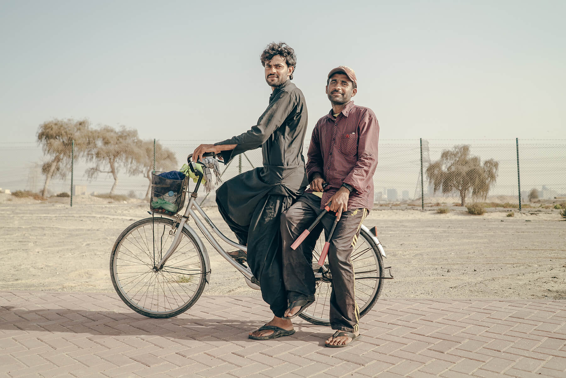
Image courtesy of Piotr Chrobot.
www.chrumo.com and Instagram: @chrumo
Editor’s comment: “There is something both sweet and unusual in this lifestyle portrait. The subjects themselves radiate a good-naturedness that warms the heart, while the setting and other elements within the photo make one wonder about their lives and exactly what they would need both bolt cutters and and basket-full of clothing or rags for.”
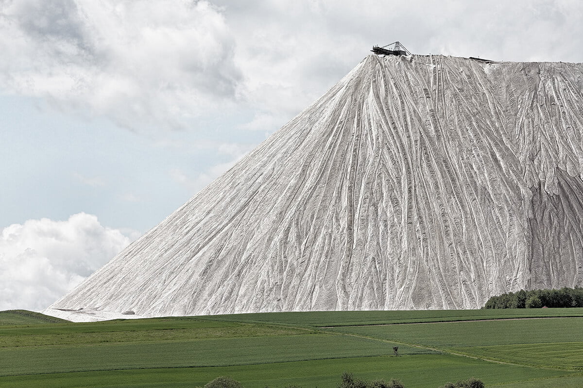
‘KALI’ courtesy of Peter Braunholz.
“This is real. The largest man-made mountain in the world, made from the waste products of salt manufacture.”
www.peterbraunholz.de and Instagram: @peter.braunholz
Editor’s comment: “With its muted colors, serene sky and sparse, rolling farmland, Peter’s image evokes oil landscape paintings from the 20th century. The jaw-dropping ‘salt mountain’ that rears up from the ground – alien and monolithic – therefore provides a stark and dramatic contrast. Captured in exquisite detail it not only looks out of place but out of time, offering a story on the very real impacts our food production has on our environment, both now and in the past.”
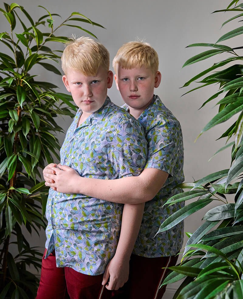
Image and courtesy of Snezhana Von Buedingen from her series Twins.
www.vonbuedingen.com and Instagram: @snezhana_von_buedingen
Editor’s comments: “The looks in these twins’ faces—especially the one on the left—speak volumes.”
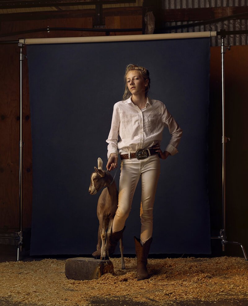
Image and text courtesy of R. J. Kern from his series The Unchosen Ones.
“This project takes place on the sidelines of county fair animal contests in Minnesota USA. One isn’t born a winner or loser but a chooser, and this is the theme I explore – As we look at them they look back allowing us to think about how we choose winners and the repercussions for the ones not chosen. The project consists of over 60 portraits made at 10 Minnesota county fairs in 2016. The photographs showcase the subject facing the camera allowing the viewer to decide what connects and distinguishes these subjects.”
www.rjkern.com and Instagram: @kernphoto
Editor’s comment: “This photo is unusual in so many ways. From the unique choice to break the ‘fourth wall’ by including the background in the frame, to the model’s pose and style, R.J. manages to capture an air that not only draws out an emotional response in the viewer, but causes us to wonder what is going in their rather extraordinary world. Beautifully shot and fascinatingly composed.”
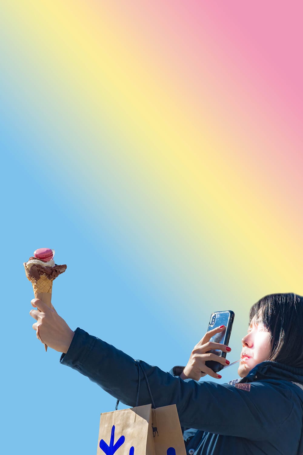
Image courtesy of Claudia Fuggetti from her series Gaps.
“This is an ongoing project about social interactions and technology addiction. The gaps are metaphorically represented by gradients as doors to another dimension or nowhere. Photography could be produced anywhere – what counts are the subjects and their decontextualization. The gesture of photographing becomes a social act – a representation of a humanness that seeks interaction, always however through a filter. “Societies have always been shaped more by the nature of the media by which men communicate than by the content of the communication”. – Marshall McLuhan”
www.its-cloudy.net and Instagram: @lafugg
Editor’s comments: “Another image with a social message, this one by Fuggetti is both colorful and witty. The multi-levels of meaning here make the image more interesting the longer one looks at it. The gradient, for example, adds to the ironic aesthetic appeal of the photo while representing elements of meaning.”
