“OPEN CALL”
ANNOUNCING THE WINNERS
“Photography is still a very new medium and everything must be tried and dared” – Bill Brandt
We are delighted to present the results of the third monthly theme of Life Framer edition IV – an OPEN CALL. With no specific lead, we left you free to surprise and delight, with any style and genre of photography – from meticulous studio set-ups to candid street shots.
The theme was judged by Katerina Stathopoulou – curator at the Museum of Modern Art (MoMA), New York. With a focus on contemporary photography, she curates MoMA’s challenging and varied collection of renowned artwork, as well as sitting on award panels, and running portfolio reviews.
You can discover the winning images below and join the discussion on Facebook, Instagram and Twitter. Congratulations to all the talented photographers featured, and thank you to everyone who submitted their work.
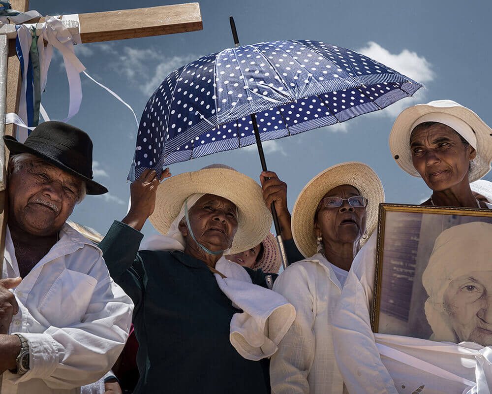
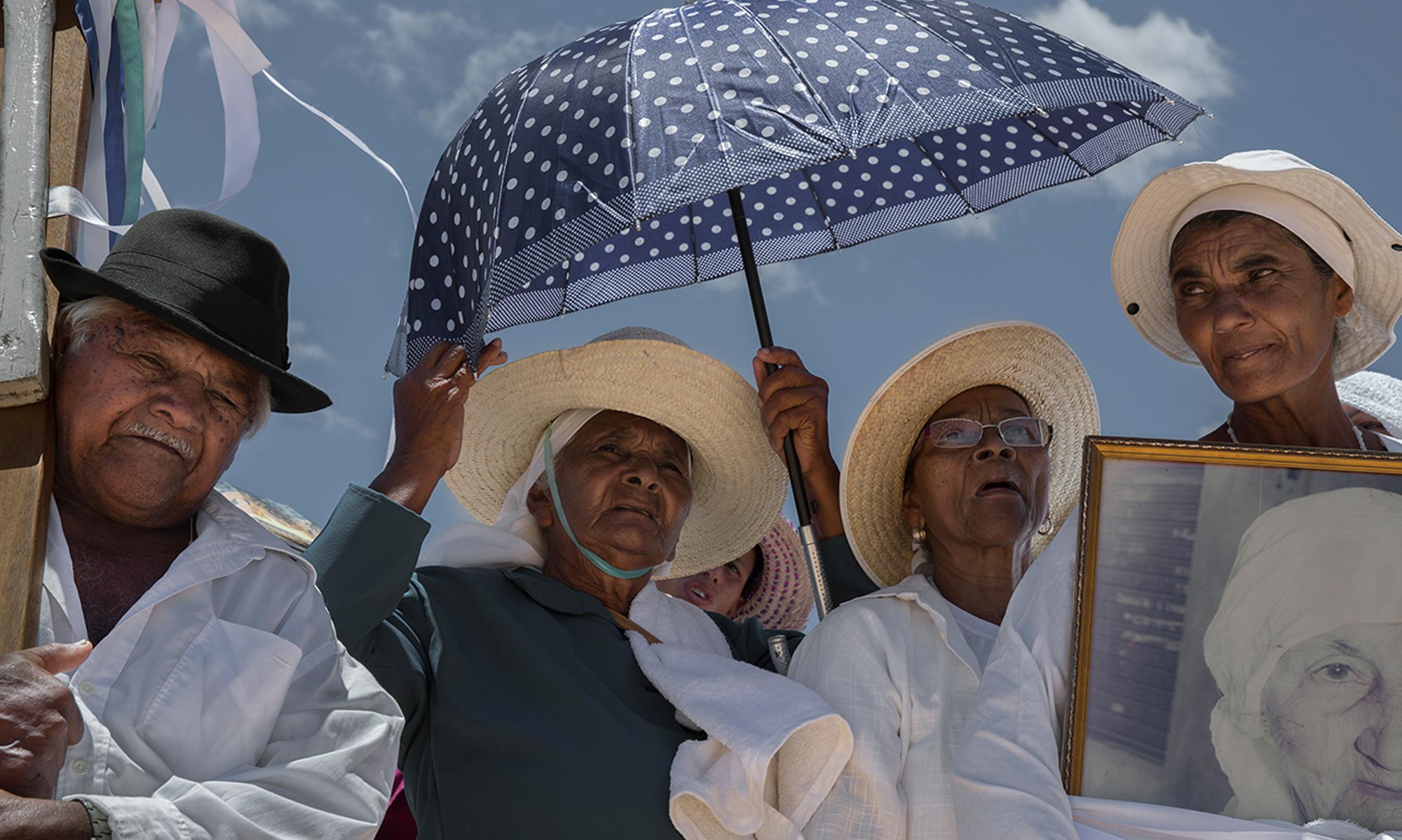
FIRST PRIZE: FELIPE FITTIPALDI
“Looking through the images I constantly came back to this one. I was drawn to the fact that even though certain physical elements are missing from the image, it tells a story: It is clearly a funeral or memorial procession yet we do not see the casket or body; segments of wood are shown which are clearly from a cross yet we don’t see the whole religious emblem. The polkadot umbrella takes center stage over the religious iconography of the cross. The photographer’s low view point, looking up, makes it appear almost as if the photograph was taken by the deceased. Pain and tiredness is evident on the individuals’ faces and the singular figure clothed in black makes one wonder who she is. The photograph simultaneously tells multiple stories and raises multiple questions, intriguing me as a viewer”. – Katerina Stathopoulou
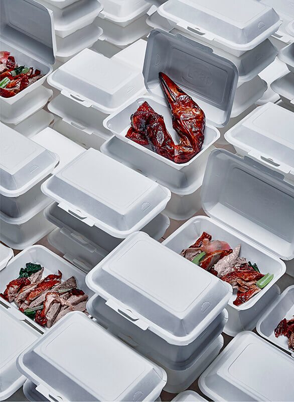
SECOND PRIZE: PATCHA KITCHAICHAROEN
“Even though this photograph depicts only two items, pieces of roast duck and the foam core “to go” packaging, this image is a complex composition with multiple stacked boxes and multiple body parts of the duck tidily placed in the compartments. The mass-produced nature of the “to go” box is echoed in the plastic-looking duck parts, particularly the dried and and shriveled duck head. The sterile white boxes almost look like small caskets housing the blood-red body parts of the duck. The repetitiveness of the packages seems to allude to an almost factory-like production of food”. – Katerina Stathopoulou
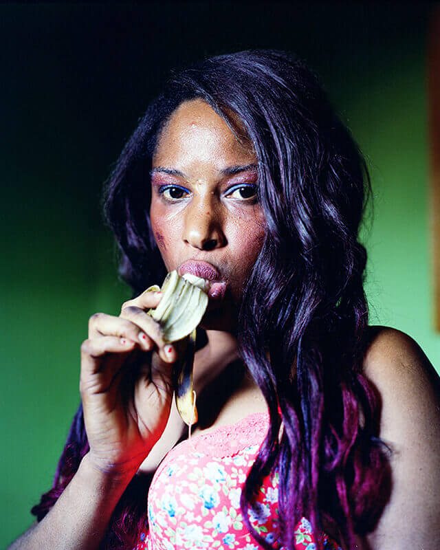
ULLA DEVENTER
Ulla’s portrait of a sex worker in Ghana – part of her long-term documentary project exploring prostitution across Africa and Europe – is raw and intimate, imperfect and full of character. The woman’s expression is so absorbing – there’s both a confidence and vulnerability; Ulla draws out so much with so little. Of course there’s an obvious innuendo with the banana, but it’s done so naturally and with such sincerity that it works – heightening the theme rather than undermining it. It’s a fantastic portrait – creative, genuine and powerful.
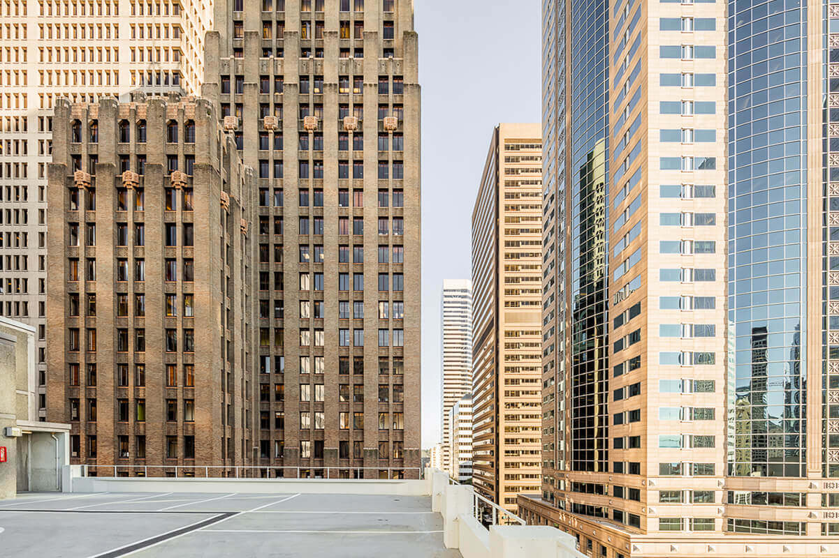
IBAI RIGBY
A composition of this nature – strong, carefully controlled lines giving a sense of order in a complex urban setting and, crucially, an eerie lack of humanity – is bound to be arresting. There’s a clear craft in Ibai’s considered framing, and he perfectly captures the golden light. Reading his statement however provides context that gives the scene a further depth – he talks of the rise of the automobile leading to the death of the street as a communal space, with this image – taken from a parking lot that one crosses en route from car to office – being the little that remains of the experience. That thematic depth, and his elegant response to it – an interesting comment on the very nature of street photography – makes for a fascinating image.
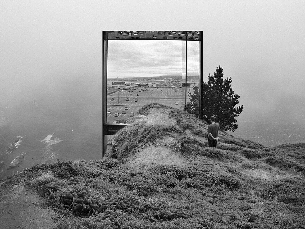
JACKSON PATTERSON
In Jackson’s photomontage of his family’s photographs and his own, he explores several themes – his country’s culture, the medium of photography in the 21st century, and his own personal history. This particular image – a mesmerising portal between barren nature and industrialised suburban America – is both playful and weighty, touching on (to me at least) themes of the environment in the face of capitalist progress through a charmingly executed amalgamation of new and old. The sea stretching to the horizon (itself a metaphor for yearning – for the past, or simplicity maybe), juxtaposed with the concrete parking lot doing the same… It’s effective and unexpected – seamlessly realised with clever digital manipulation that seeks to bemuse rather than fool.
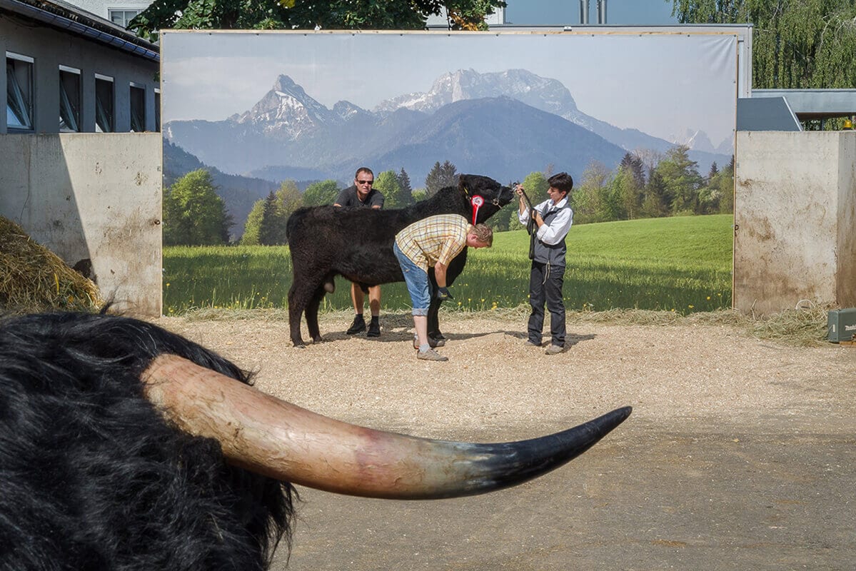
ROBERT RUTOED
Robert’s composition is an aptly quirky response to an idiosyncratic rural scene – the photoshoot for a breeding catalog at an agricultural fair. The composition is wonderfully creative, drawing back wide enough to see the un-glamorous reality surrounding the highland vista backdrop, and using a bull’s horn in the foreground as an unusual and interesting framing device rather than presenting us with either an empty gravel foreground or the expected building tops and sky. It gives the image a delicious depth to juxtapose against the flat photographic banner – a playful commentary on advertorial spin.
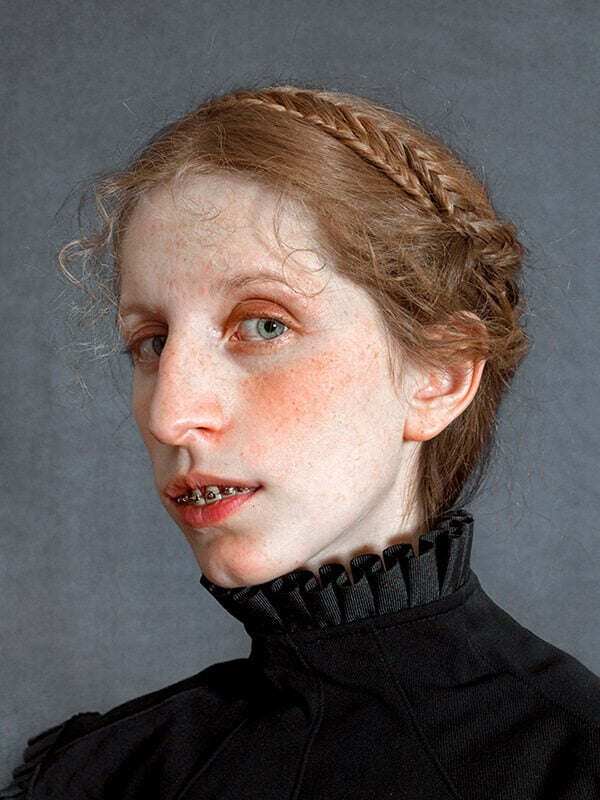
ROMINA RESSIA
Romina’s portrait is wonderfully realised – paying dues to the paintings of the Old Masters (the soft color palette, the neutral background, the frills and plaits), while adding a modern twist – the braces, almost anachronistic, are the only clue to the time. It’s a charming play between the classic and the contemporary. What’s also refreshing is the level of imperfection in the slightly unkempt hair, the blushed cheeks. It’s incredibly naturalistic, and those details add a welcome vulnerability and realism. I see this as a subverted comment on the selfie-generation, and the nature of beauty in a world of online appearances and superficiality. It’s a brilliant, memorable image.
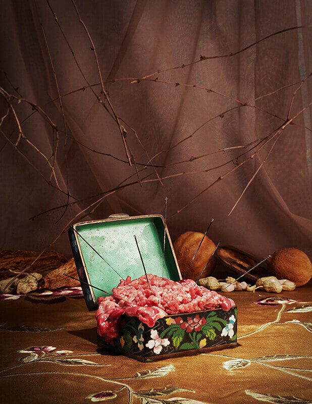
NATALIE CHEN
Natalie’s still life is a response to her experience in moving to California from Taiwan when she was 17. Accordingly, it is imbued with personal meaning – the acupuncture needles representing the way her mother used to take care of her, held in a box to signify how she carries it as a memory. Whether this intended meaning translates to the viewer or not is questionable, but it’s visually rich, and inviting enough for spectators to form their own meanings. A jumping-off point from which the mind can wander… In terms of a visual piece, it’s a triumph – a perfect composition full of sensual textures and warm earthy colors. It has a very fresh and contemporary feel, while nodding to the tradition of still life with the fruit and fabric in the background. This sense of absorbing and respecting tradition, and then building from it is a real success, and particularly apt given Natalie’s life experiences of tradition and culture-shock.
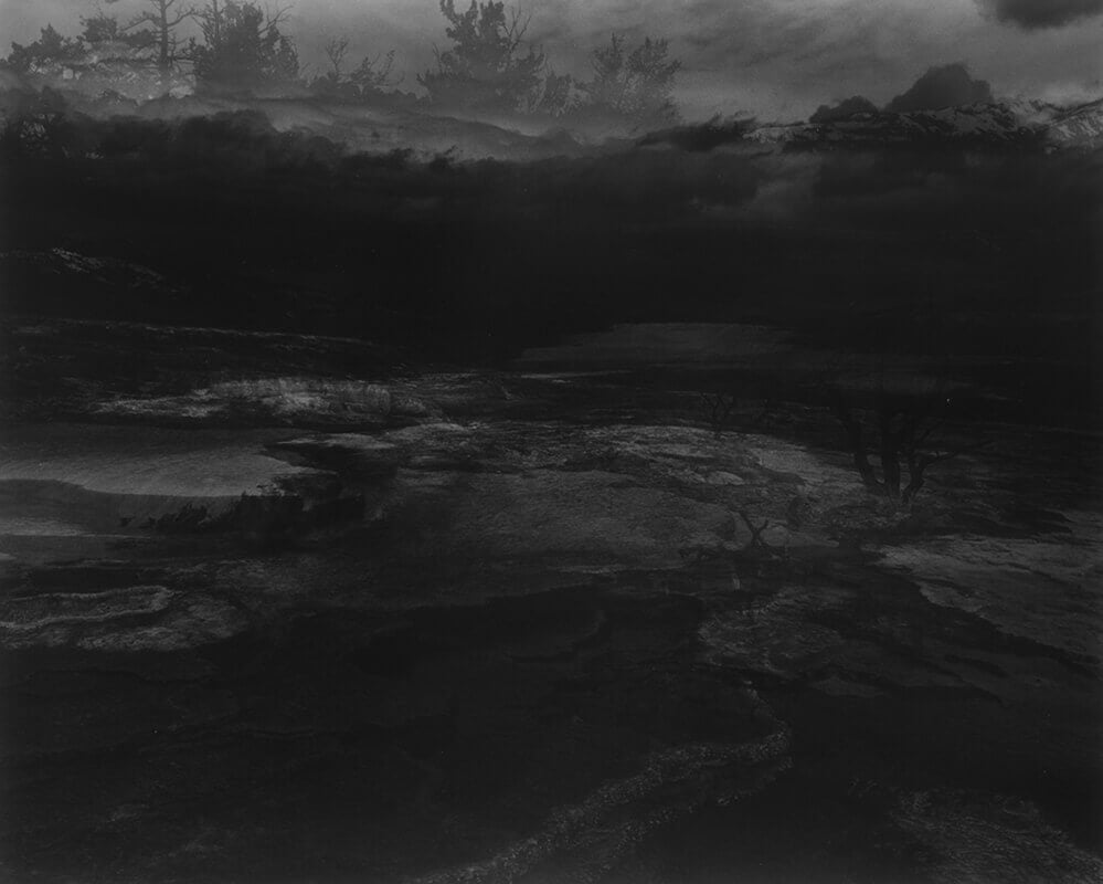
OLIVIA FERNANDEZ
Olivia’s image – from a series in response to her brother’s death – is a powerful visualisation of grief. As her statement describes, the image is in fact taken during the day and ‘turned to night’ in the darkroom, and it’s a clever device – as well as giving the image an aesthetic depth and quality that would be impossible to achieve at night, it acts as a poignant metaphor for her feelings in the face of loss, where darkness descends on all thoughts, and where the world may lose its edges, fail to make sense. It’s an arresting image; both layered in its detail and vast in its empty; both delicate in its execution, and overwhelming in its emotive impact.
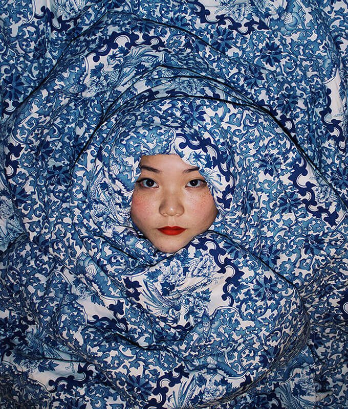
JAMIE SHIN
Jamie’s self-portrait is simple but striking – a face at the eye of a storm of texture and pattern. I do wander what to make of it conceptually; is it a comment on culture and tradition? On the female body? Just a spontaneous, playful reaction to a prop? It keeps me guessing, and is visually-arresting, and that combination is memorable.
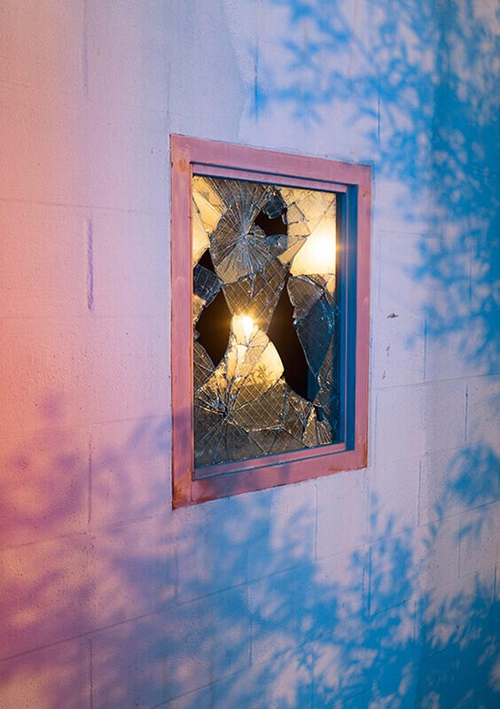
ARYAN NAVID
Aryan’s perfectly balanced street image glistens with an eerie beauty, the broken shards of glass catching the sun like diamonds in the urban rough. And the colors – strange and alluring – suggest that this is something more than a spontaneous street shot. It’s one of those images that finds splendour in the mundane. A magic in the everyday. It’s one you want to step into, and peer into the darkness…
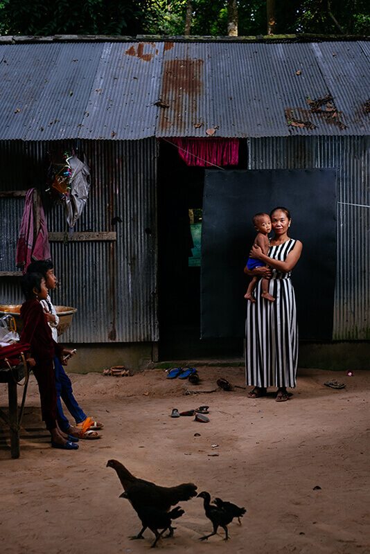
DOUG SHOBBROOK
This is a brilliantly executed portrait of a Cambodian mother and child. Doug uses the full frame to great effect, carefully balancing the composition with still and moving elements, and by stepping back he gives the viewer a window into their world, giving equal prominence to his subjects, and the life they lead. The framing is one of several clues to Doug’s craft – the lighting is elegantly controlled, and the positioning of mother and daughter in front of the dark tarpaulin is a subtly-handled way of isolating her from the corrugated iron building, and thus avoiding a muddle between her striped dress and the vertical stripes of metalwork. In his statement, Doug talks of juxtaposing the genre of precise studio portraiture with the gritty living conditions he encountered, and it’s a pairing that works wonderfully – a tender, imaginative portrait.
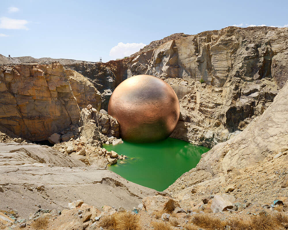
DILLON MARSH
Dillon’s image – a glistening CGI orb placed into a crater of a rocky landscape – is undoubtedly striking and very contemporary. It’s well-executed, with the complementary colors of the rusty, shimmering ball and the bright green pool catching the eye, and the superb level of realism achieved in the shadowing and reflections. An image like this can risk falling a little flat beyond its initial wow-factor though, especially when such techniques are currently quite fashionable in photography and the digital arts. Fortunately, there is a conceptual thread to back-up the aesthetic appeal. Dillon describes in his statement how the image comes from a project about the mining industry – the landscape is a South African mine scarred by the copper extraction industry, with the ball carefully scaled to represent the 302,791 tonnes of copper removed across its operational lifetime. It’s a brilliant way of visualising something that can be fairly abstract, offering a hook to prompt questioning about environmentalism, and the merits and shortfalls of mining. It’s a layered image that both delights visually, and engages cerebraly.
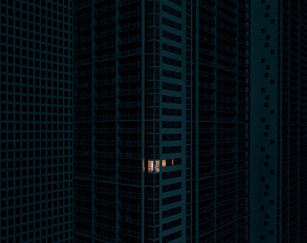
ARISTOTLE ROUFANIS
This image is stunningly executed – the single window of light in a deep and uniform sea of blue repetitious geometry. We see a sprawling, lifeless (and soulless) urban canvas, with the smallest signs of human activity. It plays on ideas of modern loneliness, of loss of social connection, of feeling alone and alienated, despite being surrounded by other city dwellers. Of voyeurism and surveillance. These are grand and relatable themes for those of who live in cities. It’s a meticulous composition, and the product of scrupulous, skilful digital editing – the result is spectacular, and well worth the effort.
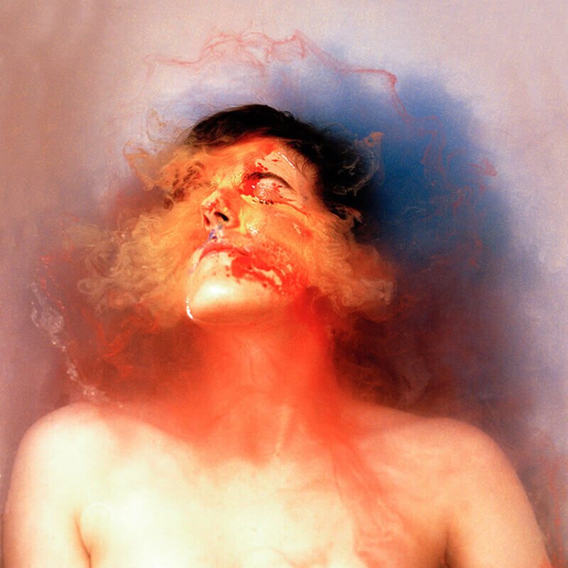
HANNAH LAYCOCK
Hannah’s self-portrait is a bold and colourful reaction to a dark and weighty theme – the diagnosis and coming-to-terms with her Multiple Sclerosis (MS). The shot is beautifully executed, full of mesmeric tones and absorbing textures. For me at least, it speaks of being completely helpless but not without a sense of hope – a beauty that will emerge from the disorder. It’s a brave and creative response to a personal subject that I admire, as well as enjoying the result.
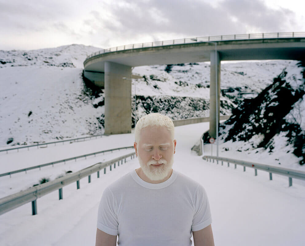
MICHALIS POULAS
Michalis’ wintery portrait is incredibly striking. He describes in his statement how it’s from a series about human identity, and of loss, loneliness and isolation, whether as actual immigrants (his series is shot in Crete, where many have arrived) or in one’s own homeland. As albino, this man will be familiar with feeling different, with existing on the periphery of society, and those themes are elegantly explored here, with him gracefully shot against the snowy suburban backdrop. It channels basic ideas of survival – shelter and warmth – as well as more emotional concepts of belonging, and does so with tenderness and subtlety. It’s a memorable scene.
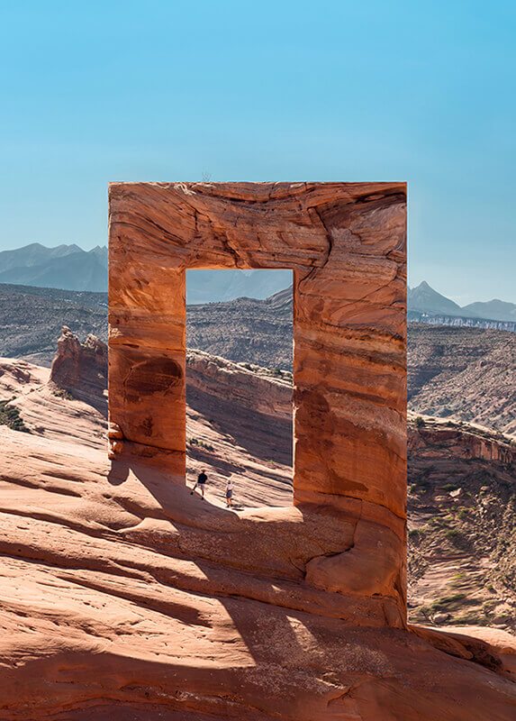
ANDRIN WINTELER
Does Andrin’s image from his series ‘Monument’ have a deep meaning? Probably not (he doesn’t provide a statement) and yet does it matter? It’s striking and memorable – the irregularities of nature turned satisfyingly regular. Disorder replaced with clean order. It imbues ideas of science-fiction in the scale and the bewilderment – strange and powerful. There’s certainly some missing craft – the untouched shadow not matching the distorted rocks, and the obvious ‘stretch-marks’ on the right-hand side are give-aways to the processes used – and Andrin could learn a thing or two from those that do this so well (I’m thinking the likes of Asger Carlsen and Victor Enrich, even if their subject matter is very different), but overall, this wins out on charm and impact.
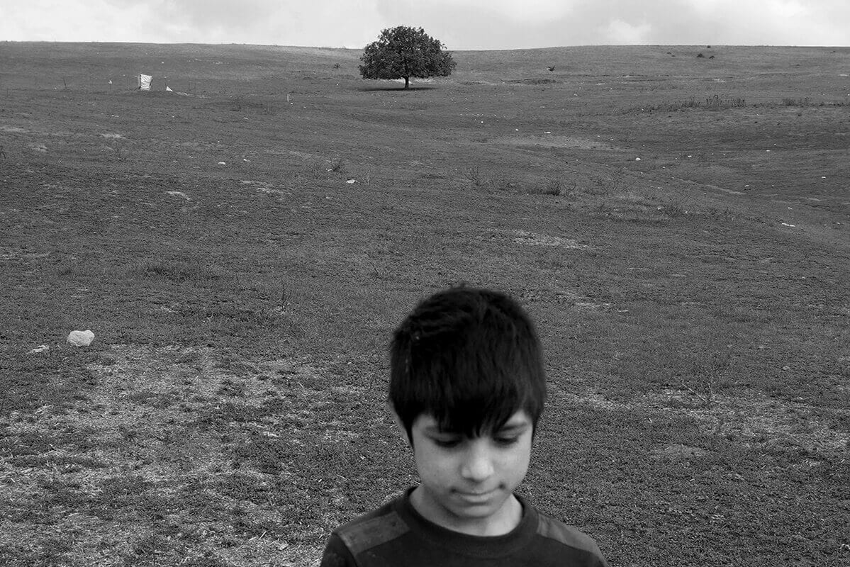
IRIS TUSA
What I think works so well in this image is its childlike naivety. Of course, the subject is a child, but there’s something wonderfully spontaneous and innocent in the execution – the odd framing and the unexpected focal range, the swathes of unused space. It breaks the rules and is all the more charming for it. There’s a quiet peace to the image, a reflection on the “solitude of our being” which Iris refers to in her statement. It’s beautifully nostalgic, there’s a gentle longing to it, but not in a forced way.
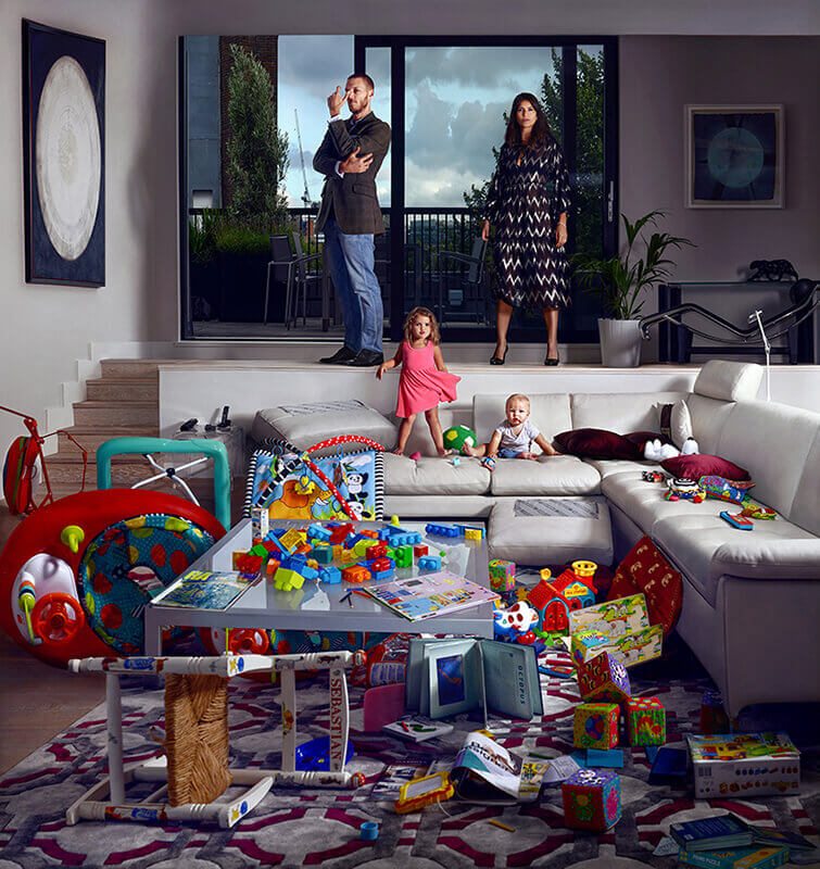
FREDERIC ARANDA
Frederic’s staged environmental portrait of parents and children is an exercise in controlled chaos – a wonderful interpretation of the tension between adult aesthetic taste and childish exploration and disorder. It’s perfectly framed (with careful attention to the edges) and lit, and there’s a delight in the expressions he’s elicited – the baby’s curiosity, the little girl’s confident swagger, the mother’s strength and the father’s (perhaps) exasperation. It’s a masterful shot.
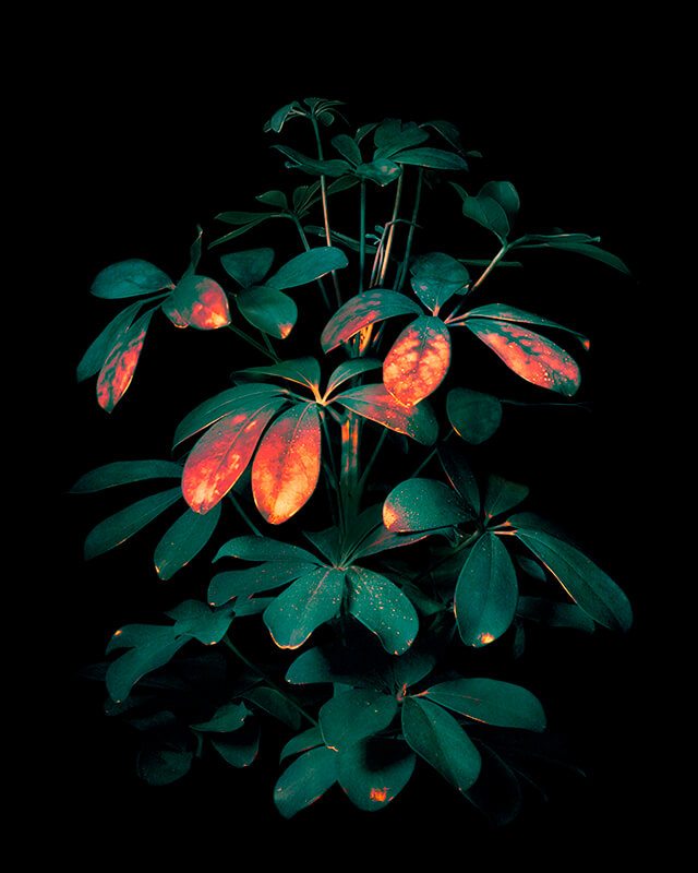
LISA VAN CASAND
I was immediately pulled towards Lisa’s image. It’s beautifully structured, and the vivid reds and oranges of the leaf tips are foreign and striking. It’s a tactile, physical image and my first thought was that the fiery colors were heat prints left from human touch – a comment on our heavy-handed relationship with nature. I feel like it plays with the long and familiar tradition of still life photography (and painting) of plants and flowers, but with a bold and contemporary spin. From reading the statement, I understand that it’s the result of stressing the plant with external elements (drought, hot water, chlorine…) and then capturing the infrared energy released, normally imperceptible to the human eye. It’s a considered way of depicting that fragility – how our actions as humans can damage our environment in ways that are often invisible. Warning signs hidden and so easy to overlook. There’s a subtle irony at play too – how that damage manifests itself in something so beautiful. It’s an experimental image, borne of investigation and process, and that’s to be admired.