EDITORS’ PICK
Flesh and Heart
THE HUMAN BODY
The Human Body Editors’ Pick
“The flesh is at the heart of the world.” – Maurice Merleau-Ponty
Following Joachim Ladefoged’s selection of winning images for our theme THE HUMAN BODY, this compilation of 20 images, selected by the Life Framer editors represents some of the other talented photographers whose work struck us and left a mark. Each a stunning image worthy of exposure and attention…
These are intended to be a conversation starter… so feel free to join the discussion on our social networks.
BANNER IMAGE COURTESY OF TODD KENNEDY
www.toddkennedy.zenfolio.com / @toddkennedypics
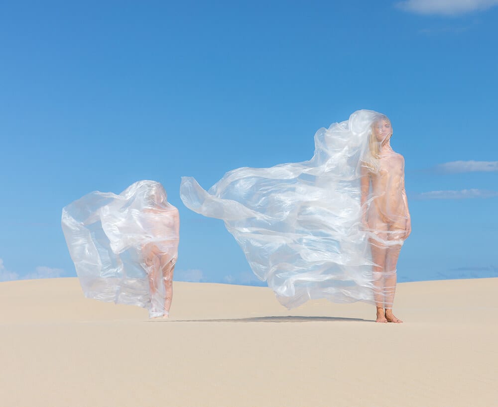
“Story telling with the human body. My images touch on themes of plastic waste, the duality of existence, and the juxtaposition of beauty and ugliness.”
Editor’s comment: The minimalist composition, contrast of pastel colors and bold staging make this image work. It’s artful and beautiful, while perhaps hinting at something more troubling – the problem of plastic waste, here accentuated by the purity of the environment and the cloaks that almost suffocate. It leaves a strong impression.
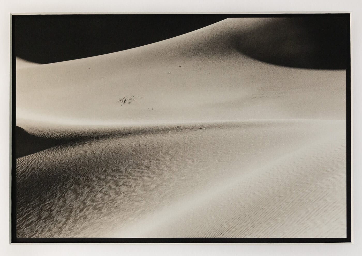
IMAGE COURTESY OF MATTHEW ZORY
www.matthewzory.com / @matthewzory
“A photograph of an actual platinum prints from a series of about 20. I love the desert – the solitude, the smells, the immensity – and found it very curious and wonderful that many of the pictures from my most recent visit were so anthropomorphic.”
Editor’s comment: Matthew’s platinum print of a desert landscape has an alluring quality – the gentle folds of sand, the silvery waves of texture, and the way in which the distance fades to black taking a quiet hold on the viewer. But what makes it a captivating image rather than a merely pleasant one, and what makes it apt for this theme, is the way in which the landscape resembles a body – the hump of a spine, the mound of a shoulder leading to an extended arm, freckles scattered across the smooth skin, and even a clump of hair. Drawing that parallel – of body and landscape, topography and anatomy – makes for an artful result.
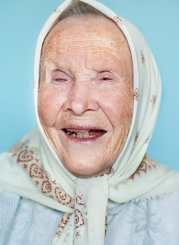
IMAGE COURTESY OF MONIKA KALVELE FROM HER SERIES 100 METU KARTU (100 YEARS TOGETHER)
www.pozerskyte.com
“The state of Lithuania is celebrating the centenary of its independence. In this portrait series I photography Lithuanian people who are 100 years or older. No make-up, no filters, just bright faces – like a message to us all to just look into the eyes of our closest relatives and listen to their stories.”
Editor’s comment: Monika’s image is taken from a series in which she photographs centenarians from Lithuania – a country recently celebrating its own century of independence. It’s a lovely concept, and one her paired with a beautifully executed portrait. She closely crops her subject against a pastel background and uses a tight depth of field to create a real closeness and intimacy. And her subject’s joy and ease in front of the camera, her pride despite clear hardship apparent in the lines on her face, her missing teeth and glassy eye, is infectious. It’s heart-warming and tender. A portrait of a life well lived, we can assume.
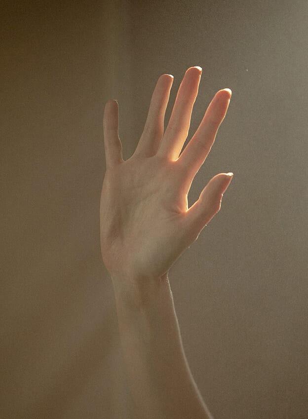
IMAGE COURTESY OF LAURENT CASTELLANI
www.laurentcastellani.com / @laurentcastellani
Editor’s comment: Images like this are to be admired – the artist’s desire to engage with the simplest of subjects and create something beautiful. The soft tonal contrast and subtle highlighting of form with natural light enhance the delicate subject. Sometimes all you have to do is look around to discover the best photographic subjects, to find a poetry in normality.
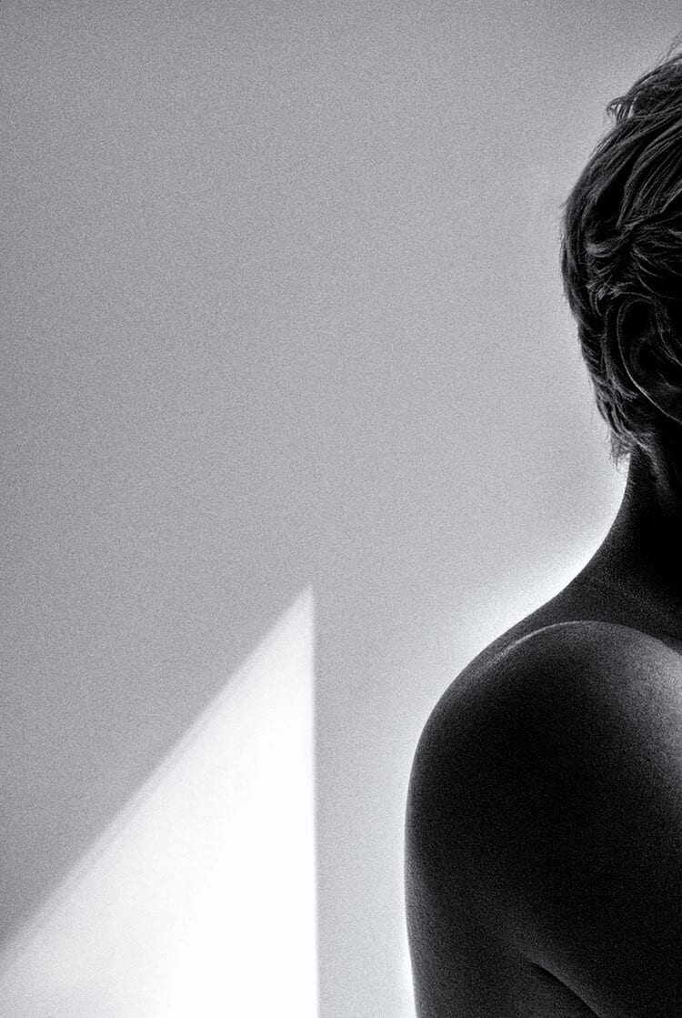
IMAGE COURTESY OF MAURO MARINELLI
www.mauromarinelli.com
Editor’s comment: Leaving empty, negative space in a frame can feel a lot more daunting than filling it. Here Mauro creates a strong aesthetic through an intelligent, unconventional use of geometry and cropping. He contrasts the human with the man-made, curves with lines, softness and harshness. With strong but tasteful post-processing it channels something of a technical pencil drawing – an artist’s sketch where the scene is expressed in the fewest number of lines.
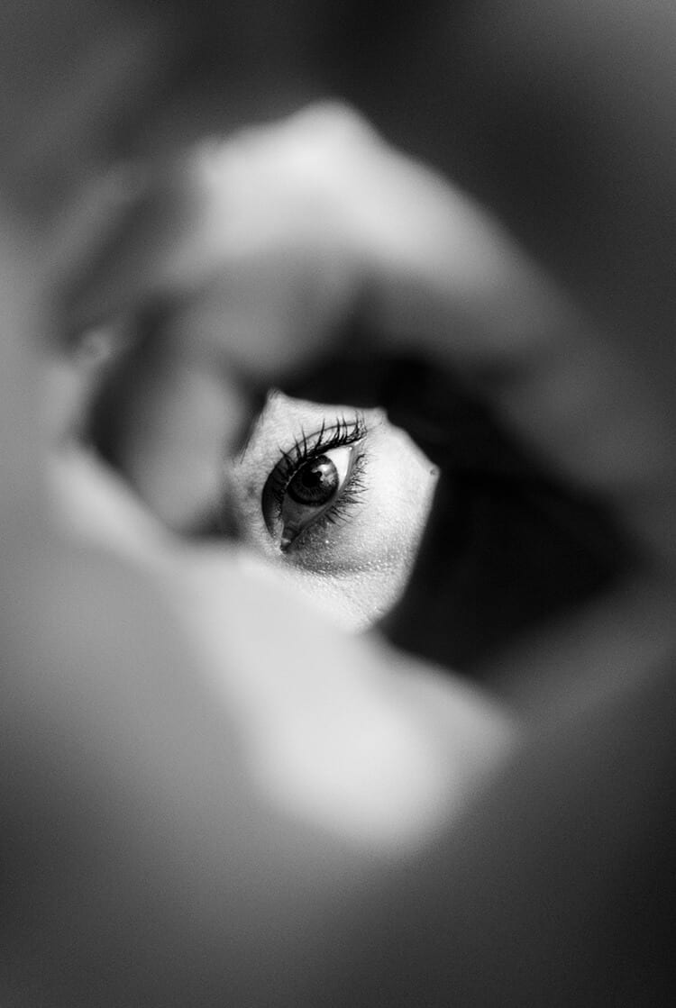
IMAGE COURTESY OF SANDER VOS
@sandervos
Editor’s comment: The ‘picture within a picture’ effect isn’t easy to achieve, but Sander applies creativity to find an interesting perspective on a common subject matter. She works adeptly with light and shadow, and depth of field to arrive at an image that draws you in with its tunnelling, and holds you there. It also comments subtly on the very act of photography – the watcher being watched.
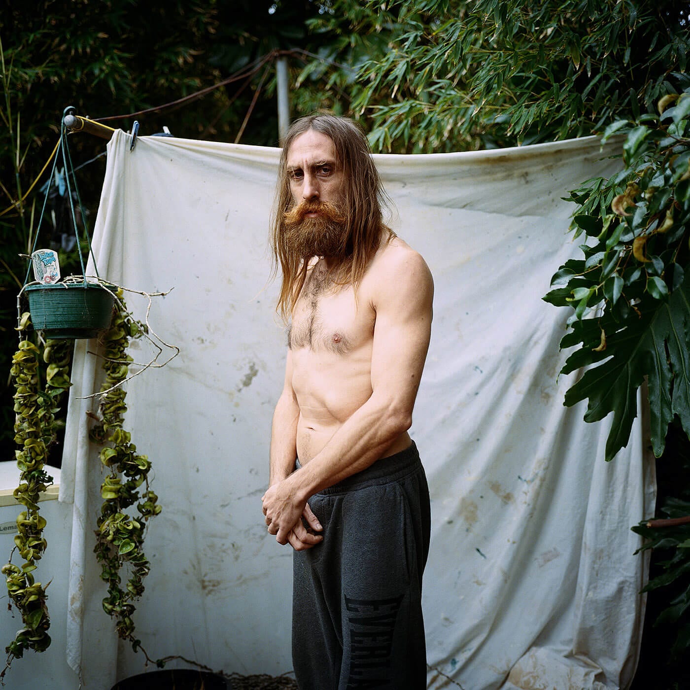
IMAGE COURTESY OF TRISTAN STILL
www.tristanstill.com / @tristan.still
“”All I want is a patch of The Earth to call home, somewhere I can do whatever, without restrictions.” Simon has two twists in his spine due to severe scoliosis – an abnormal curvature of the spine, which has no cure but can be treated when diagnosed at an early age. Whilst young girls in Australia are checked at school for signs of the disorder, boys are not usually checked and Simon was not diagnosed until adulthood. Compensating for his affected spine, his body naturally refined the muscles on his front, helping reduce the severity of his chronic back problems.”
Editor’s comment: Behind the human body, there is always a story. This image is touching and has a lot to say. The backdrop of sheets hanging on a line is not only a superb framing device, but hints at something of the character – non-conventional, imperfect but practical.
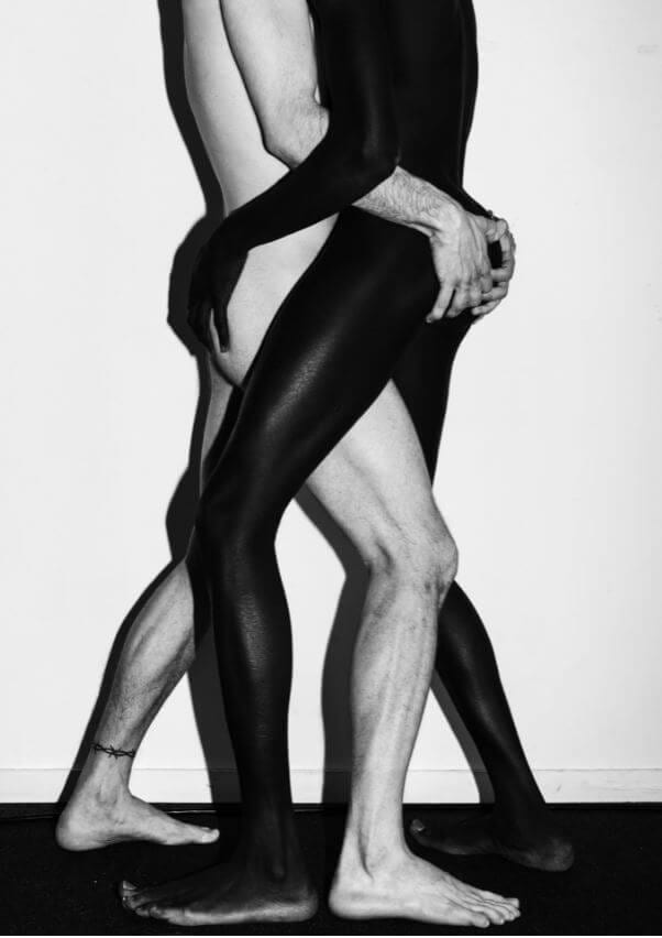
IMAGE COURTESY OF YAN MIRANDA
@arctic.night
“This project is about masculinity on the app Grindr. I felt never really accepted in this community because my body doesn’t fit in this perfect and masculine pattern. So I decided to explore the app by having dates with guys on Grindr, portraying them in my way and represent the body elitism that grindr has.”
Editor’s comment: While verging on the edge of cliché, this image works because of the powerful drama and urgency Yan creates in the frame. The body as geometry, an interconnectedness. Ying and Yang. It’s artistic and decorative but also shares strong messages and concepts about diversity and acceptance which, while already said, need to be shouted louder. And this image shouts.
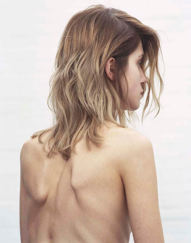
IMAGE COURTESY OF GIORGIO LATTANZI
www.giorgiolattanzi.com / @george_giorgio
Editor’s comment: There’s something magical in the imperfections of the human body – the uniqueness and authenticity of this image is to be admired, demonstrating that there are many forms of beauty in this world. It’s also an interesting composition, with numerous vertical lines drawing the eye through the frames.
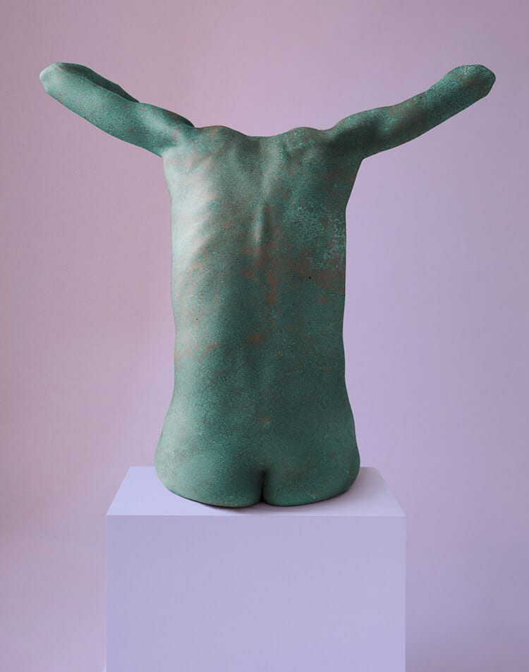
IMAGE COURTESY OF MATT THOMPSON
www.mattthompson.co.uk / @photo.matt
“In physical chemistry, when a material becomes ‘passive’, it is creating an outer layer or shield material in order to strengthen and preserve. When exposed to the environment, copper undergoes a series of chemical reactions that gives the shiny metal a pale green outer layer called a patina, which renders the metal less reactive and gives it protection.”
Editor’s comment: Capturing art is an ambitious task, but this image manages to transform one form of art into another. The use of color and shape is transfixing, along with the ability to transform a static object into a visual story – Matt applying the scientific concept of material patination (copper creating an outer layer that shields it from its environment) as a metaphor for the hardiness we must find in a superficial world where our bodies are on display.
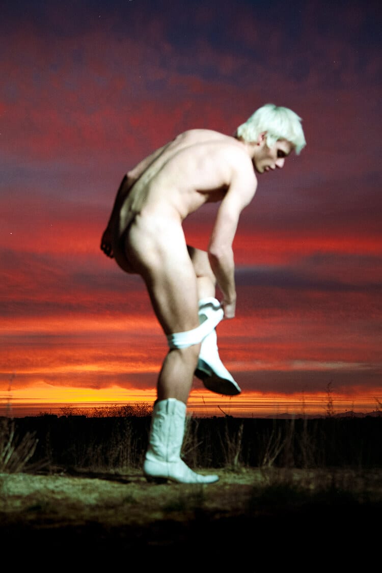
IMAGE COURTESY OF CARLOS MORANTE. INTIMACY EXPOSURE 7,718
@mr_morante
“Nudity or exposure is a weapon used nowadays by an over-sexualized generation of teenagers on their constant race to become digital idols. The number on the title of the image makes reference to the ‘likes’ the picture received on social media. I name it Apolo – a name chosen to establish a relationship between youth, beauty, attitude and race, and how little the commercial representation of success has change through the centuries. The model was contacted via Instagram and agreed to pose for exposure on my profile. The censorship criteria for the shoot was chosen in accordance with the Instagram guidelines.”
Editor’s comment: With an out-of-focus subject caught in a state of mid-undress, in cowboy boots and seemingly in the middle of nowhere, this image is certainly provocative. Freezing his model in a pale white flash against the deep reds and oranges or sunset, Carlos nods towards Greek/Roman marble sculpture, something echoed in his chosen title of ‘Apollo’. And then as if to thrust us out of history and into the zeitgeist he adds ‘7781’ – the number of ‘likes’ the image received on Instagram. Knowingly referencing the superficiality of social media, he almost toys with the viewer – provocative with subject, technique and title as if to say “the old rules no longer apply”.
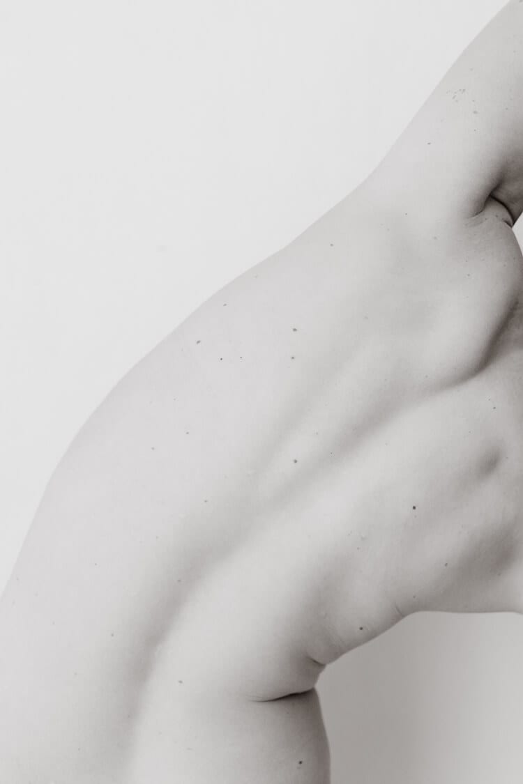
IMAGE COURTESY OF ELLA MACK
www.ellamackphotos.com / @ella_mack_photos
Editor’s comment: This image is artful and exhibits beauty beyond conventional standards. It’s simple and efficient, balanced and catchy, and respects the topic very well. Geometry is used wisely and the viewer is invited into a long contemplation.
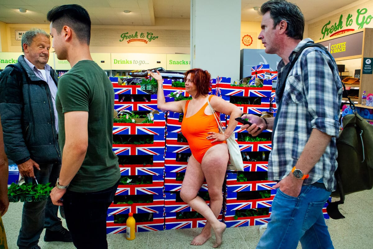
IMAGE COURTESY OF PAUL HYNES-ALLEN
Editor’s comment: Although raw in its execution, this is wonderful storytelling, including so many symbols and breaking so many preconceptions. It also exhibits a strong eye for candid street photography – excellent use of color and a wry sense of humor.
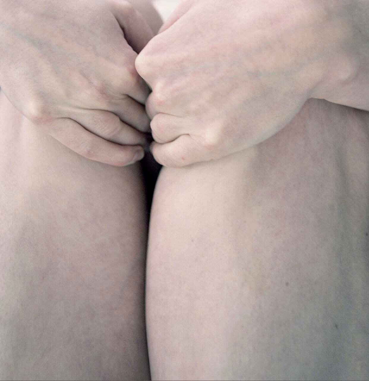
IMAGE COURTESY OF MIA DUDEK FROM HER SERIES SKIN STUDIES
www.miadudek.co.uk / @mia.dudek
“The veins, moles and other structural body elements in Mia Dudek’s depicted models’ skin conjure a sense of fragility and allude to a translucent and corporeal surface that has sensitivity to touch. It has been an extended and ongoing attempt to represent alienation in depictions of compromised human physicality. Her works are shot through with a sense of claustrophobia – of ourselves being repressed by our bodies, and our bodies being repressed and contained by the physical world.”
Editor’s comment: This image speaks strongly – the artful perspective with the tight off-centre cropping, and the use of color communicate fragility, pain and determination in the most evocative of ways. There’s so much gesture in something so ostensibly simple.
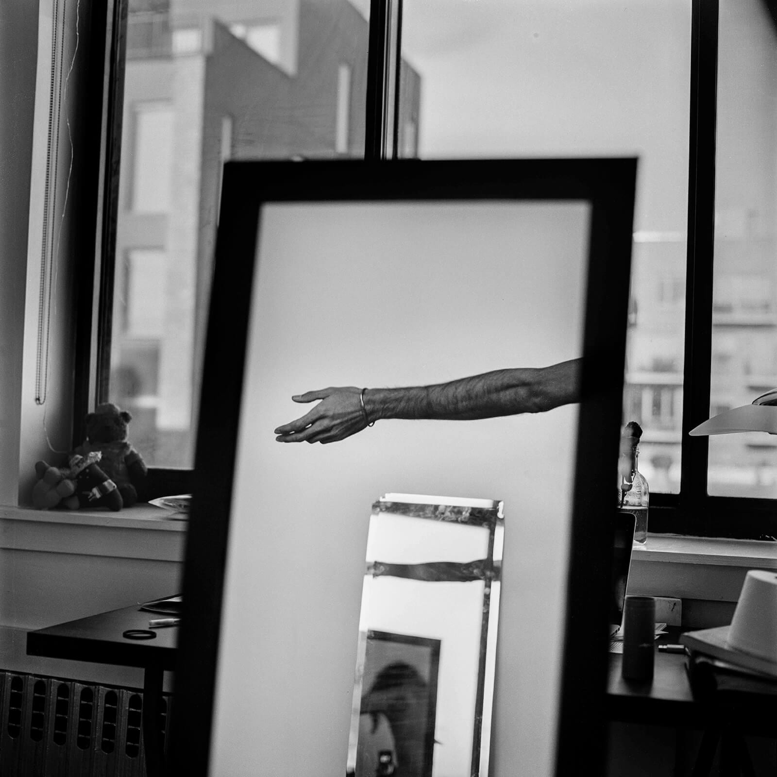
IMAGE COURTESY OF ITAMAR DOTAN KATZ FROM HIS SERIES THE UNFAMILIAR SELF
www.itamardotankatz.com
“A subjective exploratory photo-essay, shot with a 35mm and a medium format camera.”
Editor’s comment: Reflections and contrast create a powerful black and white image. There’s a narrative that reveals itself slowly – it’s not only about the human body but about the entire human experience. About culture, about life and the complexities of navigating it.
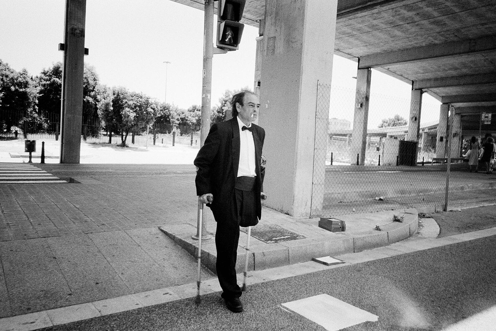
IMAGE COURTESY OF ALEX BARTSCH
www.alexbartsch.com / @alex.bartsch
Editor’s comment: This image speaks about strength and dignity – a powerful subject with a demeanor and setting that feels cinematic in its rawness. Using black and white photography adds depth and drama to the story.
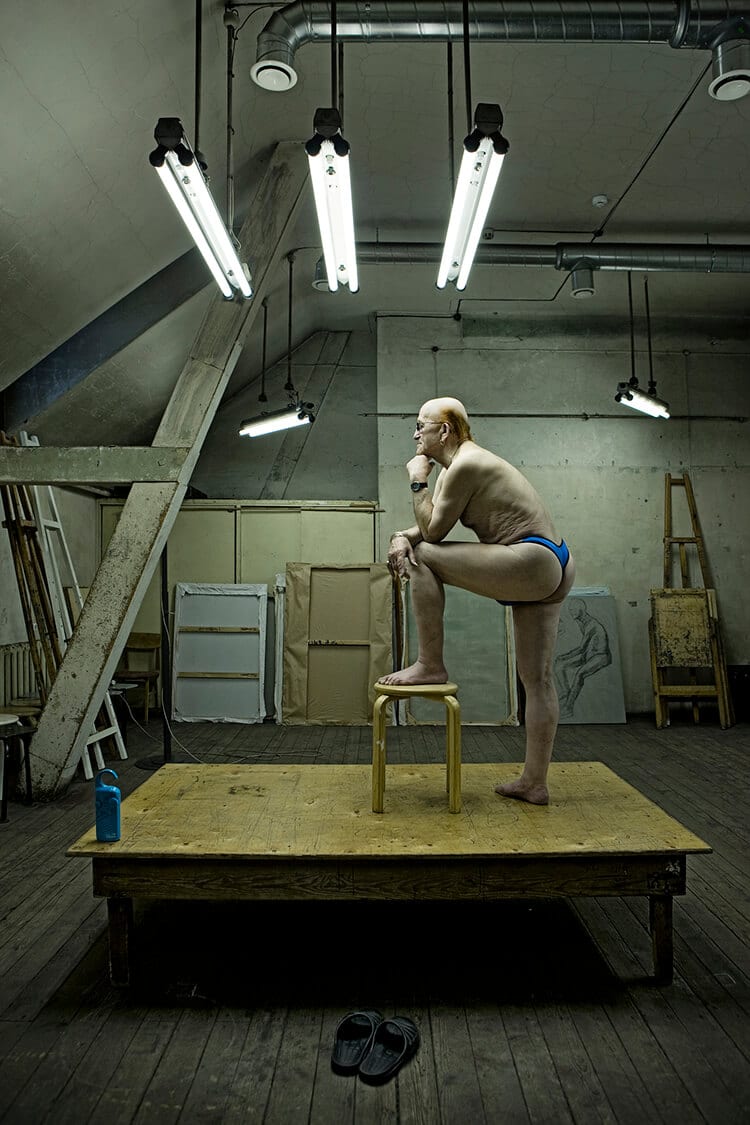
IMAGE COURTESY OF REINIS HOFMANIS FROM HIS SERIES MODEL
www.reinishofmanis.com / @reinis_hofmanis
“”Reinis has created his series sensitively, discretely and reverently, as we see from the distance between the model and photographer. Each photo is equally aesthetically beautiful and absolutely candid in everything it reflects. His photography has retained an unobtrusive position – there is no indifference present, but great care, as the pictures tell us about relationships: man and environment, man and camera, man and viewer. We can also feel that author has gone further than the traditional “model – object” association, that we usually observe in studio artworks, further than the belief that the model is solely a formal source of investigation. He reveals models as humans rather than objects or a means to investigate colours, textures and the play of light. What matters is not the message each model could deliver, otherwise they would have probably been photographed in a different way, but their occupations. In the pictures we see individuals as models, depicted in an appealing, slightly bohemian environment which is also their working place, and as regular people following their daily routines – tense, exerting themselves, indifferent, relaxed, delighted or satisfied. It is interesting how their personalities transpire – subtle and very quiet, they are ubiquitous and form significant relationships with their surroundings, the viewer and the photographer. Reinis has certainly succeeded inbreaking up the classical pattern of model-photographer relationship, based in posture and posing, and has delicately developed a seemingly psychological trust equal to the one we often feel in paintings from older days – mutual reliance and interplay between the depicted and the depicter.” – Maija Rudovska, Art Historian”
Editor’s comment: Just another day in the life of a model! The use of color contrast is striking, along with the courage to use a busy background. Through careful observation of geometry, Reinis arrives at a balanced composition, with a fascinating, eccentric character at the heart of it.
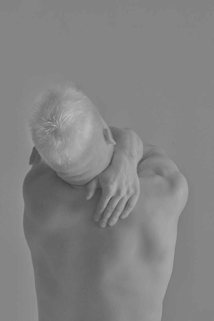
IMAGE COURTESY OF IRIS KIVISALU FROM HER SERIES THE TALE OF MATIAS
www.iriskivisalu.com / @iriskivisalu
“I explore the perceptive concept of physical male image. When the standard to be constantly seen as the strong sex both physically and mentally highly contradicts with the realistic need to be accepted as fragile or vulnerable, it creates a deep inner turmoil of identity. The Tale of Matias observes a very intimate and loving relationship between a man, his physical body and spiritual self. Yet as an everlasting battlefield between gaining independence from others and accepting the fact of being dependent.”
Editor’s comment: Captured in pale, understated tones, Iris’ image resembles a classical statue carved in marble – an early form of documenting the ideal, aspirational physical form. And yet her subject’s posture is contorted rather than tall, turned away from view – a personification perhaps of the tension in trying to emanate power and strength while feeling unsure and vulnerable. With male mental health issues, and aesthetic ideals perpetuated through social media more prominent than ever, this image – at least in our interpretation of it – explores very contemporary issues while reflecting on the rich history of art.
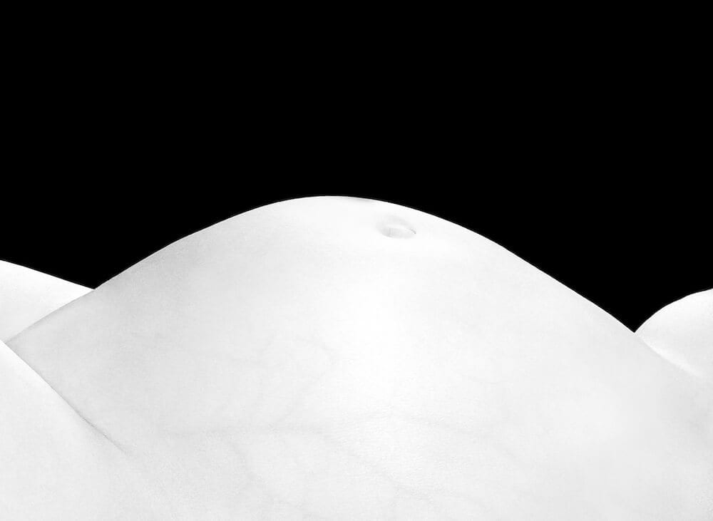
IMAGE COURTESY OF ANA LAZAREVA FROM HER SERIES METAPHYSICAL BODY LANDSCAPES
@laza_anna
“My childhood was spent at my grandmother’s house in Romania, near the Carpathian Mountains. Seeing people’s strong bond with earth, observing nature and the landscapes around me influenced my understanding of the earth’s beauty and our connection with it. Life is something whole, indivisible. Earth, sky, plants, fruits, mountains, rivers, men, women, day, night – all merge together and flow into each other. This process is infinite and harmonious. We came from the earth, live on the earth and will return to the earth. And landscapes of the earth can be seen in the curves of our bodies. Growing up I moved to live in big cities, my grandmother passed away and I felt my spiritual connection with nature slipping away. In order to reconnect I started to search for those Romanian landscapes in our bodies.”
Editor’s comment: Although simple in terms of the elements in the frame, this image is highly effective in its tight cropping and high contrast coloration, capturing the viewer’s eye with its sumptuous curves and shapes. It’s a wonderful description of the human body, and Ana should be commended for her use of light to capture the subtlest of details, and her courage to address fine art photography in such a crowded genre.
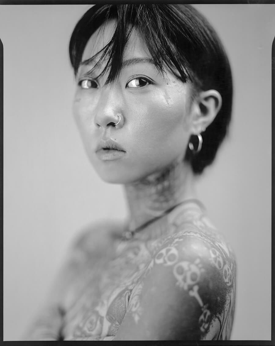
IMAGE COURTESY OF TIM FRANCO FROM HIS SERIES ILLICIT INK
www.timfranco.com / @timfranco
“An obscure South Korean law makes tattooing technically illegal. Although this does not stop a growing number of underground tattoo parlors opening in people’s home or in hidden rooms, it does pose a challenge for a young generation looking to express themselves beyond the imposed ideal South Korean look – often controlled by the Kpop and cosmetic industries. The tattoo history is actually centuries old in Korea. Sailors marked themselves with frightening shapes to scare away the monsters that inhabited the deep seas. But things changed during the Joseon dynasty when tattoos were used to mark robbers for their crimes and slaves as a perpetual mark of punishment. In the 20th century, South Korean gangs inspired by Japanese Yakuza used tattoos as a distinctive mark. This rather dark history of the art created a negative perception that has endured to this day in this very conservative society. Nowadays, a new generation of Koreans influenced by pop stars, Western athletes and television programs see tattoos as attractive and fashionable. But the ban remains in place. These portraits of young South Korean Tattooists who chose to defy laws and cultural standards have been captured directly on pieces of 8×10 inches negative photographic paper.”
Editor’s comment: There is a game of light and shadow here, clarity and opacity. Like with most portraits, the viewer is first captured by the subject’s eyes, her guarded demeanor – vulnerable and wary. But her anotherness starts to shine through – her piercings, her scaring that resembles a lightning bolt, and of course the tattoos. She is a personification of a redefinement of beauty that we’re currently witnessing – something all the more powerful when you understand the context behind the image: that tattooing, especially on females, is still largely taboo in conservative South Korea, and in fact technically still illegal.
