EDITORS’ PICK
Earth Is What We All Have In Common
THE FACE OF THE EARTH
The Face Of The Earth Editors’ Pick
Following Samantha Clark’s selection of winning images for our recent FACE OF THE EARTH competition, this compilation of 20 images represents some of the other talented photographers whose work struck us and left a mark. Each a stunning image worthy of exposure and attention…
For this Face of the Earth theme, we really wanted to explore the beauty of our shared planet – nature’s landscapes and man’s influence on them. From icy polar snowscapes to vast and arid deserts; from sweeping agricultural plains to dense tropical rainforest; the earth has always provided an awe-inspiring backdrop to our short stay.
When selecting for editor’s picks we’re always searching for those striking photographs that have potential as an unforgettable single image, whether from a broader series or not. The accompanying text some photographers submit with their images is not always necessary, but can be relevant when understanding the work in full context.
These are intended to be a conversation starter… so feel free to join the discussion on our social networks.
BANNER IMAGE COURTESY OF ISAYA HIGA
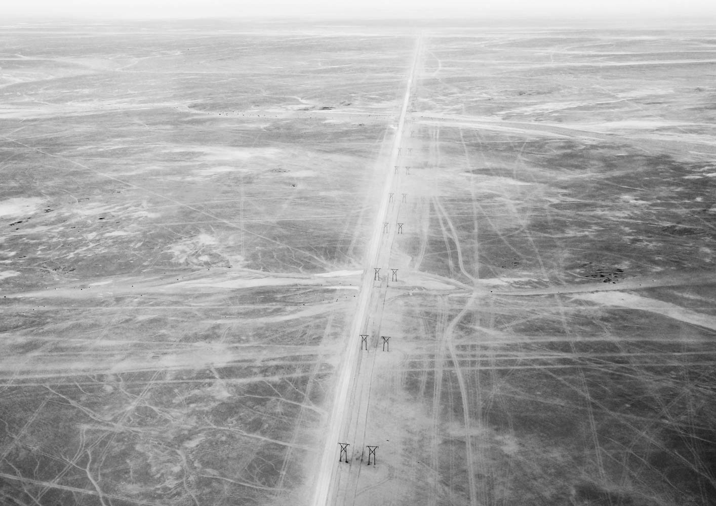
Editor’s comment: I love the sense of texture and chaos this photo brings. It was wise to choose black and white to depict this Namibian scene. It allows the viewer to focus on the manmade traces that mark this landscape – distilling the image down into a study of man and environment – and spend more time admiring the photograph. Isaya makes fantastic use of negative space.
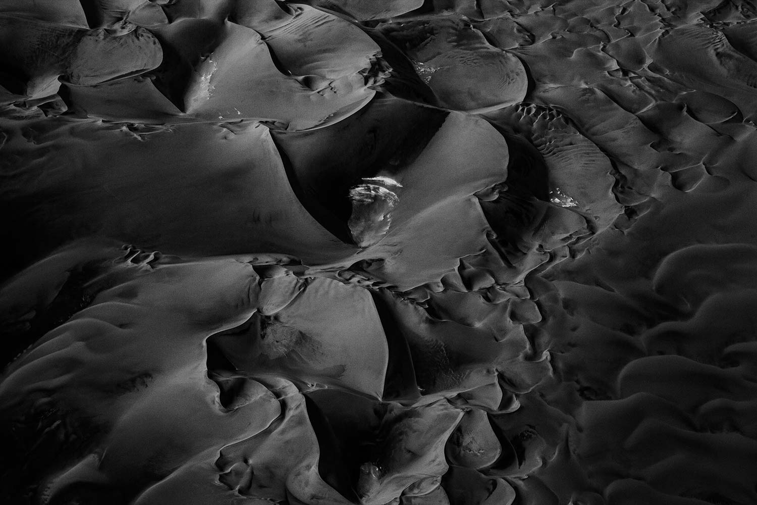
IMAGE COURTESY OF TANJA WILLEKENS
www.tanjawillekens.com / @willekenstanja
Editor’s comment: There is something magical in this composition. An abstract approach transforms the landscape into a fantasy world, and yet the ‘faces’ that emerge from the undulations of sand confront the theme literally. The lack of color only enhances the features and makes the photograph more interesting. It’s graphical and decorative, and would look amazing large-scale in print.
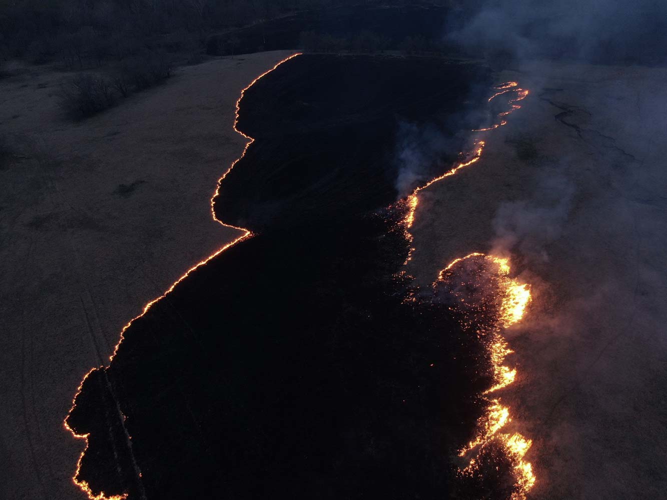
IMAGE COURTESY OF LOUIS COPT
www.louiscopt.com / @lcopt
“Every year in March and April the grassland in the Kansas Flint Hills are burned. Historically, Plains Indians started fires to attract game to grasses that quickly sprout in the burned areas. They sometimes referred to the fires as the “Red Buffalo.” Ranchers today start fires to improve forage for their cattle, and the fires play an extremely important role in maintaining the prairie ecosystem.”
Editor’s comment: The different faces of fire constitute an interesting subject matter. Louis exhibits storytelling abilities as well as a commitment to the subject matter and technical skills I appreciate the use of light and shadow, the strong focal point, and the 3D aspect of this photograph. And there is an artistic element two – the lines of flames like gilded edges of an abyss. It is understated yet powerful.

IMAGE COURTESY OF DENIS KARASEV
@nedkar
Editor’s comment: Humankind has definitely changed the face of the earth. This photograph captures the essence of industrialization. In a blurry world, the furnaces stand up tall. Rising above everything, and obscuring what’s below with their billowing fumes. I appreciate the strong focal point, framing, and blurred foreground.
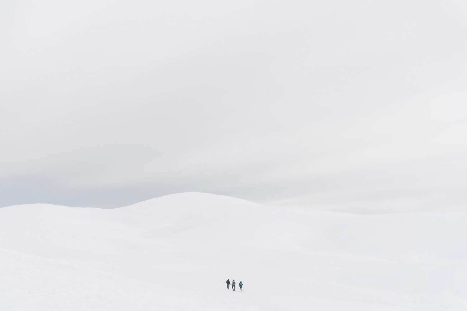
IMAGE COURTESY OF LORENZO LINTHOUT
www.linthout.it / @lorenzolinthout
Editor’s comment: Lorenzo’s minimalist approach makes you spend more time with it, trying to decode its message. It speaks so beautifully about the greatness of the world, and the tiny spaces we occupy in it. I also appreciate the use of high-key technique, the well-considered contrast between humans and nature, and the geometry of the composition.
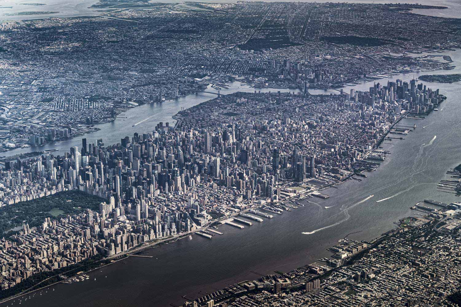
IMAGE COURTESY OF JOE WILLEMS
www.joe-photo.com / @josefwillems
“Rural to desert to city to mountain… a selection of aerial shots taken from the cockpit of an airliner within the last decade. NY departure.”
Editor’s comment: Aerial photography is one of the best ways to capture the enormity of our cities, and this one rising from the desert is no exception – reaching out in every direction. There is a coldness in the coloration Joe applies – somehow enhancing the sense of wonder, while tinging it with a sadness at the way we push nature out. I appreciate the use of leading lines, the strong focal point, and the storytelling skills of the photographer. We shouldn’t forget nature is always nearby.
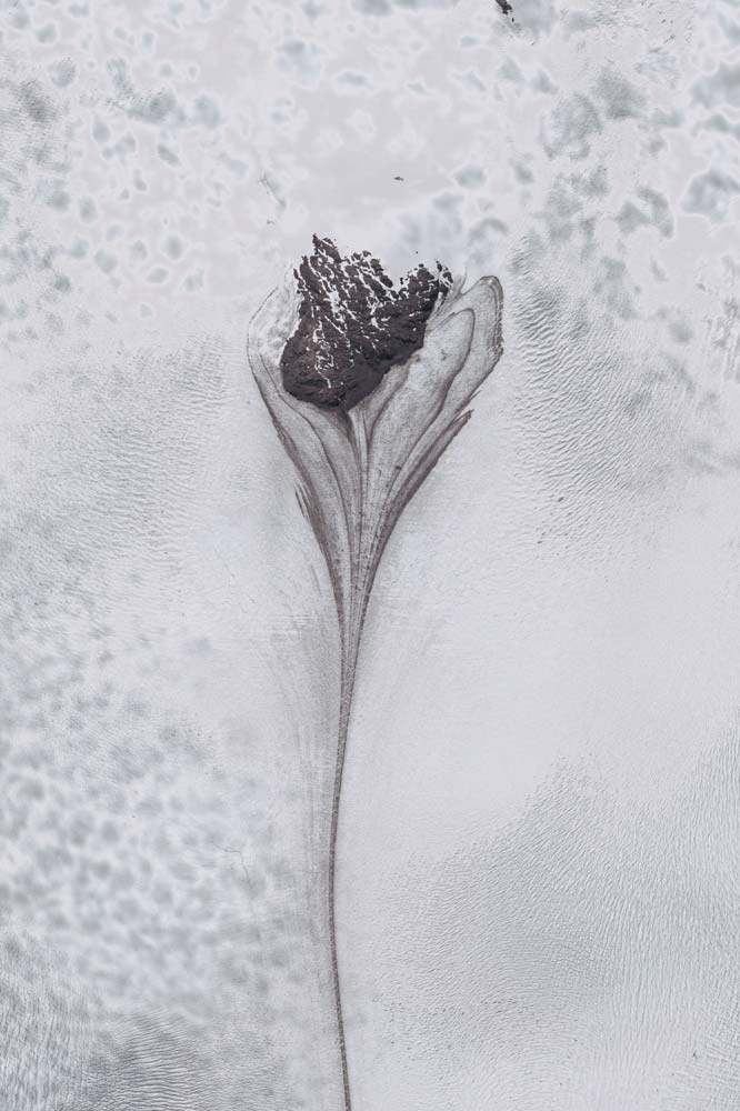
IMAGE COURTESY OF CHARNKURT YAOYUENYONG
www.charnkurtyao.com / @charnkurtyao
“Satellite image of snow-covered terrain in Magallanes and Chilean Antarctica region of Chile. The resemblance to a floral shape reminds me of the beauty and fragility of our world.”
Editor’s comment: There is something surreal and fascinating about this photo, in the way Charnkurt plays with scale and meaning. It’s abstract and artful but, at the same time, it keeps the viewer interested and eager to know more. The black and white aesthetic fits perfectly. I appreciate the sense of composition and the attention to detail.
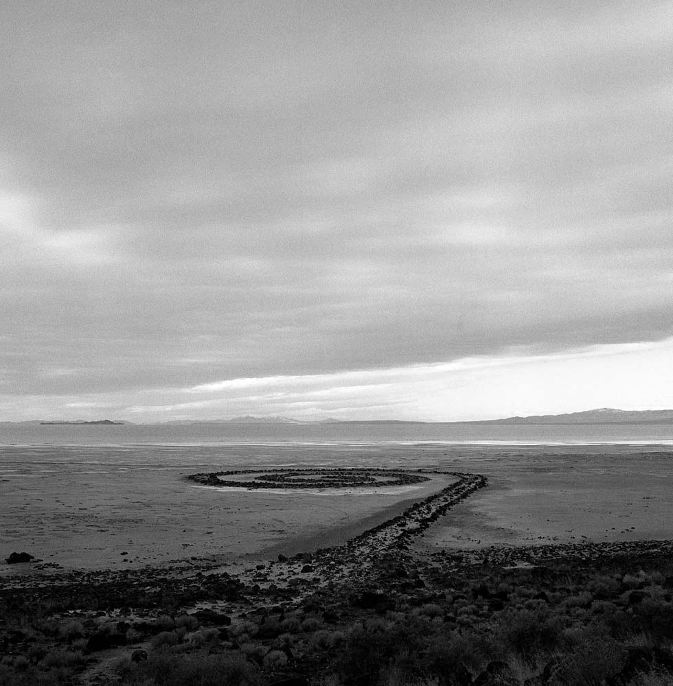
IMAGE COURTESY OF EVELINE SCHNEIDER
@newmoonface
Editor’s comment: Leading lines are hard to handle, which is why I appreciate this photograph. The photographer creates an appealing image using just the geometry of the landscape and luminosity contrast. The black and white aesthetic adds drama. The strong focal point in the foreground drags the viewer into the story. This might not be Eveline’s artwork – it’s Spiral Jetty by American sculptor Robert Smithson – but she captures it elegantly, creating a photograph one will remember.
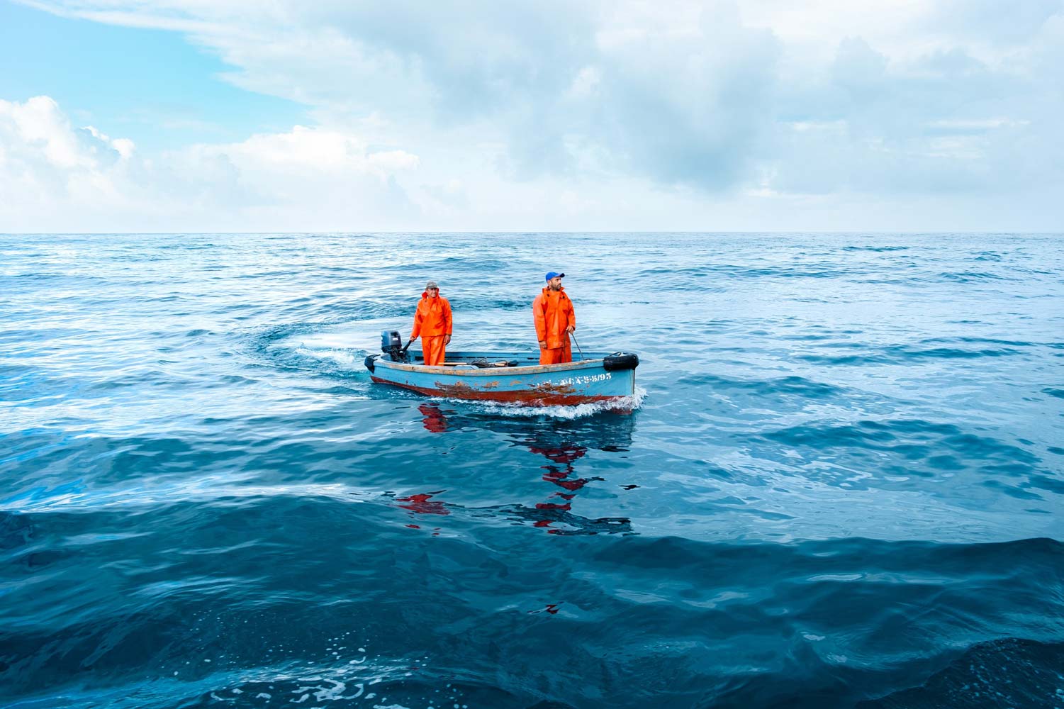
IMAGE COURTESY OF JOSE BERNARD
www.josebernad.net / @josebernadphoto
Editor’s comment: A color contrast that steals your heart. This photograph is a statement. It has a simple and playful composition you won’t easily forget, depicting an unusual perspective on ‘the face of the earth’ (water covers around 70% of our planet’s surface after all). I appreciate the use of the rules of composition, the vast negative space, and the strong focal point.
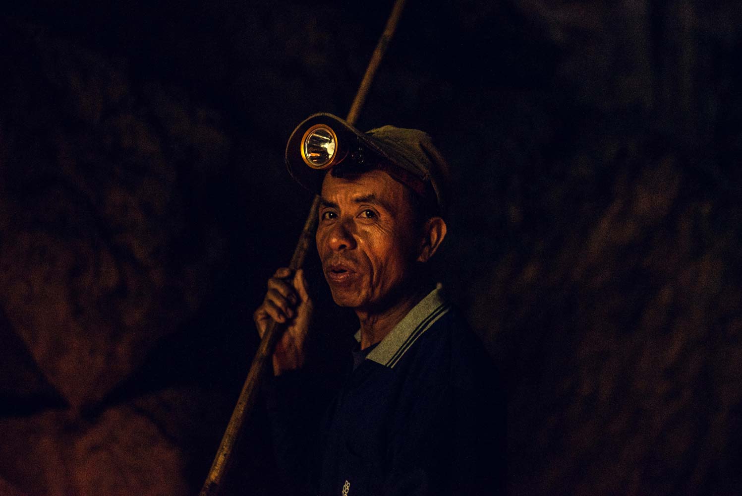
IMAGE COURTESY OF BRANDON MINIERI
@bminieri
“While traveling to the north of Thailand in a town called Pai, there are mountains and caves to explore and photograph. Upon the visit to my first cave, I was greeted by this gentleman appearing from pitch black in an old wooden boat that could only fit two. He told me he has worked at this cave his whole life rowing people in and out of this cave, while only using his headlamp as a source of light and guidance. I knew I had to capture him in this fading light from outside as we entered the dark abyss of the extraordinary cave.”
Editor’s comment: It’s the face of the earth seen from the inside. I like the use of light and shadows, the focus of light on the man’s face, and the simplicity of the composition. It’s not easy to work in these lighting conditions. Brandon bottles some of the sense of awe and anticipation he describes so well in his statement.
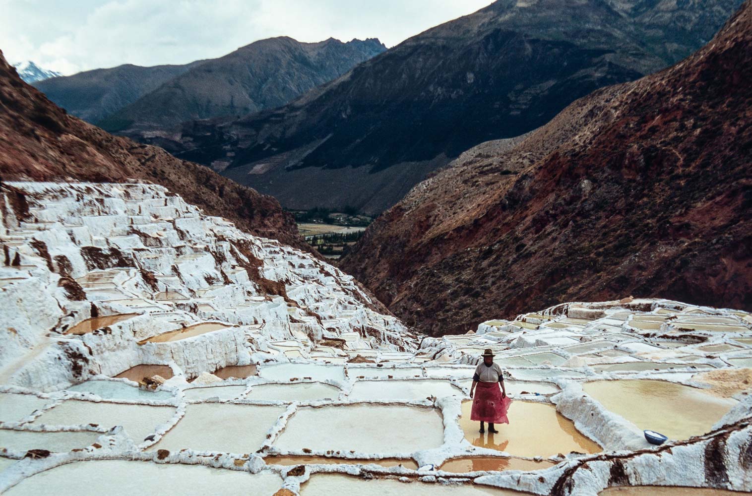
IMAGE COURTESY OF ALFREDO GARZA WOLLENSTEIN
www.photograffair.com / @photogr.affair
Editor’s comment: This is a powerful composition that depicts the relationship between humans and nature. Capturing the soft pastel color palette with an interesting shooting angle, Alfredo captures both the beauty of the landscape and the human-made wounds. I am impressed by the visual story and eager to find out more.
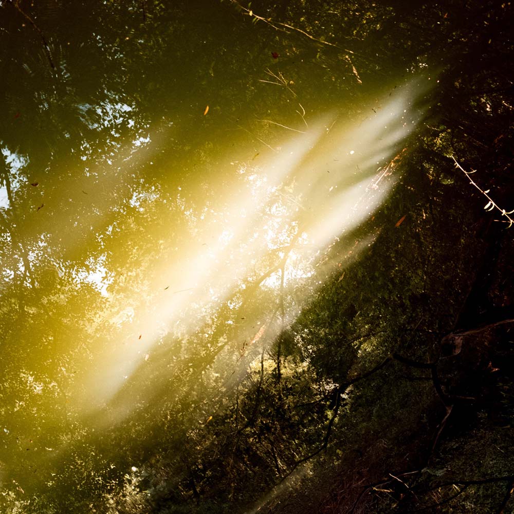
IMAGE COURTESY OF ALVIN NG
www.alvinnzh.com / @alvinnzh
‘Samsara is a visual reflection of my relationship with the balance of the world and its natural elements. Based on the teachings of the Buddhist doctrines Anitya (Impermanence), Samsara (Cycle of life), and the ancient Chinese book of wisdom known as the I Ching, I’m guided by both my intuition and the union of the knowledge gained, following the ‘Flow’ (Tao) of life, understanding the harmony in which the elements compliments each other, and the disharmony in their conflicts.’
Editor’s comment: There is a fascinating sense of harmony in this photograph. I like the way light and shadows come together, the flow of light, and the reduced color palette. For me, it’s clear that Alvin connected with the environment and had the patience to observe and care. A quietly beautiful shot, reminding us that even the simplest of moments can feel monumental.
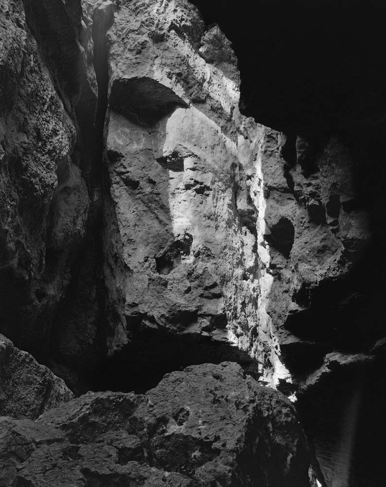
IMAGE COURTESY OF ALEXANDER HEJNA
@alexanderhlargeformat
Editor’s comment: This black and white composition captures textures that only a few can spot. I admire Alexander’s dedication and skill. It’s not easy to capture this dynamic range. I also appreciate the use of space, the unusual shooting angle, and the unique perspective over the mountain.
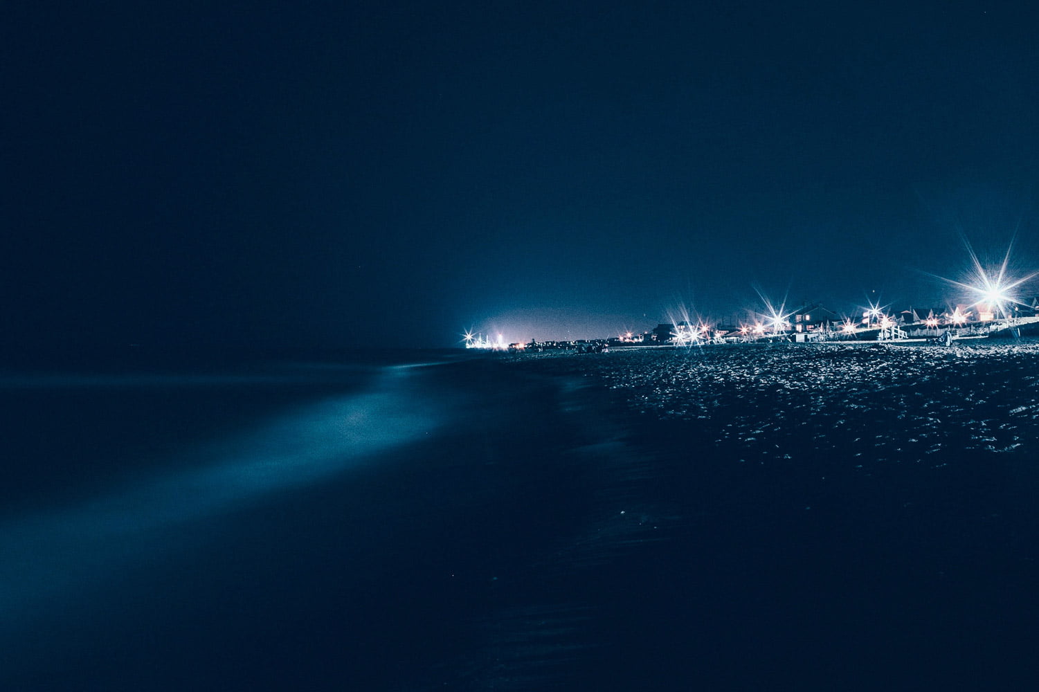
IMAGE COURTESY OF TIM GERDES
@timgerdesphotography
Editor’s comment: I am charmed by the deep shade of blue that fills this photograph. City lights only enhance the profoundness of the color. And while the lights are bright and appealing, we finds ourselves lost in the ocean of blue. It’s a simple, artful, and striking composition, which captures the thin line between nature and human-made areas with subtlety and candor.
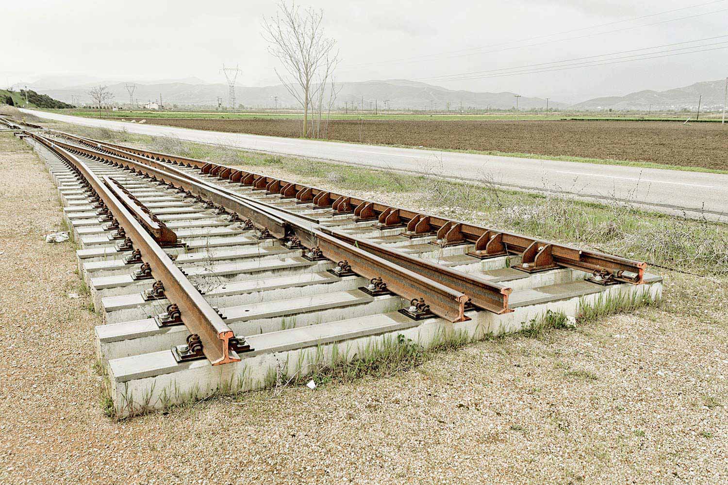
IMAGE COURTESY OF MILTIADIS IGGLEZOS
@miltiadis_igglezos
Editor’s comment: The crispness and sharp details of this photograph reveal the invisible boundary between nature and human-made objects. When the railroad ends, the metaphor begins. I appreciate the clarity of the image, the technical skills of Miltiadis, and his ability to work with natural light.
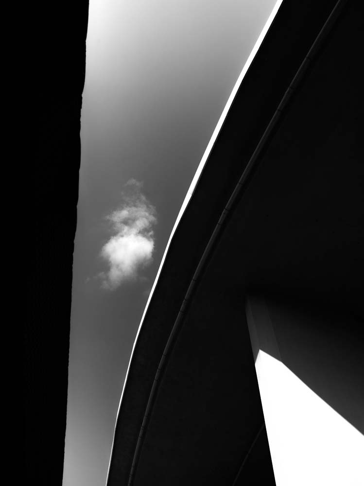
IMAGE COURTESY OF KOSTIANTYN STUPIVTSEV
@squaretheframe
Editor’s comment: This photograph impresses through its unusual angle and minimalist perspective. Kostiantyn proves to be a patient observer. At the same time, it’s not easy to achieve a clean and appealing framing using ordinary elements. I appreciate the use of the black and white aesthetic as it accentuates the fragility and serenity of the cloud that hangs above this imposing concrete-scape.
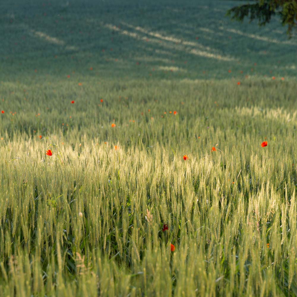
IMAGE COURTESY OF FLORIANA AVELLINO
@floriana_avellino
Editor’s comment: I like this photograph because Floriana found the best focal point in the scene and managed to create a soft light by blurring the background. Fields with poppies aren’t a new subject matter. Therefore, one should always look for unusual angles, fresh approaches, and techniques that bring the subject matter to another level. The photograph has a striking color contrast and a good game of texture, light and shadows.
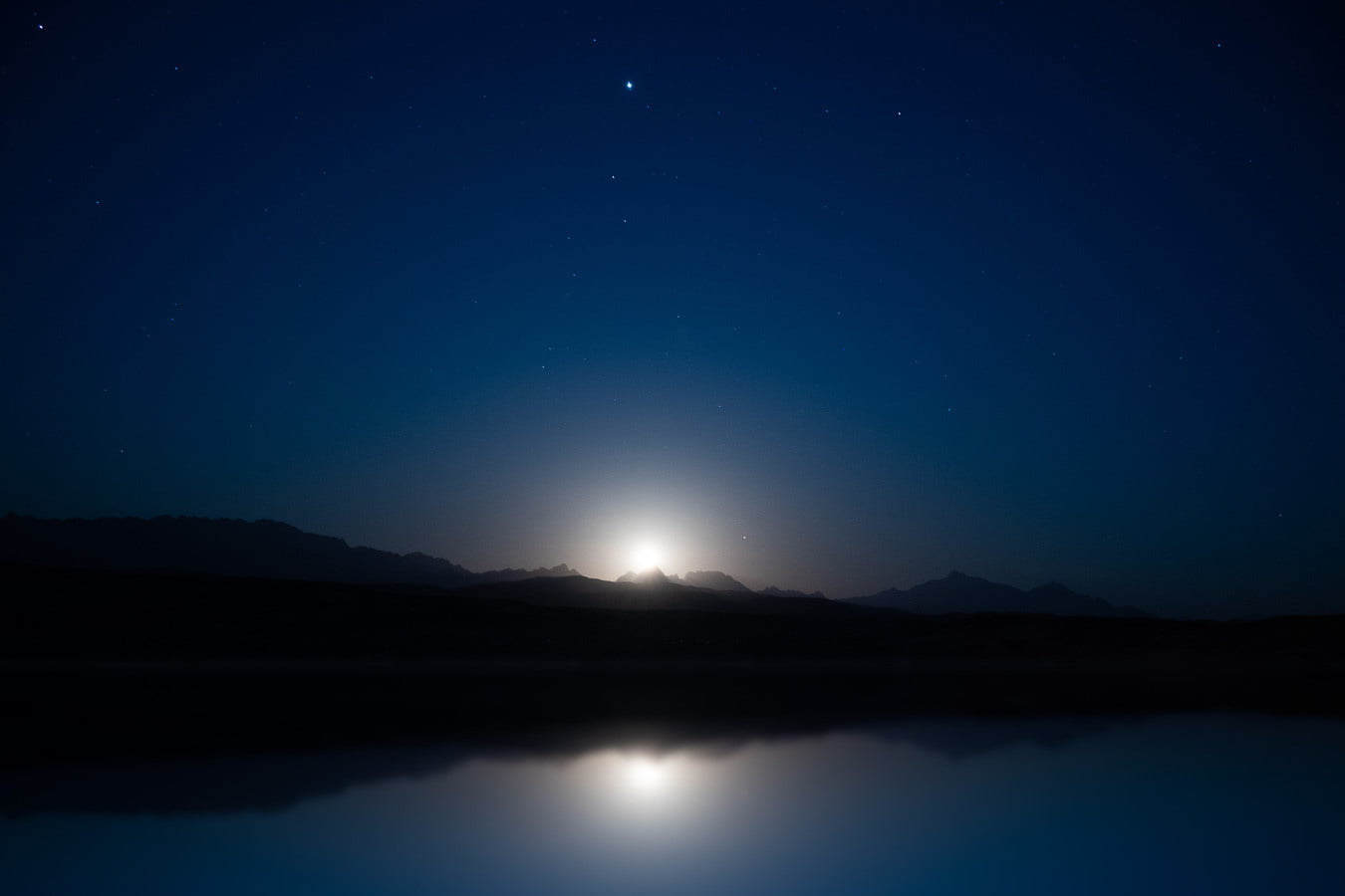
IMAGE COURTESY OF NICOLAS REYNAUD
www.nicolasreynaudphotography.com / @nicorynd
Editor’s comment: The blue hour is one of the best times of the day for landscape photography. Moonset is such a vibrant moment. I appreciate the choice of the subject matter, the ability to work with such a difficult dynamic range, and the structure of the composition.
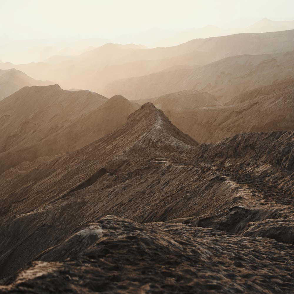
IMAGE COURTESY OF GUNAWAN SIDIK
@gunawansidik
Editor’s comment: The sense of depth in this photograph is breathtaking. I love the almost monochrome color palette, the layers of mountains, and the inviting path. It’s a photograph that makes the viewer part of the landscape. Gunawan knows very well how to capture a 3D space, and how to immerse the viewer in a place.
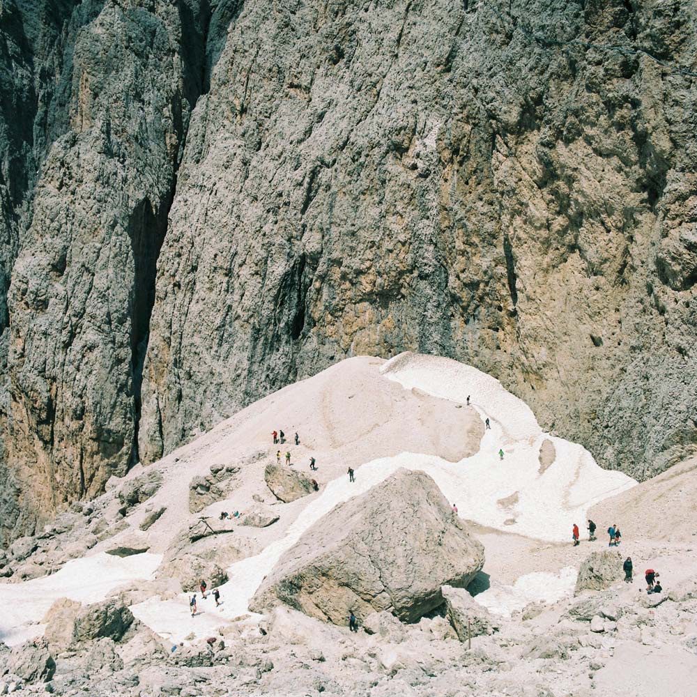
IMAGE COURTESY OF RASTRO SRAMEK
www.100acrewood.org / @rasto.sramek
Editor’s comment: This photograph shows clearly how we invaded the earth. At the same time, it reveals the majesty of nature. I love the contrast between the size of the people and the size of the mountain. I also like the structure of composition, the earthy color palette, and the game of highlights and shadows.
