“COLOURS”
ANNOUNCING THE WINNERS
“In my photography, color and composition are inseparable. I see in color.” – William Albert Allard
We’re delighted to present the results of this year’s sixth theme – Colours! The brief was to find colour-inspired photographs…literally and figuratively. Scenes, a details, narratives or moods. Single tones or technicolor daydreams. Reds, blues, yellows, and a billion pigments in between!
The theme was judged by Evgeny Tchebotarev, co-founder and Chief Photography Officer of the 500px online photography community, founded long before the days of Facebook and Flickr. The Toronto based start-up is aimed at aspiring and professional photographers and now has over 10 million monthly active users.
You can discover the winning images below and join the discussion on Facebook, Instagram and Twitter. Congratulations to all the talented photographers featured and thank you all for your support. Life is a stream of color!
Congratulations to the selected photographers and to everyone else: enjoy!
Join the discussion on Facebook, Instagram and Twitter and thank you to everyone who submitted their work.
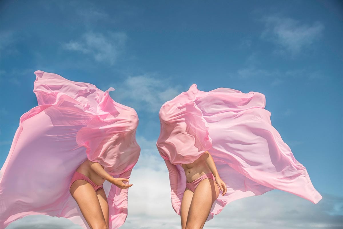
FIRST PRIZE: PRUE STENT
“Absolutely wonderful pink tones, beautiful theme, and wonderful feeling that comes with it. It shows a very elaborate effort, and created a sense of mystery because the faces are covered, leaving a lot to interpretation and imagination.” – Evgeny Tchebotarev
“This image has an immediate, sensorial impact with its rich, clean colours and strong shapes. It has a satisfying visual impact the moment you look at it. Dig a little deeper though, and you’re struck by both the detail – the tones of the skin, the rippling contours of the fabric – and the ambiguity – the mystery to what we’re witnessing, the fact that the wind seems to be blowing in both directions at once, and that we could be anywhere in the world (in fact it feels quite otherworldly).
Conceptual, performative photography sometimes risks being a little pompous, but this is light-hearted and playful. It’s feminine and beautiful, but not tacky or too ‘editorial’, and crucially is elaborate but not fussy in its set-up. And that mix of boldness and detail, simplicity and ambiguity, creates something powerful and memorable.” – Life Framer Editors
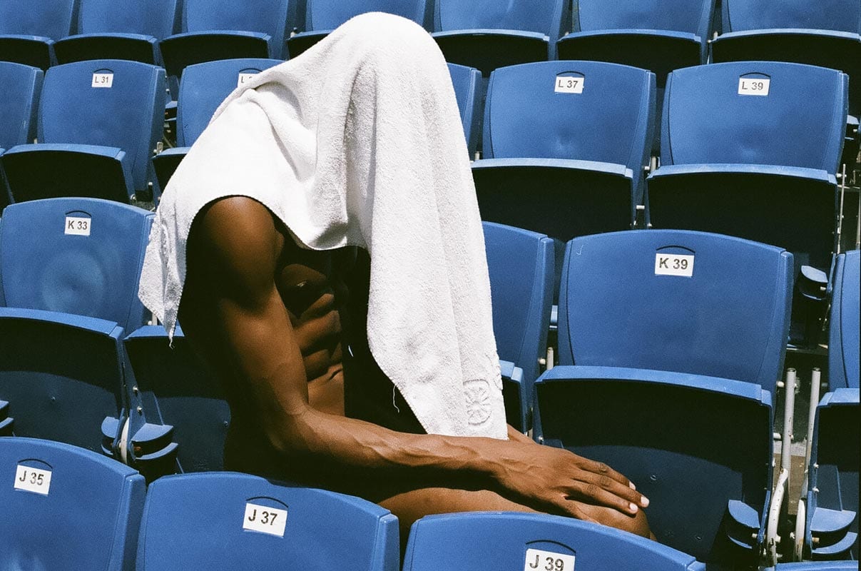
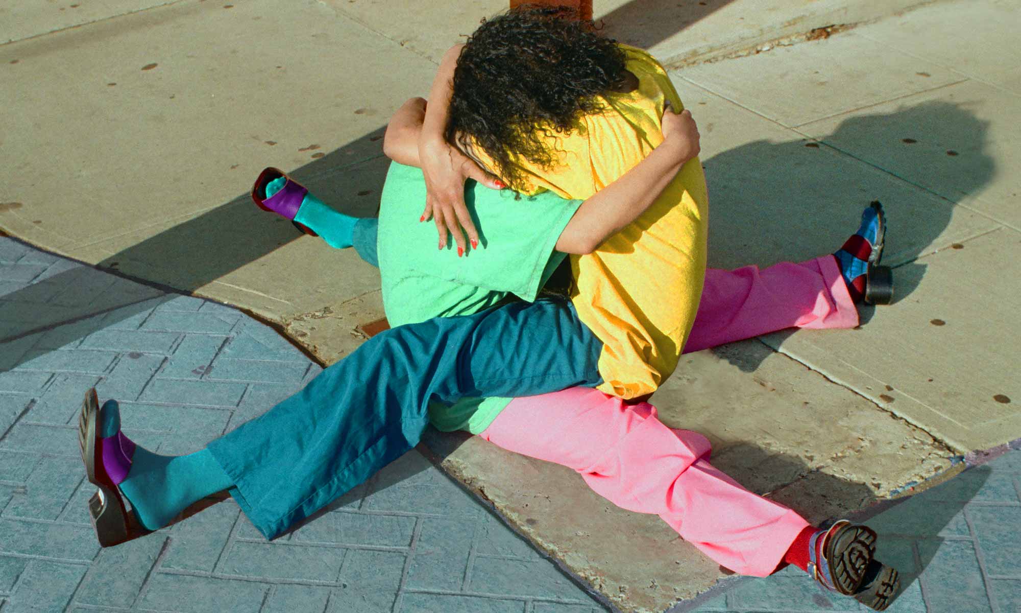
SECOND PRIZE: LUIS ALBERTO RODRIGUEZ
“Beautiful colors, of course. The subject is intriguing – the viewer can wonder… is it staged, or is more natural moment? Still, skin colors are immaculate!” – Evgeny Tchebotarev
“This image has fabulous, rich colours, and an intriguing central subject – are we witnessing something posed, or something candid? A conceptual study of the human form, or an exhausted athlete after training? It shows us enough to be extremely striking, and leaves enough out to keep us guessing.” – Life Framer Editors
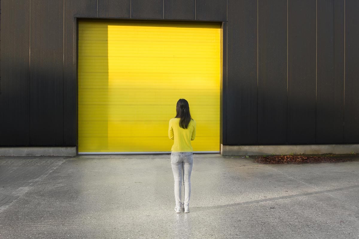
THIRD PRIZE: BO BREUGELMANS
“Another simplistic shot, but what a lovely concept and a shot. It works perfectly, and the general tonality is very light and positive.” – Evgeny Tchebotarev
“Bo takes a simple concept, and executes it wonderfully. She doesn’t try to camouflage her subject entirely – a la Liu Bolin – but instead (seemingly) plays with what she’s given, finding a more natural and playful harmony between the subject and her environment.
It has vivid colour (it’s an added bonus that the girl’s hair matches the wall either side of her) and a balanced composition. It’s a simple, well-constructed image.
On close inspection though, I see some subtle discontinuities – the girl’s shadow doesn’t appear to be cast quite right (?) and the lines of the roller door cut through her yellow jumper. Is there some Photoshop at play? My advice would be to go about it very carefully so that the illusion isn’t compromised, or better yet to avoid it – the concept is pure enough that it could be achieved without digital trickery.” – Life Framer Editors
FURTHER HONORARY MENTIONS
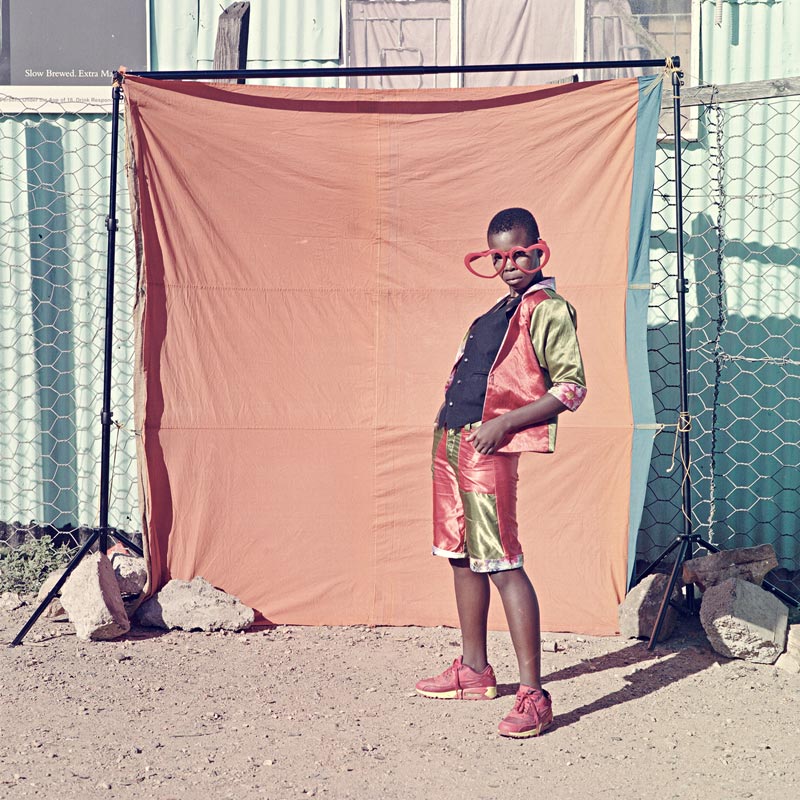
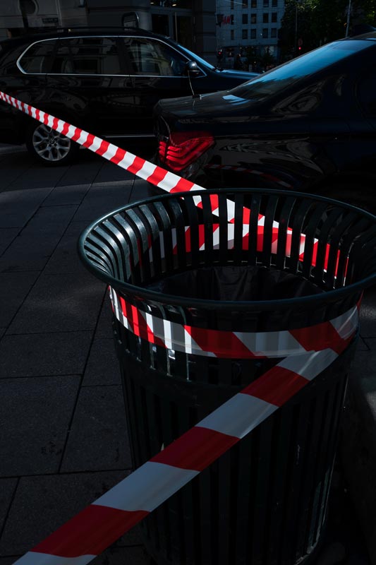
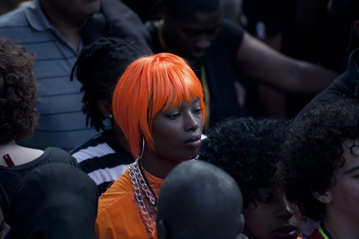
Pierre Belhassen, Amanda Fordyce, Florent Mathey, Hendrik Braet, Patrick Willocq, Mike Marlowe, Joeri van Veen, Steven Jupiter, Merijn Koelink, Scott Houston, Ben McCann, Jeremy Gould, Charlotte J Ward, Pier Carthew, Remy Whiting, Henning S Pettersen, Sara Nicomedi.
